
Now in its seventh season, the Nike NBA City Edition program was created to showcase the stories, history, and heritage that make each franchise unique. The uniforms act as a canvas for storytelling, with the designs reflective of the bond shared between the court, community, and culture.
Inspiration for the designs ranges across various reference points. Some jerseys look to the past, like the Chicago Bulls’, which is inspired by the old Chicago Stadium where MJ and crew won their first three-peat. Others are more geared towards the culture of the community, like with the Phoenix Suns, who are honoring Mexican-American culture and lowrider culture with their design. Streetwear culture has once again made its way into the collection, with Ronnie Fieg and the Kith team designing the New York Knicks uniform and street artist KAWS putting his signature touch on the Brooklyn Nets jersey.
The City Edition uniforms will be more prominently featured this season then in season’s prior, as all home teams will be wearing their City Edition uniforms throughout the inaugural NBA In-Season Tournament, which tips off on Friday, November 3rd. Teams around the league will also be unveiling City Edition court re-designs to complement the uniforms and amplify their storytelling.
The Nike NBA 2023-24 City Edition collection is available now on Nike.com, the NBA Store, and select retailers. Learn about the inspiration behind each design below. You can also check out last year’s designs here.
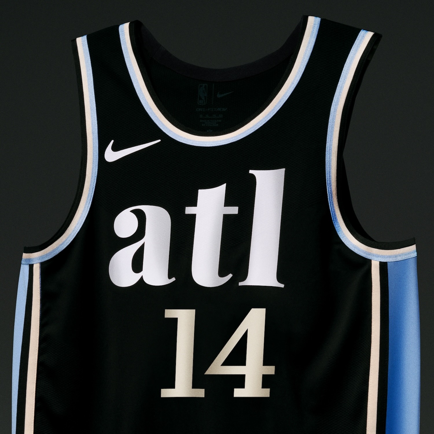
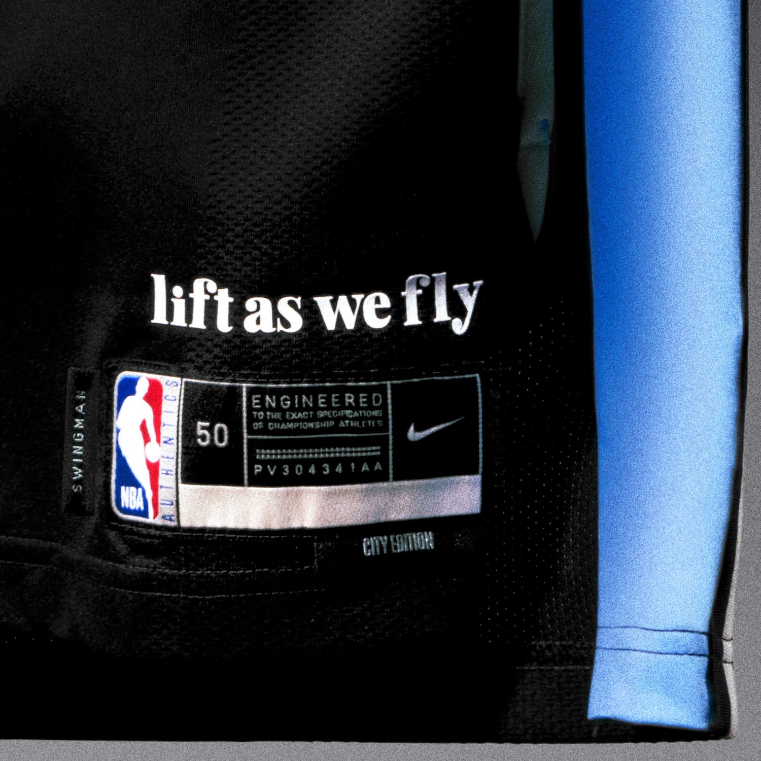
Atlanta Hawks
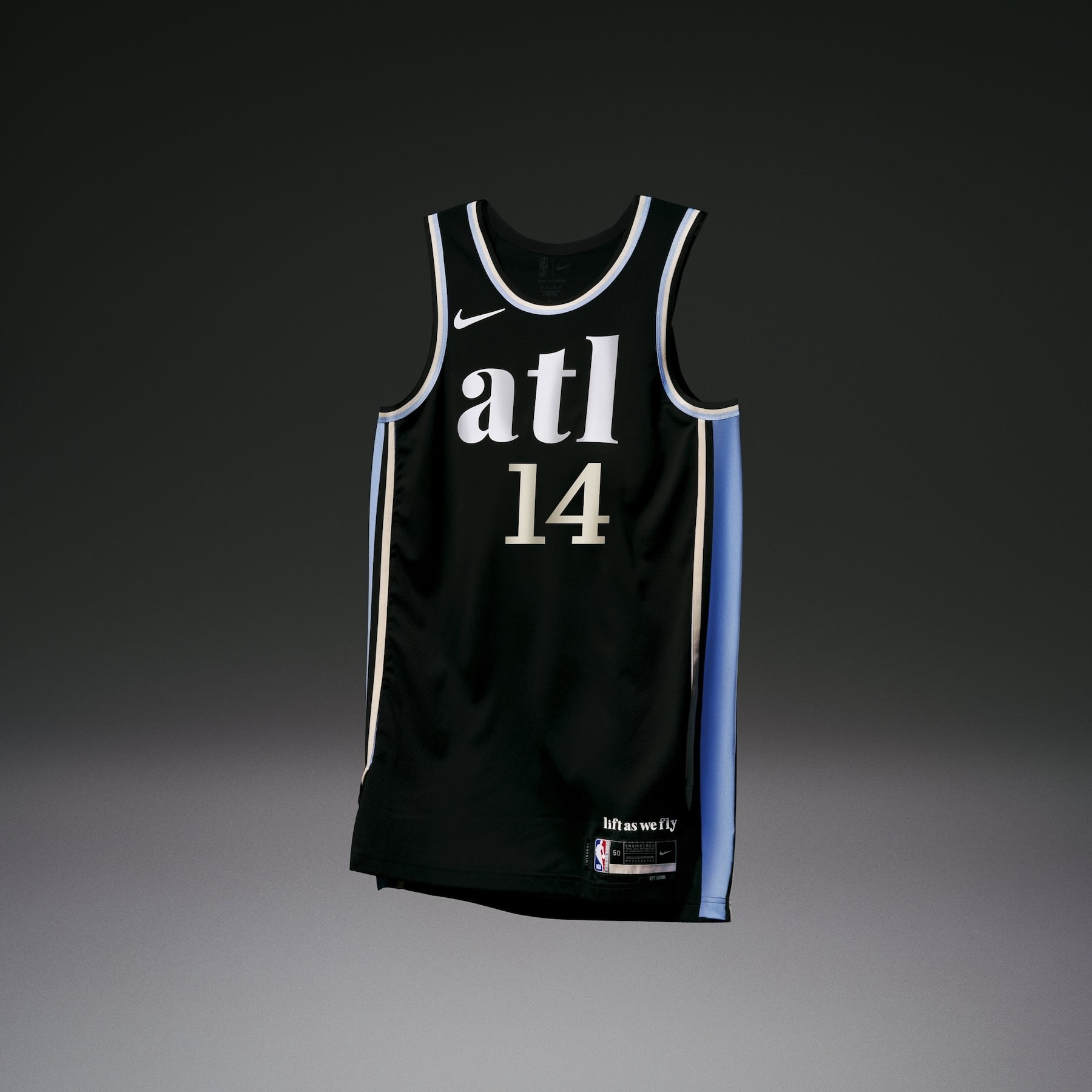
• The Atlanta Hawks uniform celebrates the power of achieving success together, designed around the mantra “Lift as we fly,” which is found on the jock tag.
• The black base is a callback to the team’s original Peachtree Street City Edition concept from last season. On the trim and the side panel, the heritage blue pays homage to the Hawks’ iconic 1968 uniform, marking the year the team arrived in Atlanta.
• The number set, the casual font and the lowercase “atl” wordmark convey the team’s signature southern charm.
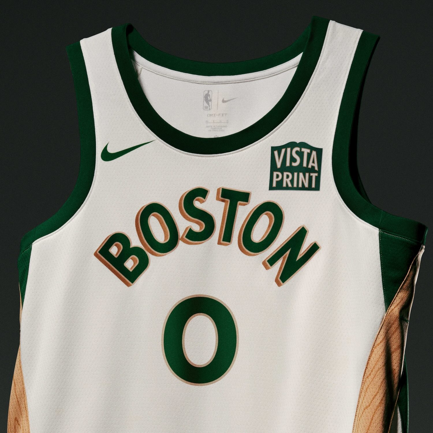
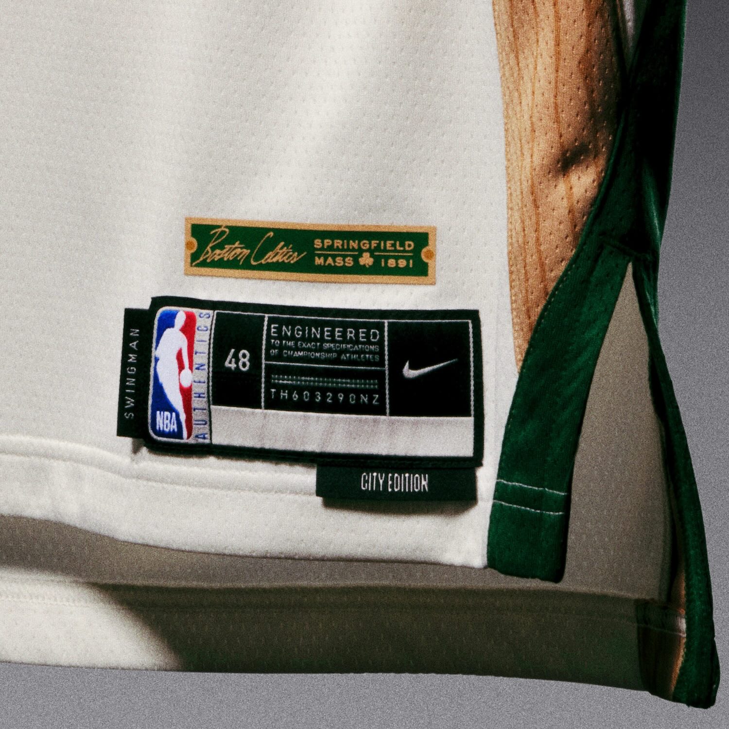
Boston Celtics
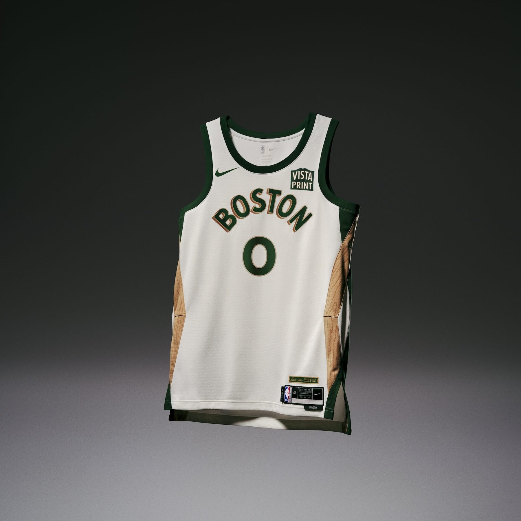
• The Boston Celtics uniform seamlessly weaves together the history of the game, its creators and the city of Boston.
• The woven taping on the side panel references the handcrafted peach baskets originally used in the sport, while the wood grain pattern on the hemp taping nods to the city’s legacy of fine furniture makers, celebrating the craftsmanship at the dawn of the game’s creation in the late 1800s.
• An illustration featuring a historic basketball with a clover inside appears on the belt buckle.
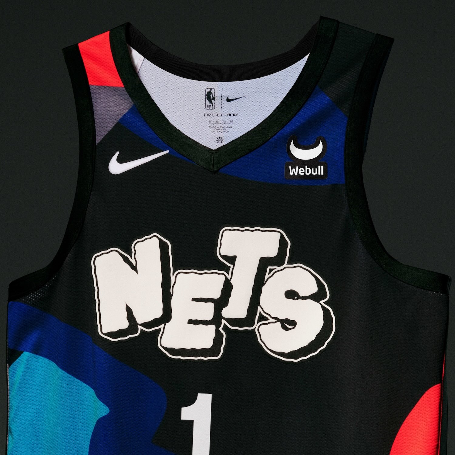
Brooklyn Nets
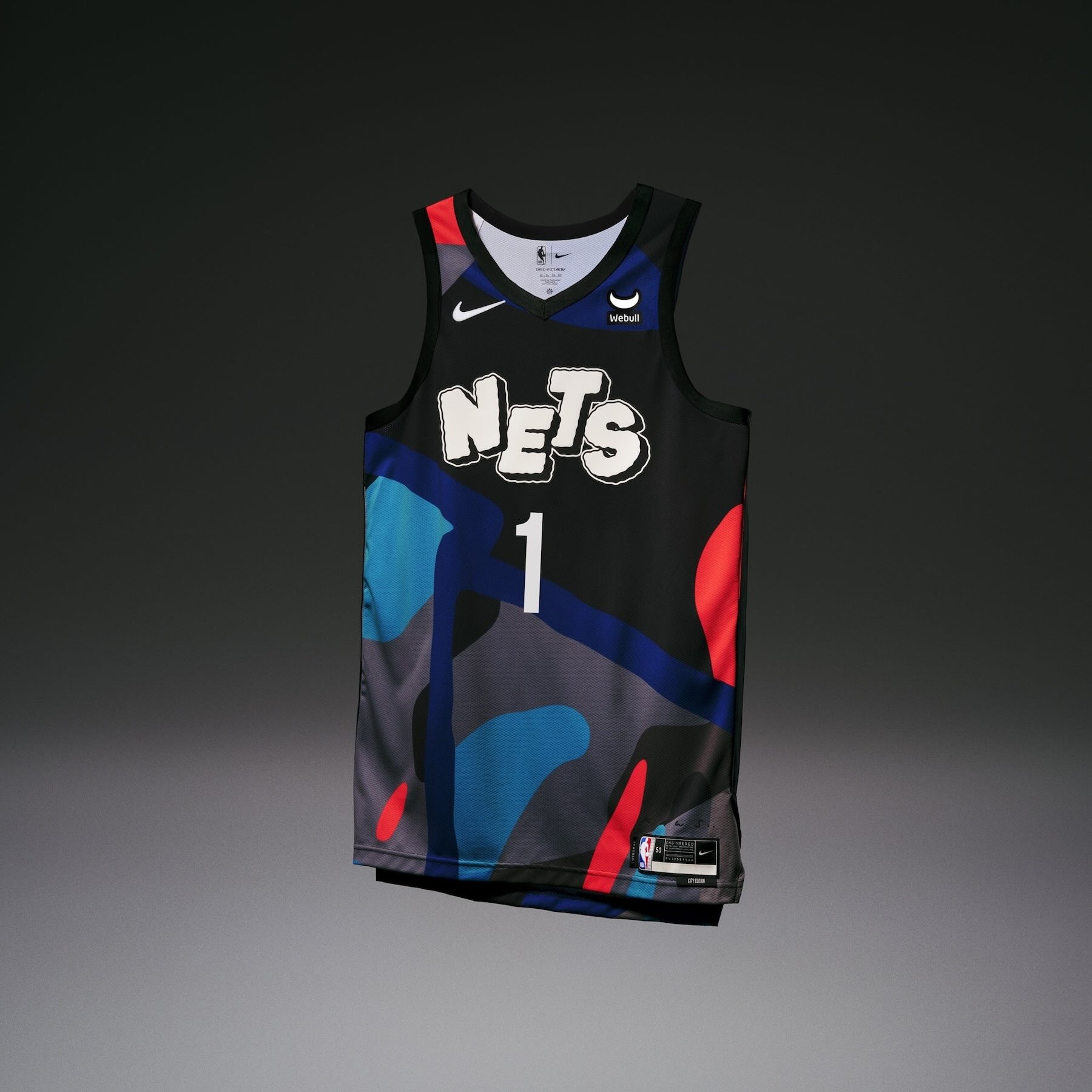
• The Brooklyn Nets uniform was designed in collaboration with Brooklyn-based artist and longtime fan KAWS, bringing together core elements of the team’s brand with some of the artist’s most notable works.
• The colors and patterns on the uniform are inspired by KAWS’ 10-part artwork, “Tension,” evocative of the artist’s eye-catching abstract paintings, while still incorporating the Net’s signature black, white and grey palette. The playful “NETS” wordmark across the chest and logo on the shorts allude to KAWS’ early work as a graffiti artist, while the logo on the waistband of the shorts highlights his globally recognized design mark, << XX >>.
• Rounding out KAW’s influence on the uniform, the jocktag includes his signature.
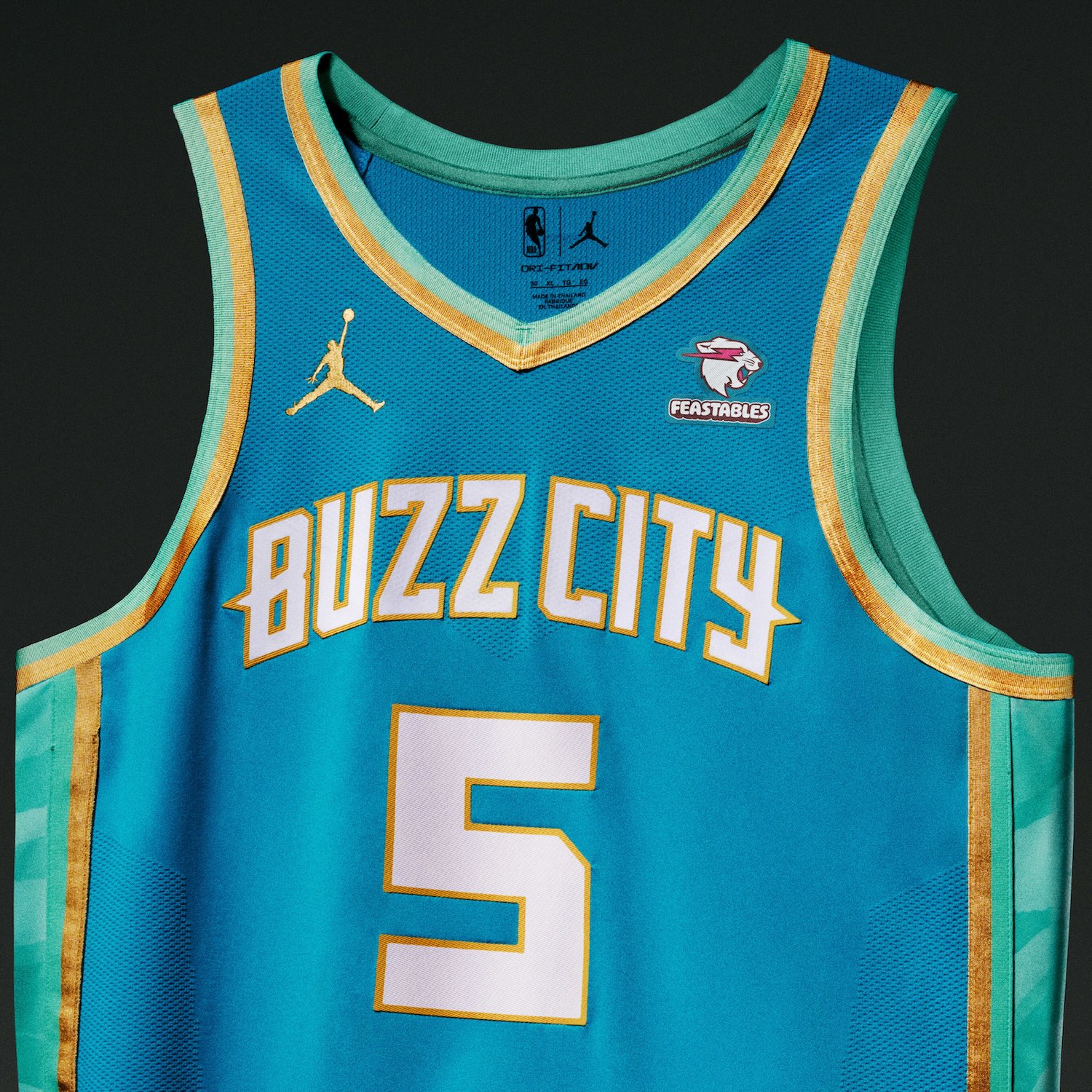
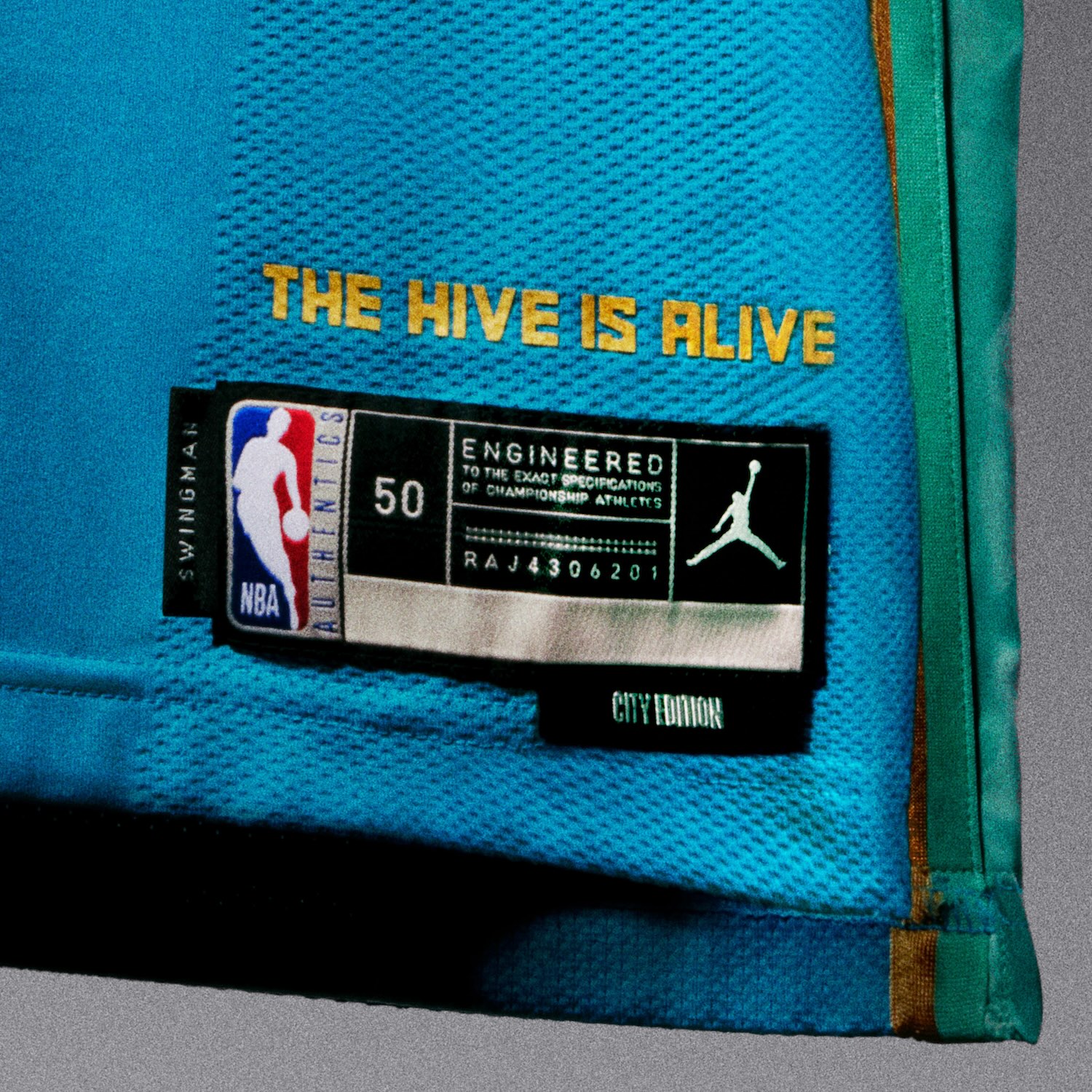
Charlotte Hornets
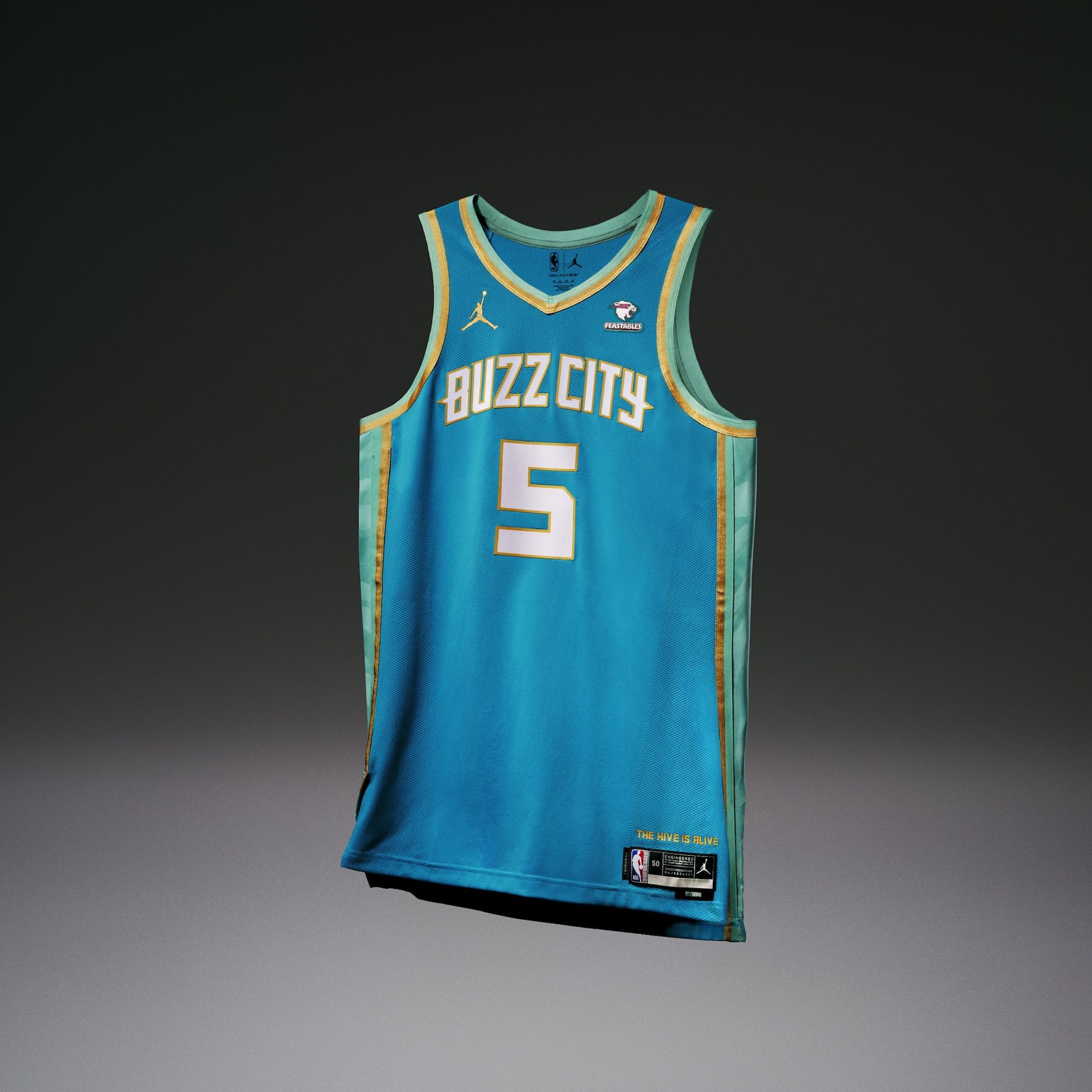
• The Charlotte Hornets uniform celebrates both the team’s home arena and the Charlotte Mint, both of which serve the city as a hub for community.
• A hive pattern is incorporated into the mint-colored side panels, while the mint and gold trim throughout the uniform reflects the city’s rich financial history.
• An enlarged gold hornet patch on the shorts and the phrase “The Hive is Alive” appear on the jocktag.
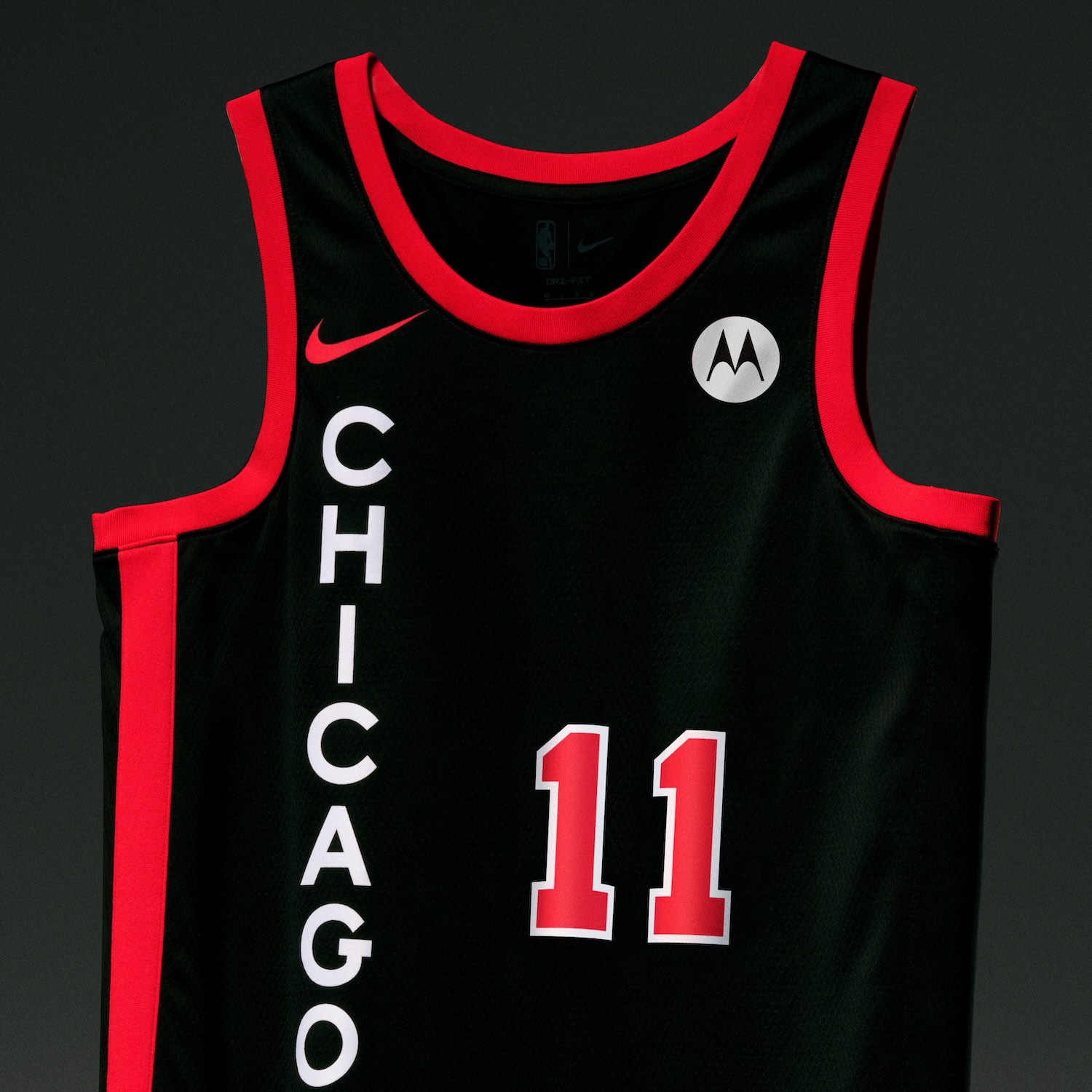
Chicago Bulls
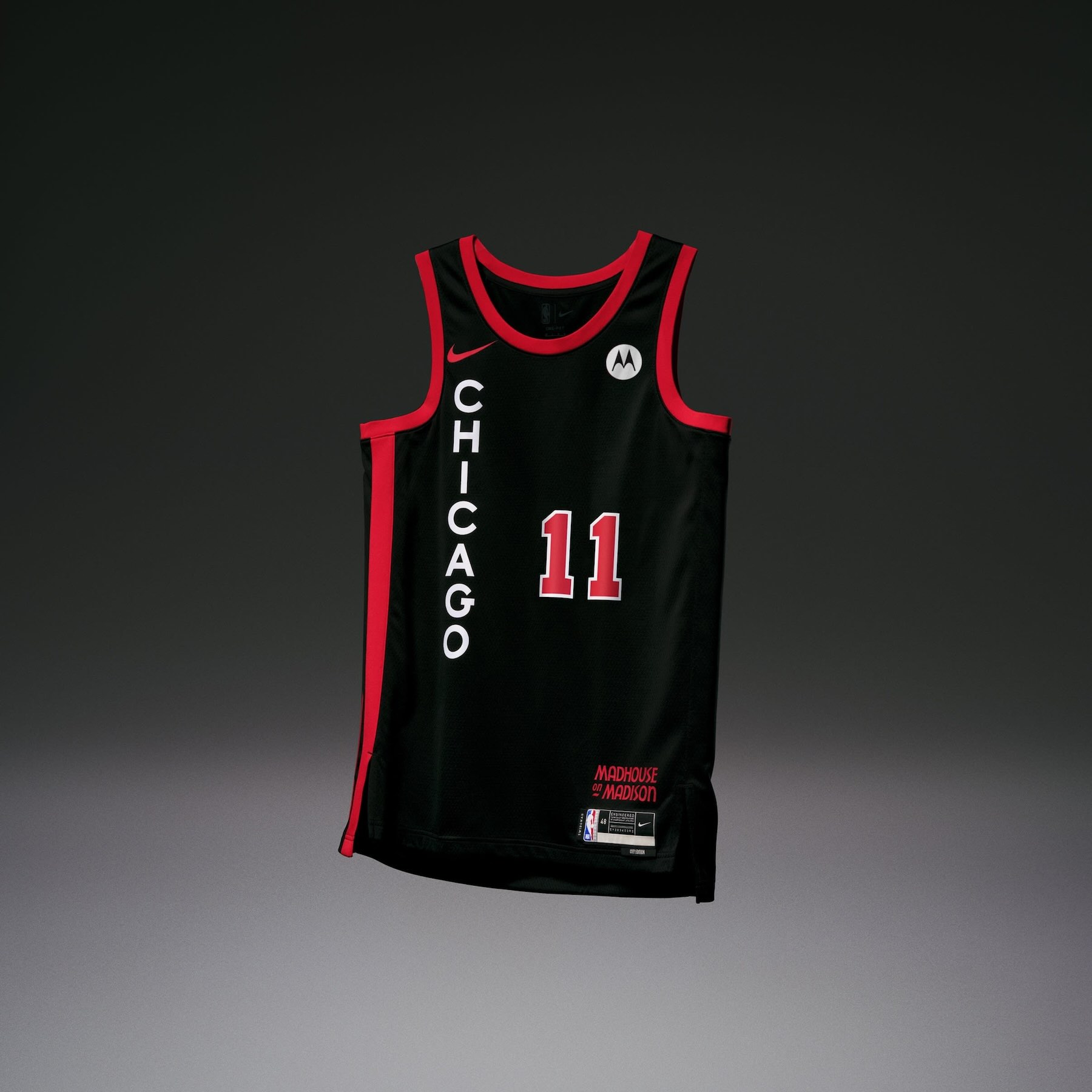
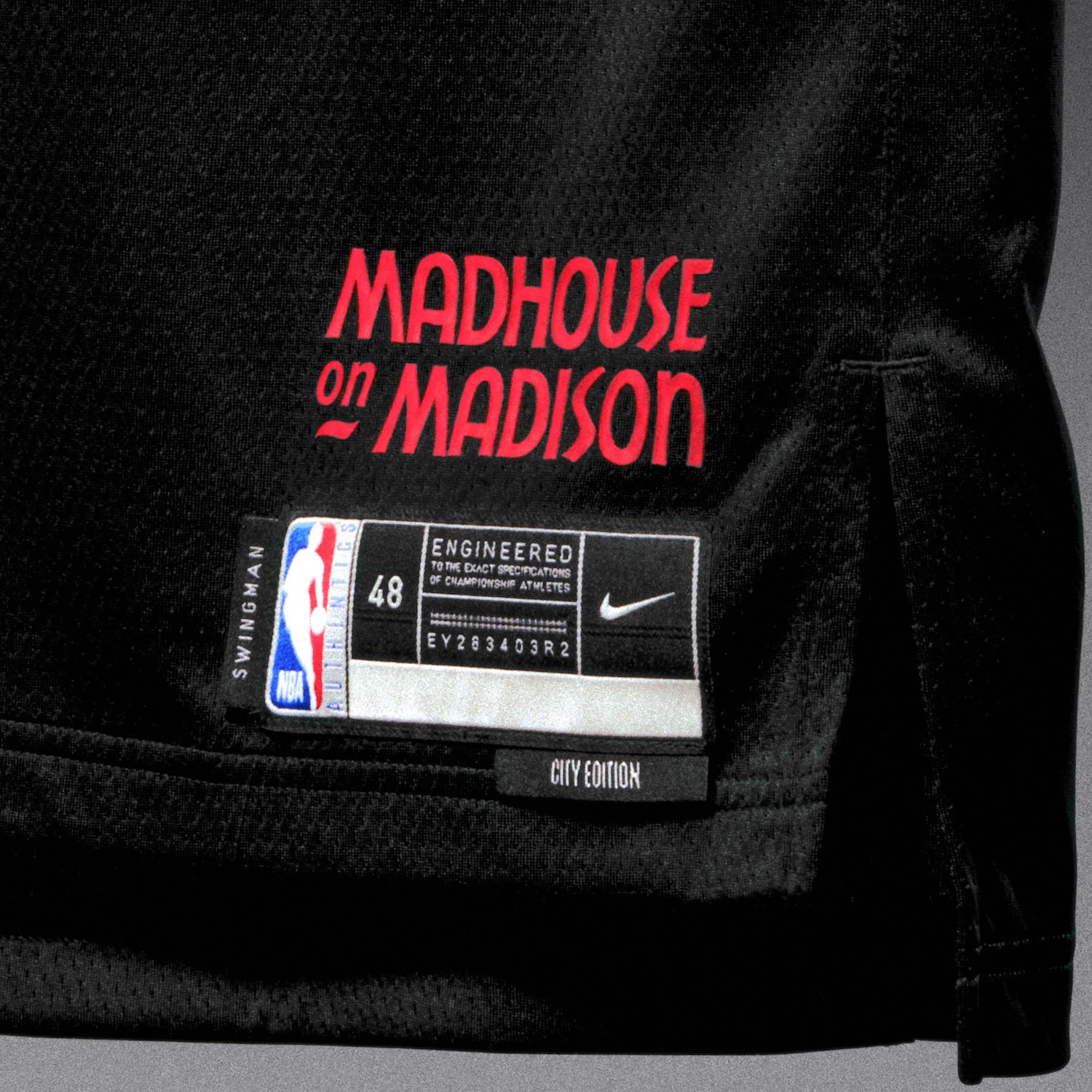
• The Chicago Bulls uniform takes its fans back to the “Madhouse on Madison,” the old Chicago home stadium in the early ‘90s known for its steep seating and rollicking crowds.
• Inspired by the vertical sign outside the arena, the “Chicago” wordmark going down the right side of the jersey is balanced by an enlarged diamond and Bulls’ logo on the left side of the shorts. The structural taping along the right-side panel represents the steel trusses and beams used in the old stadium’s foundation. The Bull on the left appears in the style of the hand-painted court graphics from that era.
• Displayed in old-school font from signs and ticket stubs from the early ‘90s, a “Madhouse on Madison” script appears on the jocktag.
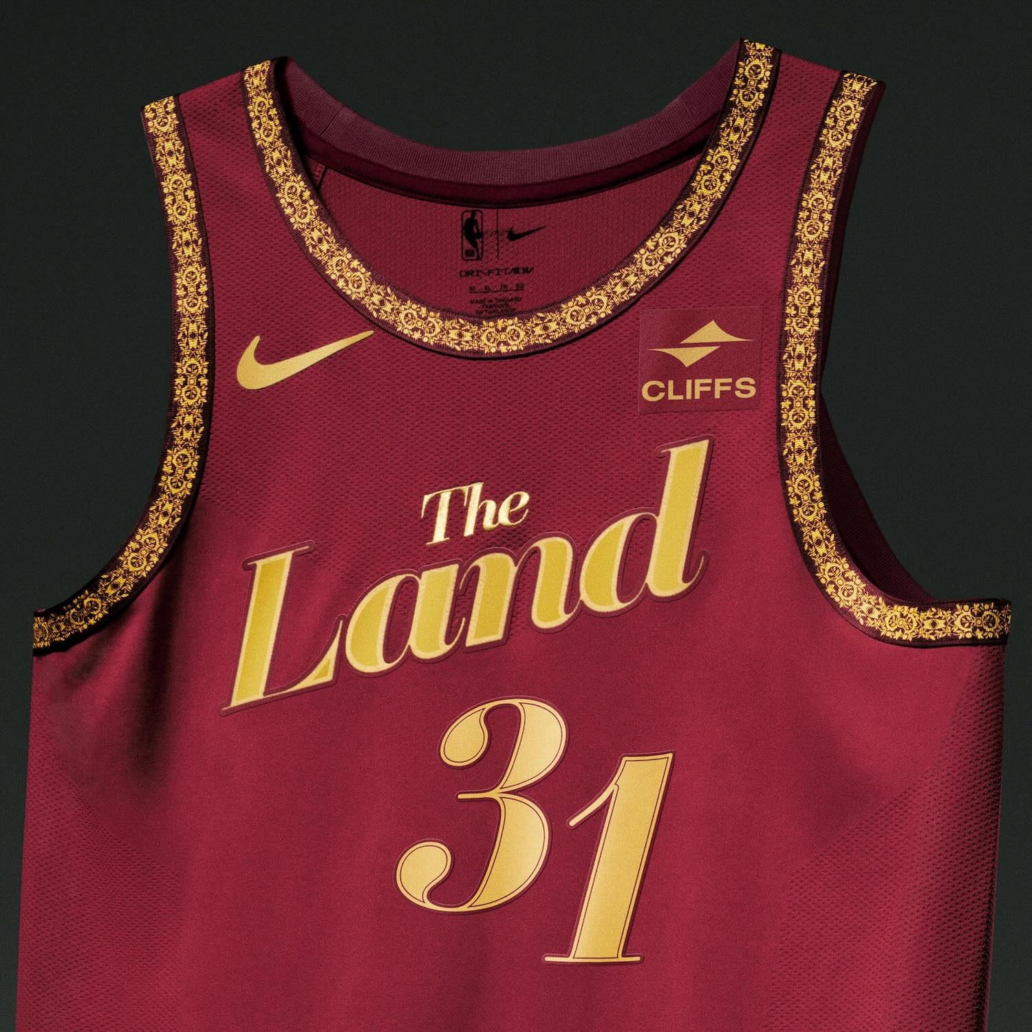
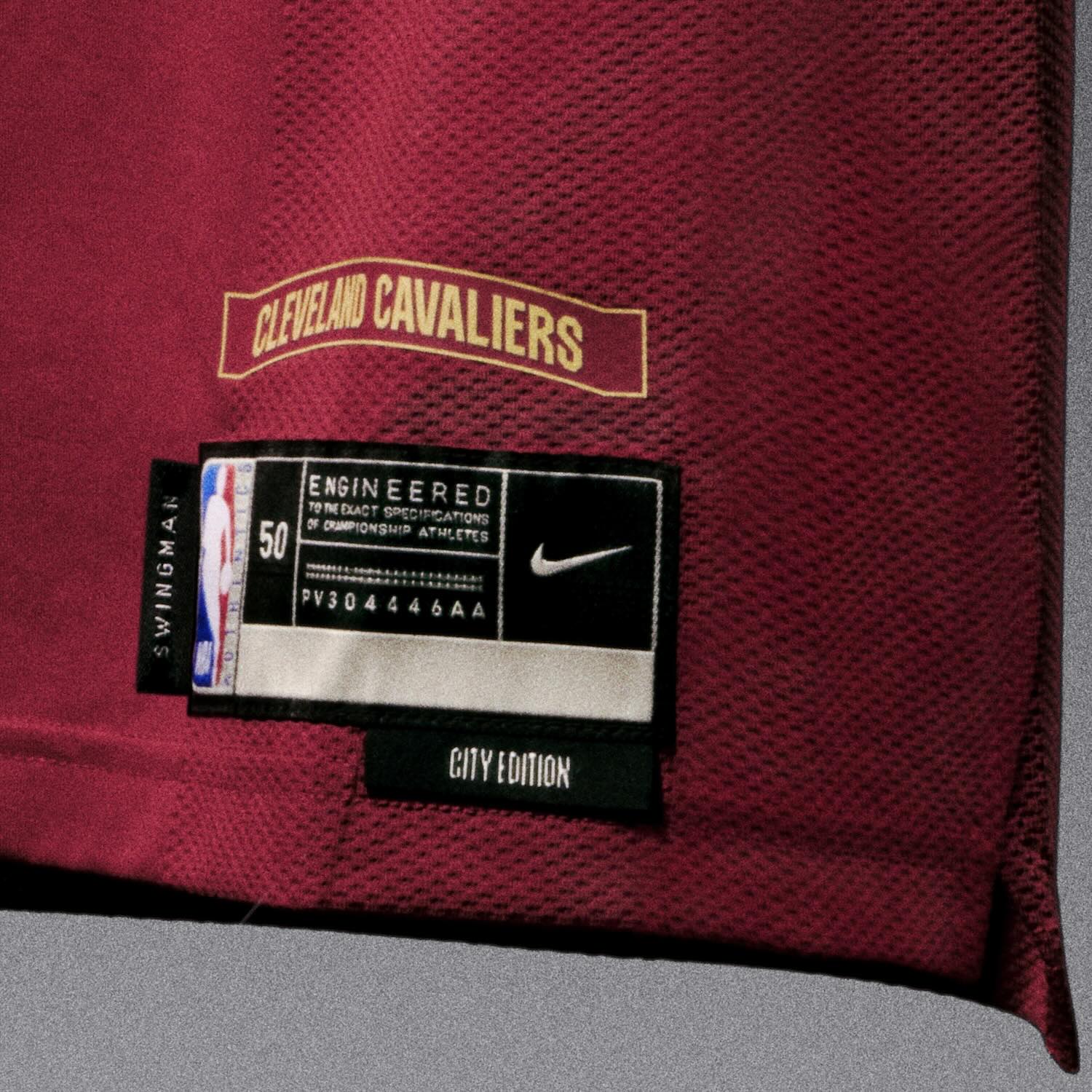
Cleveland Cavaliers
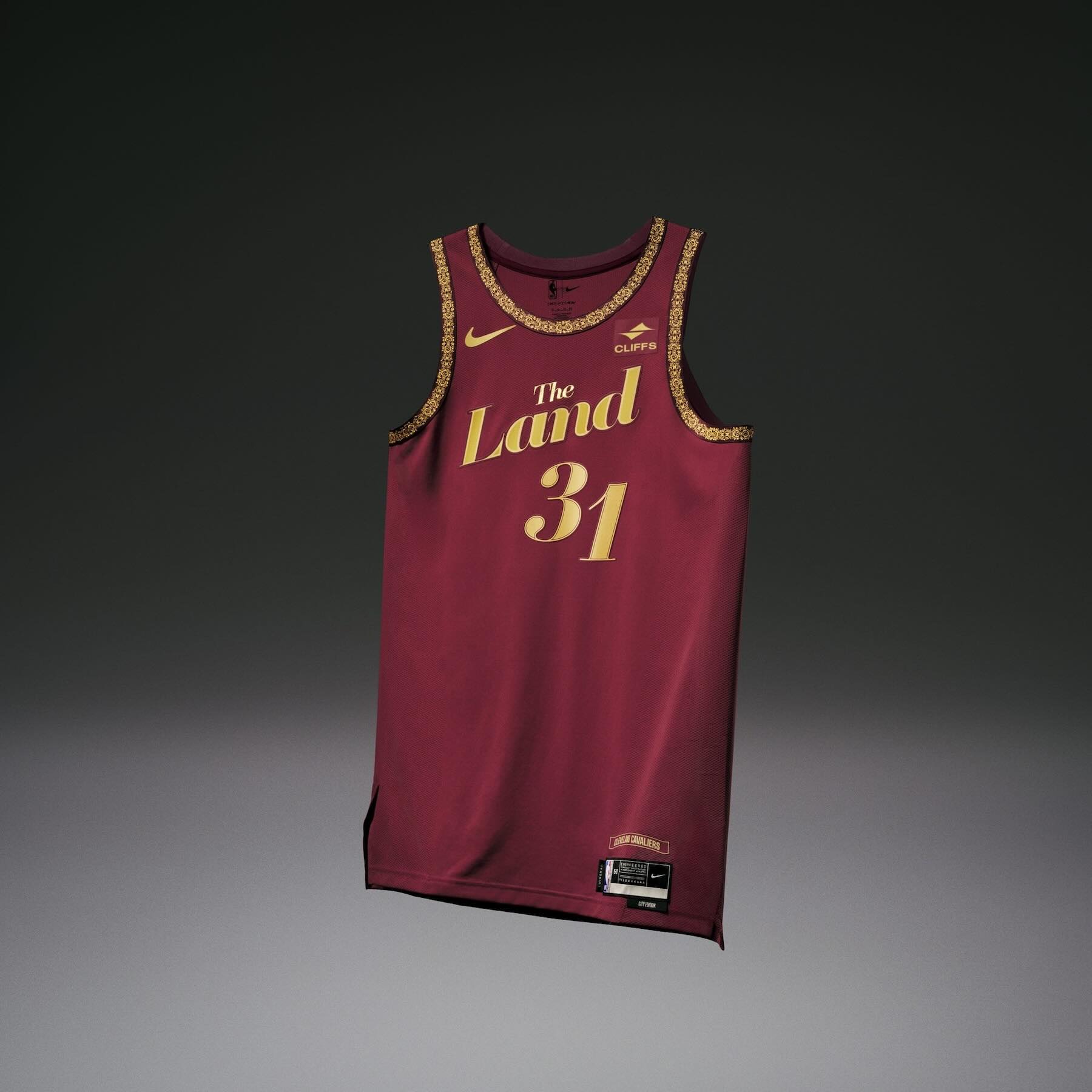
• The Cleveland Cavaliers uniform takes its inspiration from performing arts and theatres. All the colors and patterns reflect the interior of a theatre, given Cleveland is the country’s largest performing arts center outside of New York.
• The fonts on the number set, nameplate and wordmark resemble those on heavily stylized theatre playbills and graphics.
• For the shorts, a new logo on the waistband combines theatre signage with traditional Cavs branding, with the large C surrounded by theatre lights. Subtle detailing on the fabric is meant to represent curtains opening at showtime.
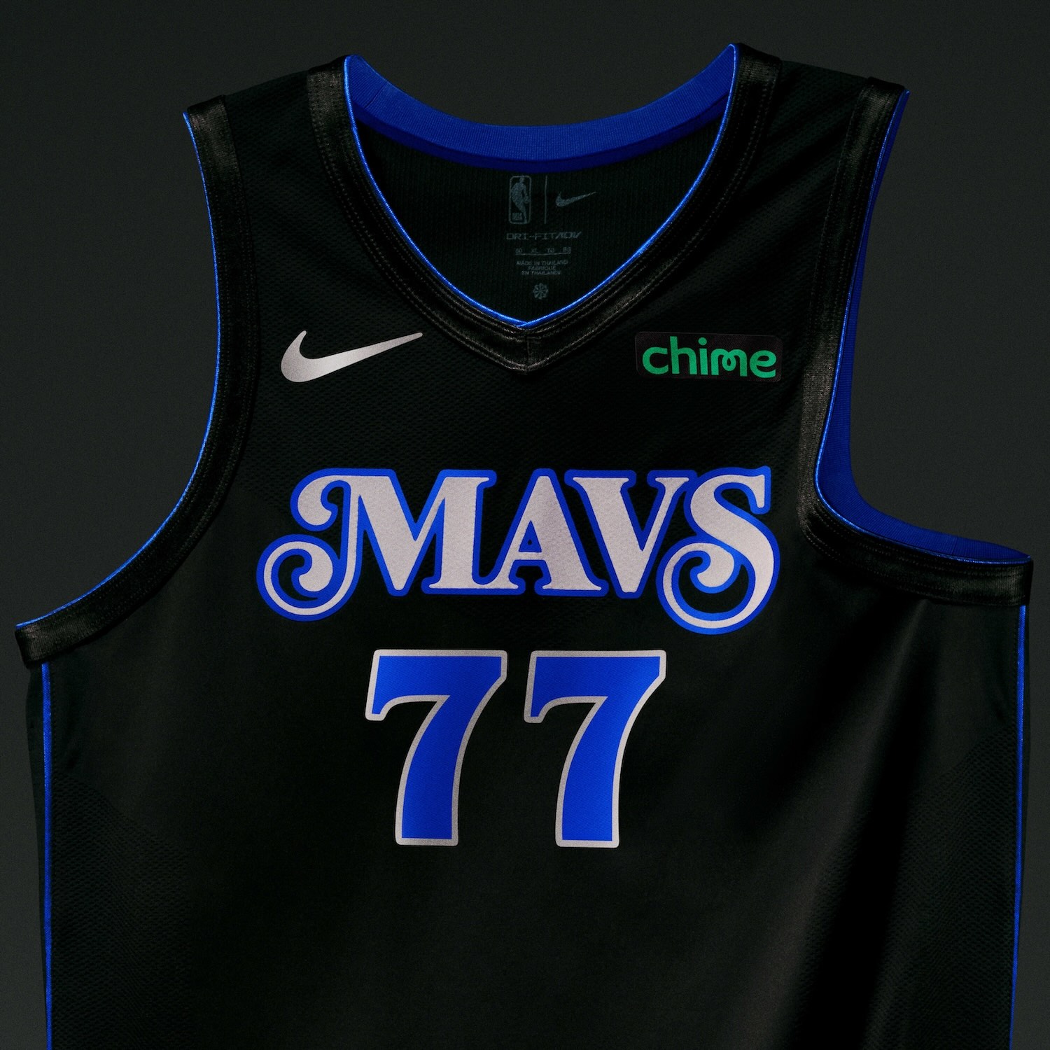
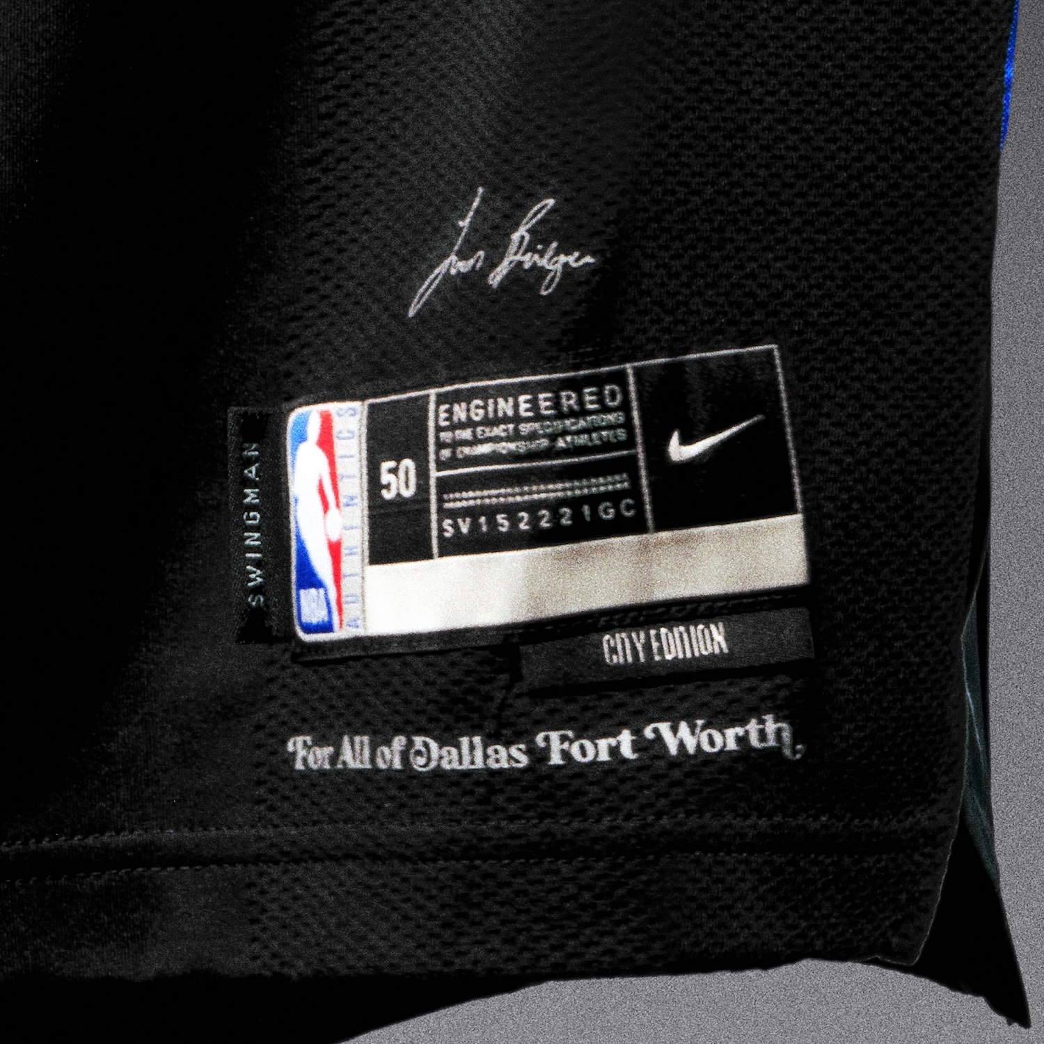
Dallas Mavericks
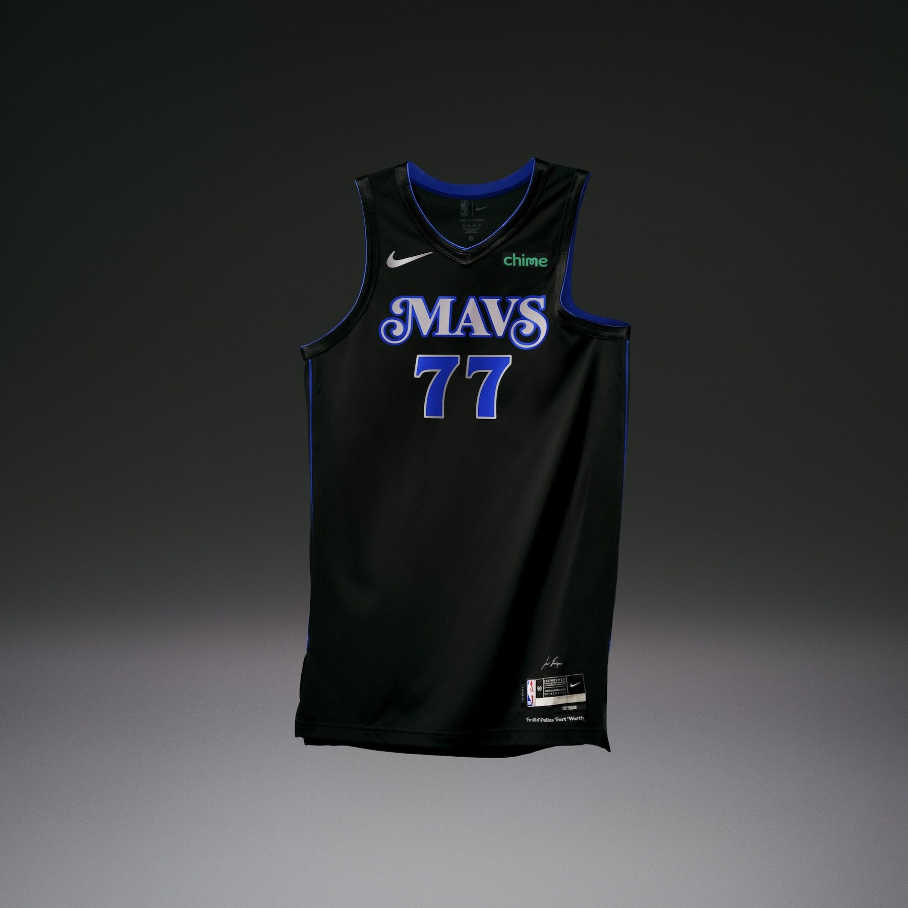
• The Dallas Mavericks uniform is inspired by Grammy Award-winning artist and North Texas native Leon Bridges and his desire to honor the rich American Rhythm and Blues history found within the city.
• The uniform features a dark, moody color palette embodying the music’s soul.
• The jocktag includes Leon’s signature and “For All of Dallas Fort Worth.”
• The side panels of the uniform include Leon’s embossed handwritten words on one side and embossed guitar strings on the other.
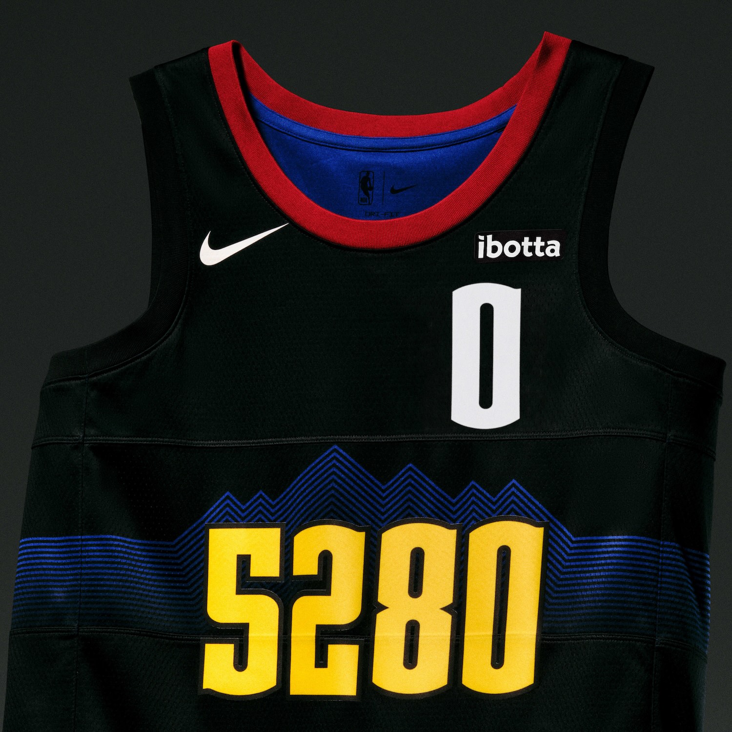
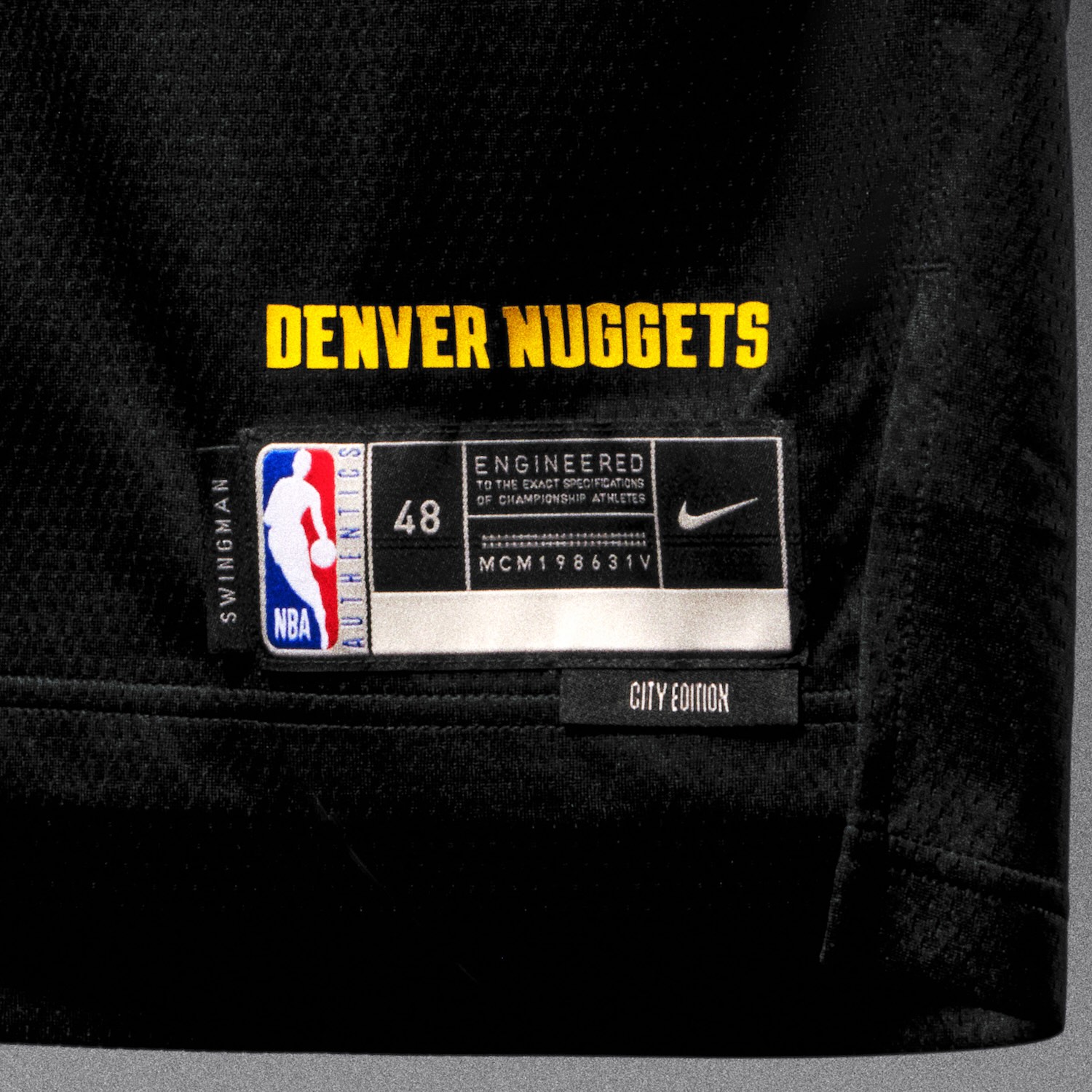
Denver Nuggets
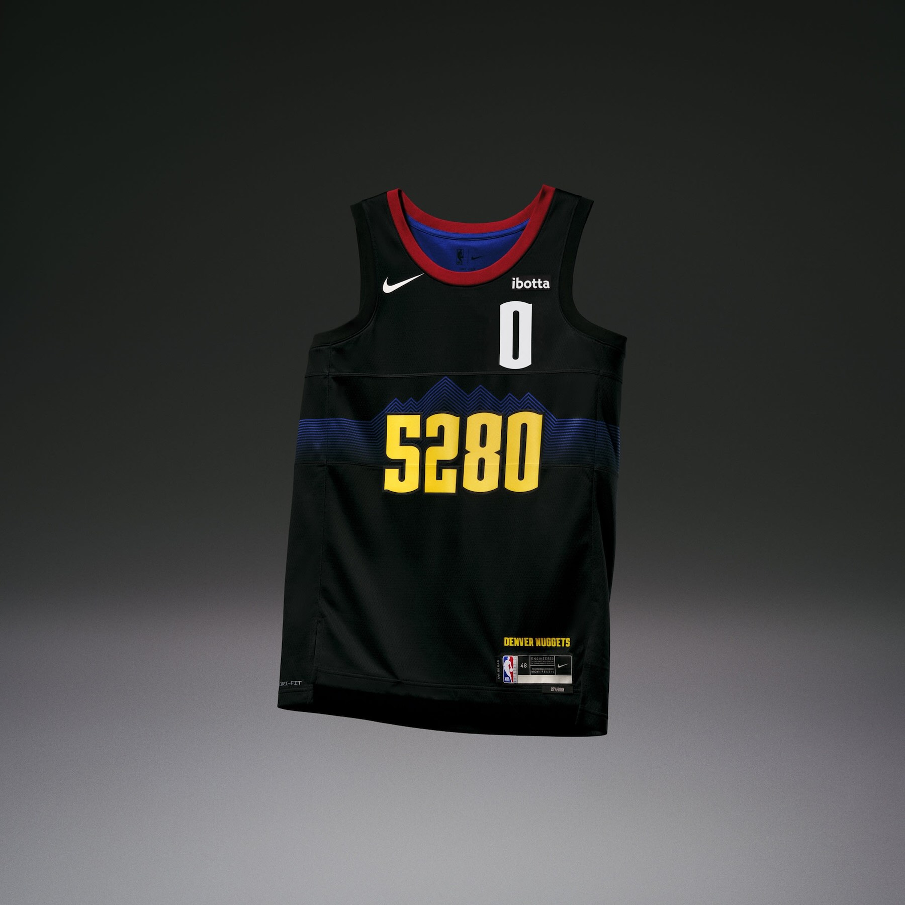
• The Denver Nuggets uniform celebrates the city’s mile-high status with topographical lines that run across the chest and along the side panels, highlighting Denver’s mountainous landscape.
• The “5280” wordmark across the chest marks that mile-high distinction.
• A secondary logo appearing on the shorts features two pickaxes landing directly through a basketball.
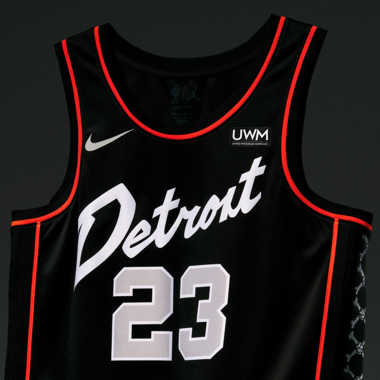
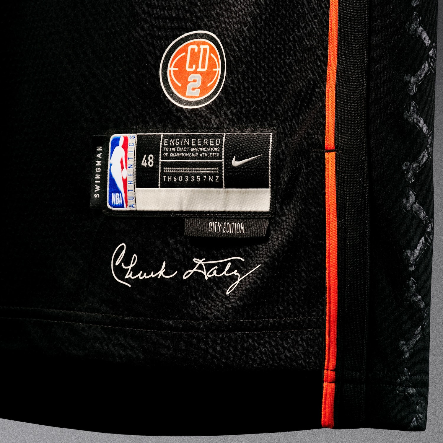
Detroit Pistons
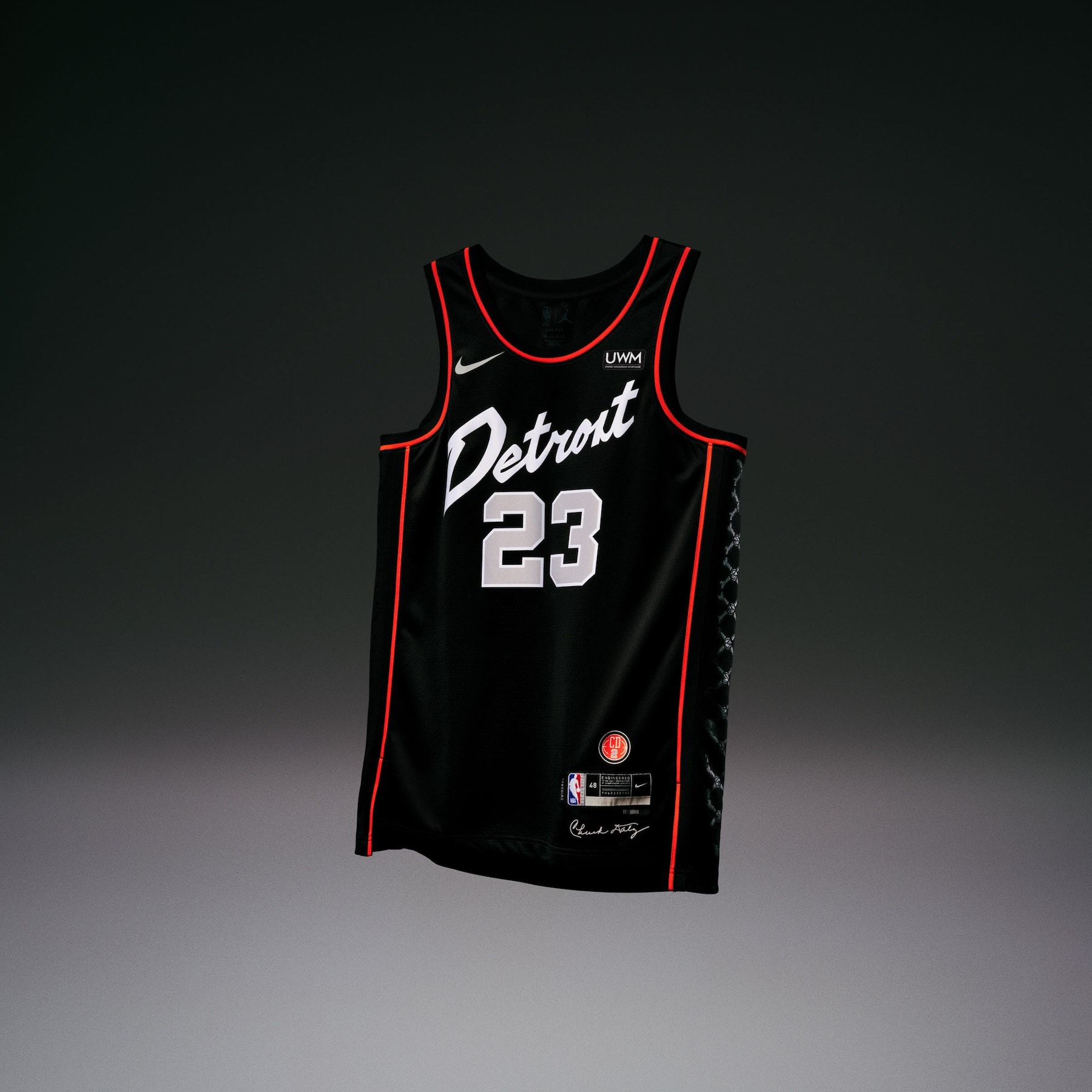
• The Detroit Pistons uniform draws from the team’s championship history, inspired by the memorable “Detroit Bad Boys” fan gear from the early ‘90s.
• Shoutouts to the team are found throughout the uniform, such as in the crossbones pattern down the side panel, the classic script font used for the Detroit wordmark and the ‘90s- inspired number set.
• A CD2 logo on the jocktag honors Hall of Fame coach Chuck Daly, who led the Pistons to five straight Eastern Conference Finals, three straight NBA Finals and back-to-back NBA titles.
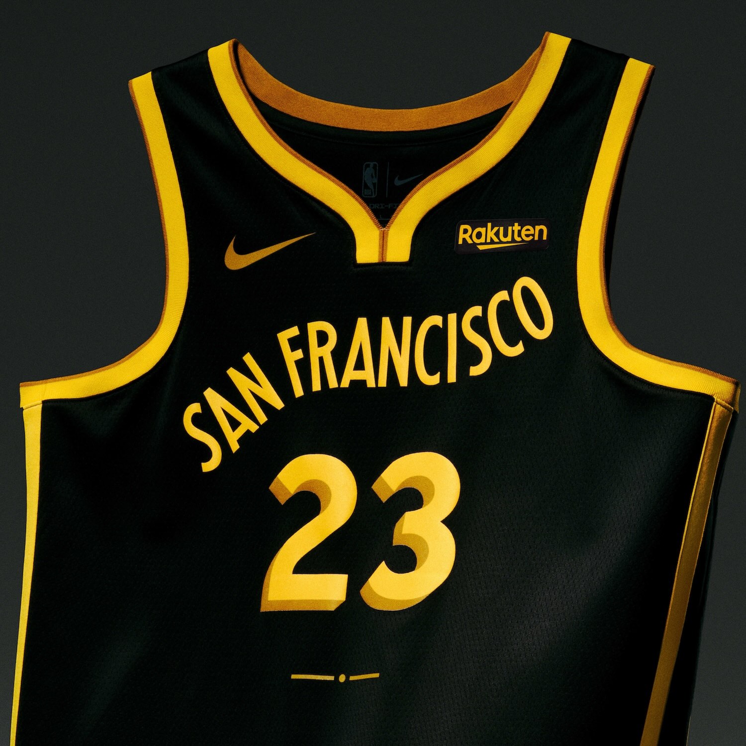
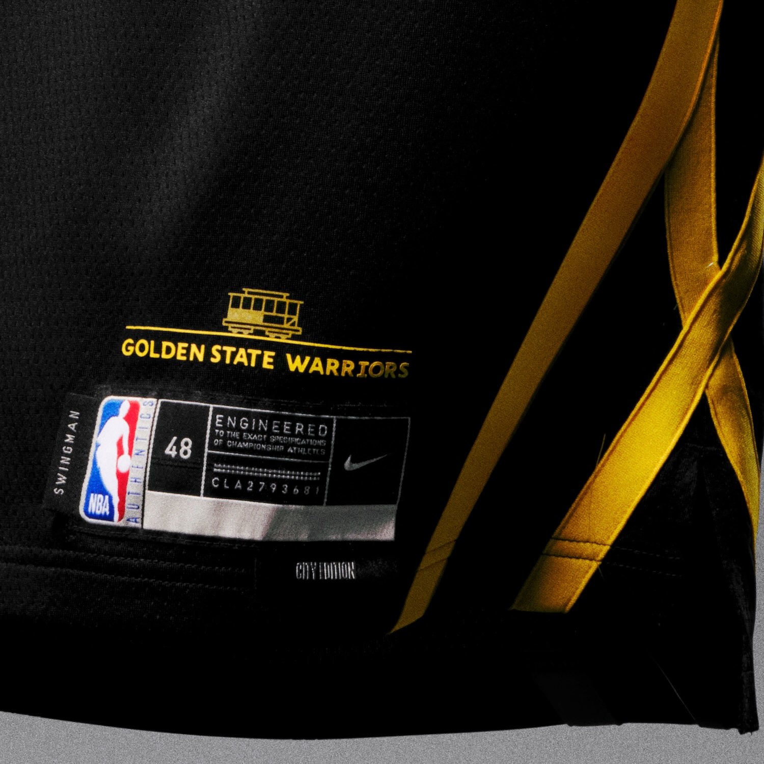
Golden State Warriors
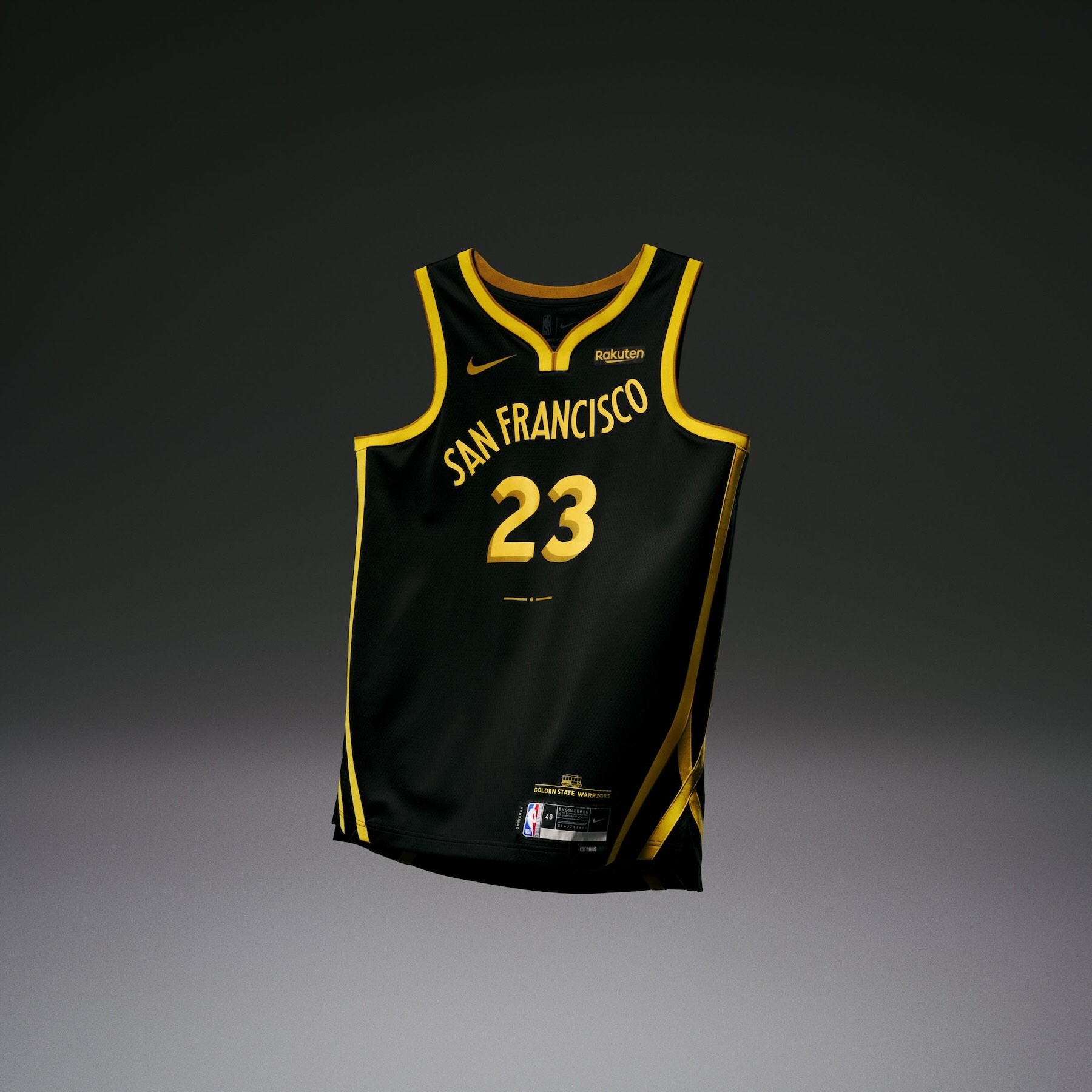
• The Golden State Warriors uniform is inspired but the city of San Francisco and their iconic cable cars. The San Francisco wordmark climbs uphill, just like the cable cars that connect the people to their city.
• The gold trim along the side panel and bottom of the shorts is designed to mimic tracks. The short waistband features detailing that’s emblematic of a steel cable, with multiple lines also serving as a reminder that there’s strength in numbers.
• The GSW seal logo on the shorts was stylistically designed for the era in which cable cars were created.
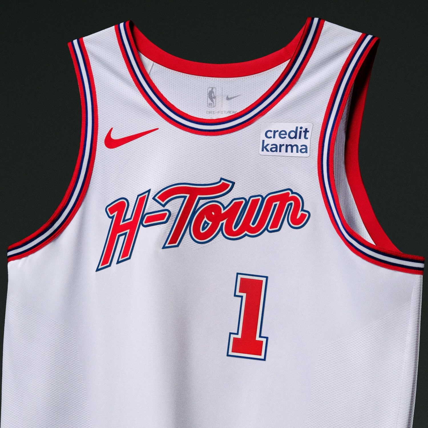
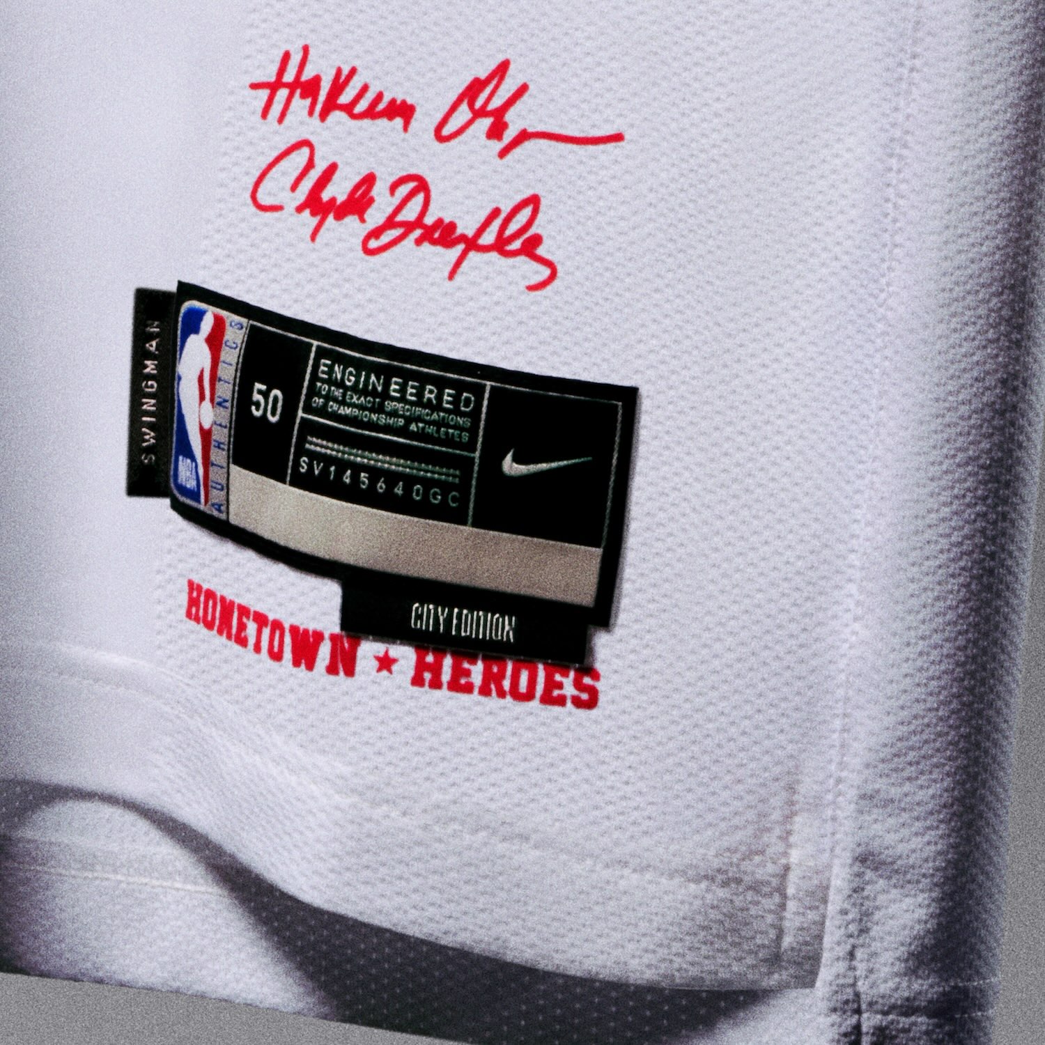
Houston Rockets
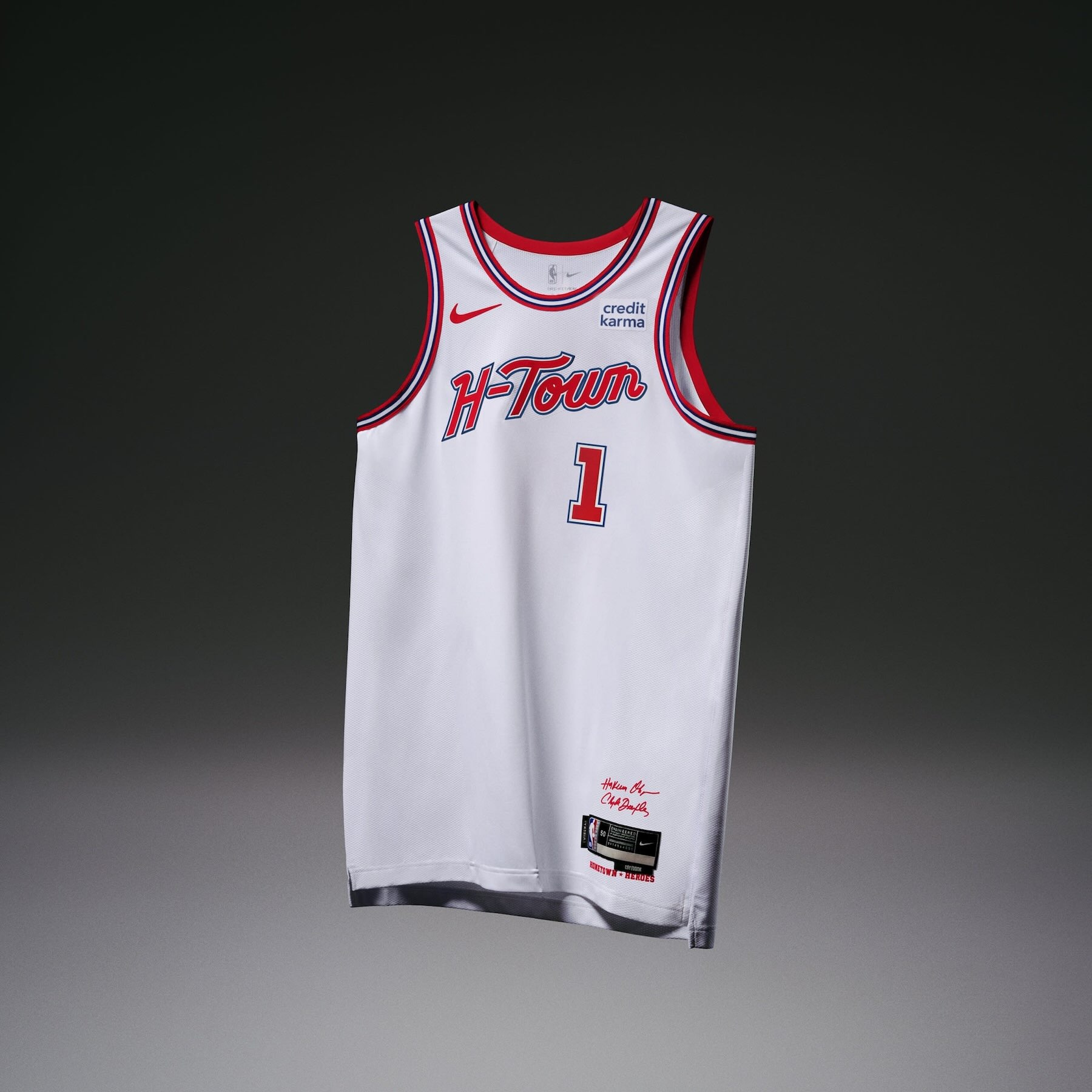
• The Houston Rockets uniform honors the contributions of Hakeem Olajuwon and Clyde Drexler, two of the franchise’s greatest players. The jersey is a fusion of classic elements from the mid-‘90s and modern detailing.
• “Rockets” is displayed vertically on the right-side panel of the shorts, while a Rocket Man going for a dunk sits on the left side.
• Signatures from Drexler and Olajuwon are inscripted on the jocktag.
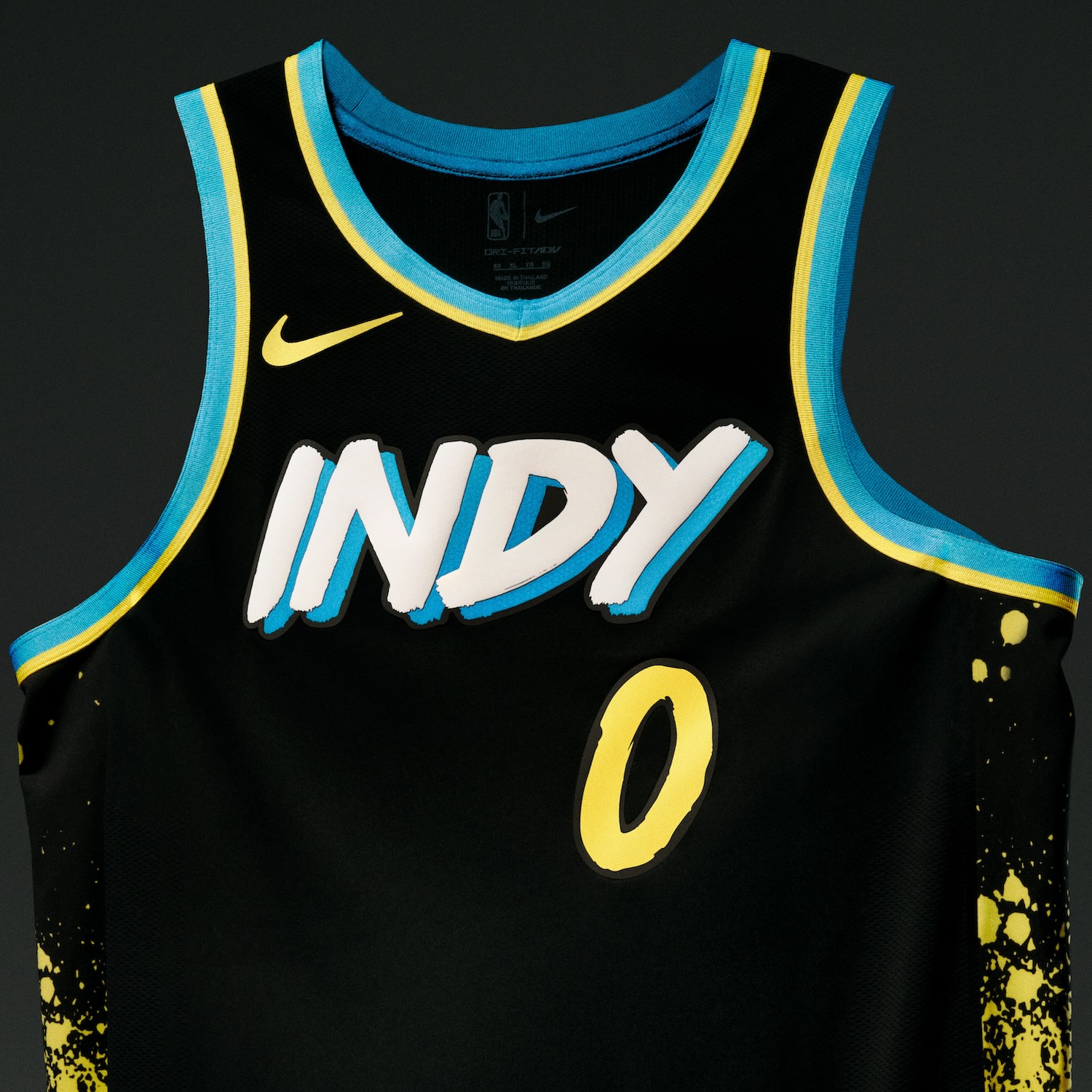
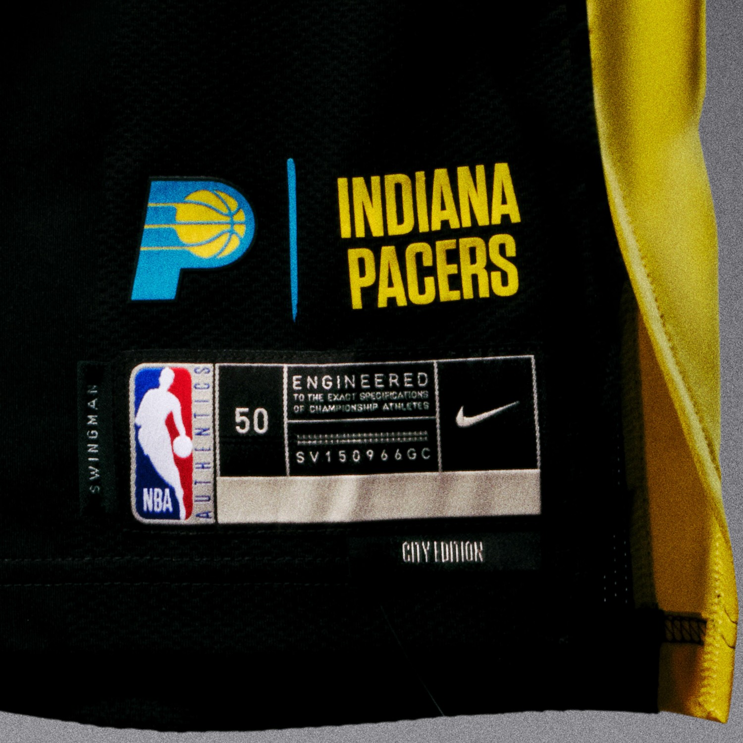
Indiana Pacers
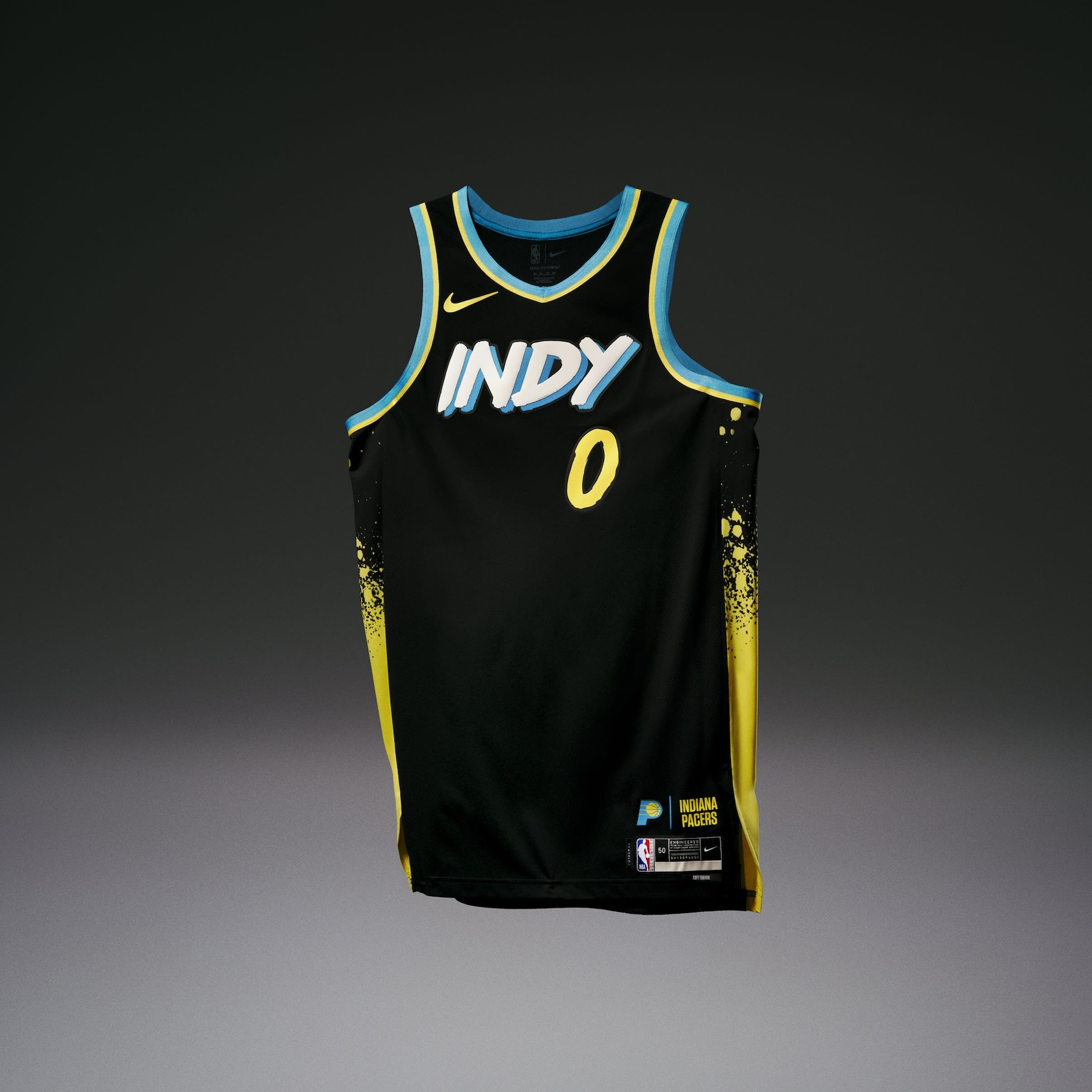
• The Indiana Pacers uniform is inspired by the murals and bright neon signs that adorn the buildings of Indianapolis. Paint splatters on the sides represent the street art unique to different neighborhoods in the city.
• All the fonts across the jersey are hand-lettered to give the appearance of painting with a wide brush.
• An outline of Indiana on the waistband is a nod to the central role the team plays for its fans in the heart of basketball country.
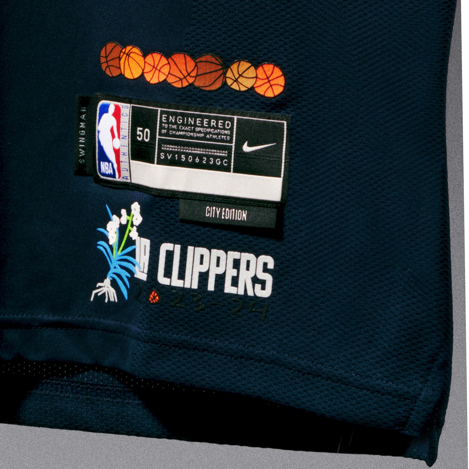
Los Angeles Clippers
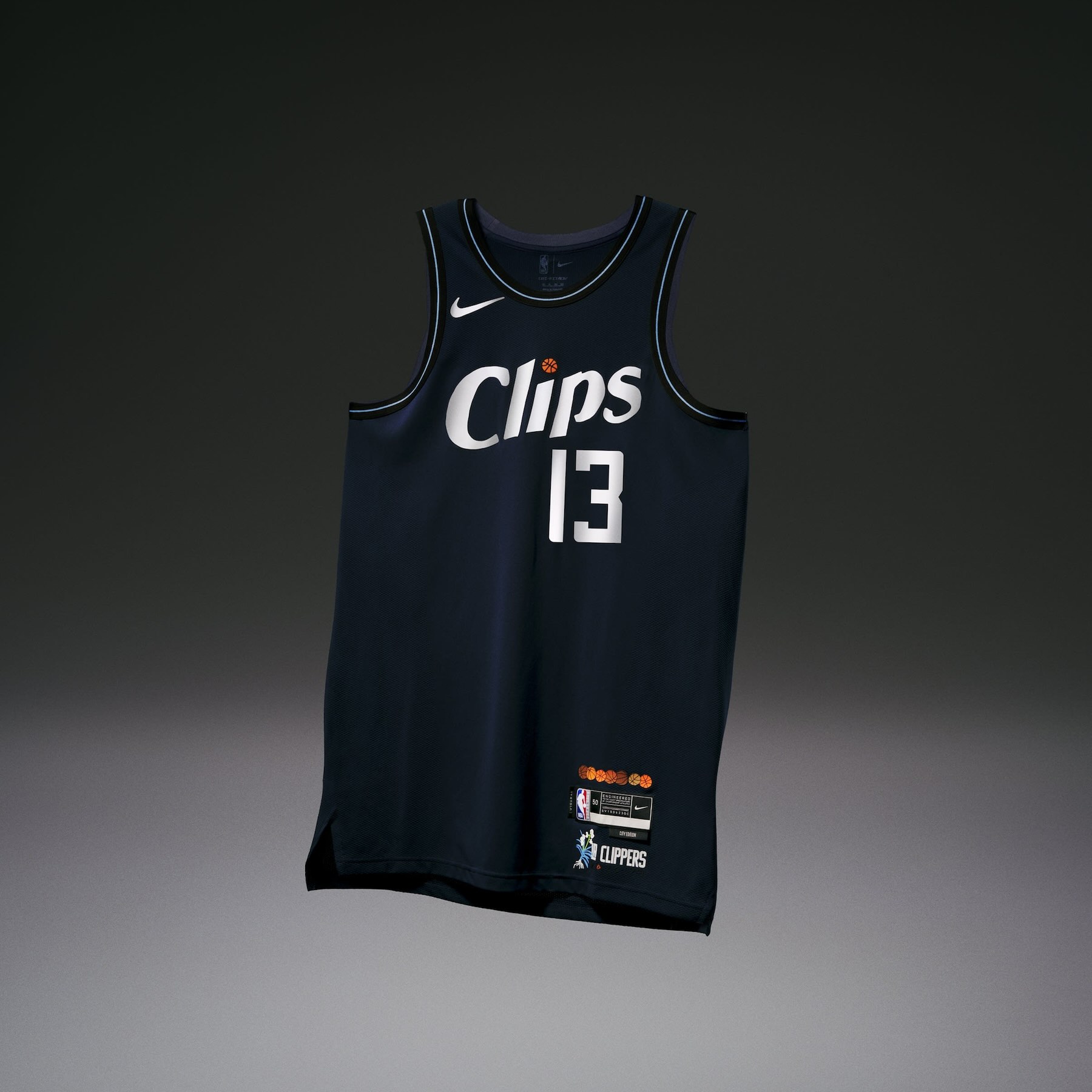
• The Los Angeles Clippers uniform was designed in collaboration with LA-based artist Jonas Wood, who improvised on Clippers uniforms from the ‘80s for a retro, yet modern look.
• The “Clips” wordmark is custom from Jonas, recreating the team’s classic wordmark with its nickname and a signature basketball illustration to dot the “I.”
• On the jocktag are more of Jonas’s signature themes — basketballs and plants — along with “2023-24” and the “LA Clippers” wordmark.

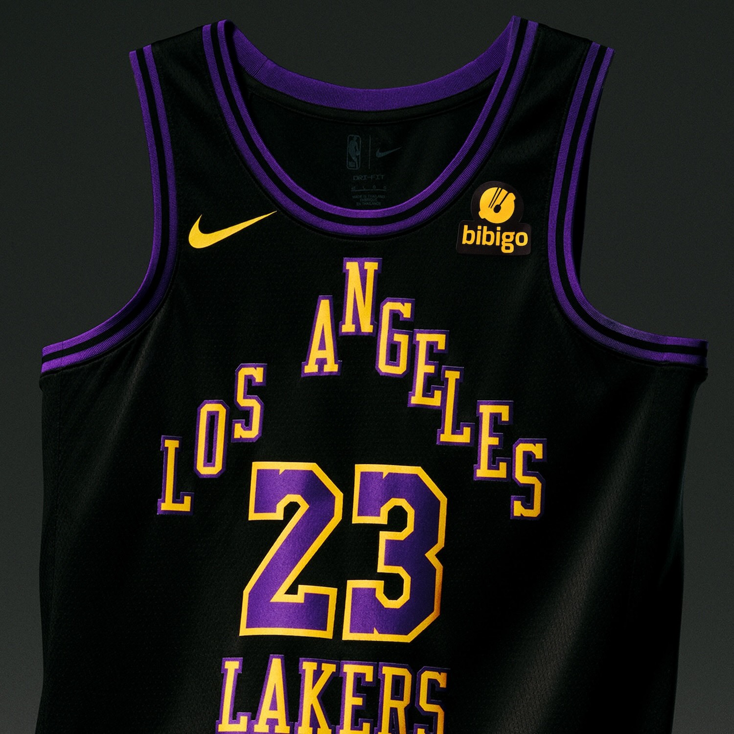
Los Angeles Lakers
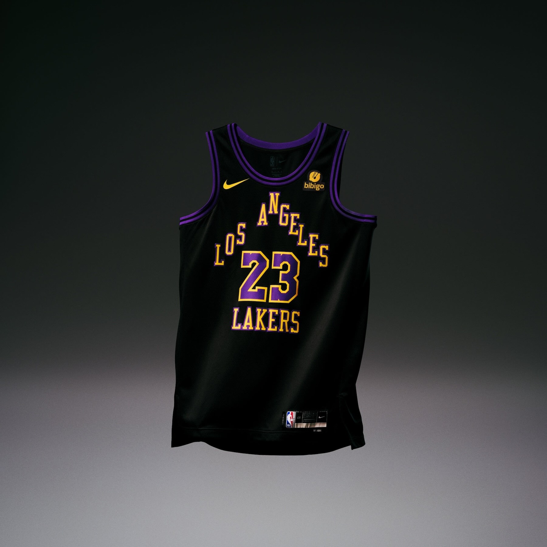
• The Los Angeles Lakers uniform is inspired by the franchise’s perseverance through change. The triangle wordmark is a throwback to those early basketball days in LA after the franchise moved from Minneapolis in the ’60s.
• The font on the number set is a nod to the jerseys worn between 1999 and 2017, highlighting another period of growth for the team.
• The trim goes from purple to black to purple, like the skyline after a California sunset.
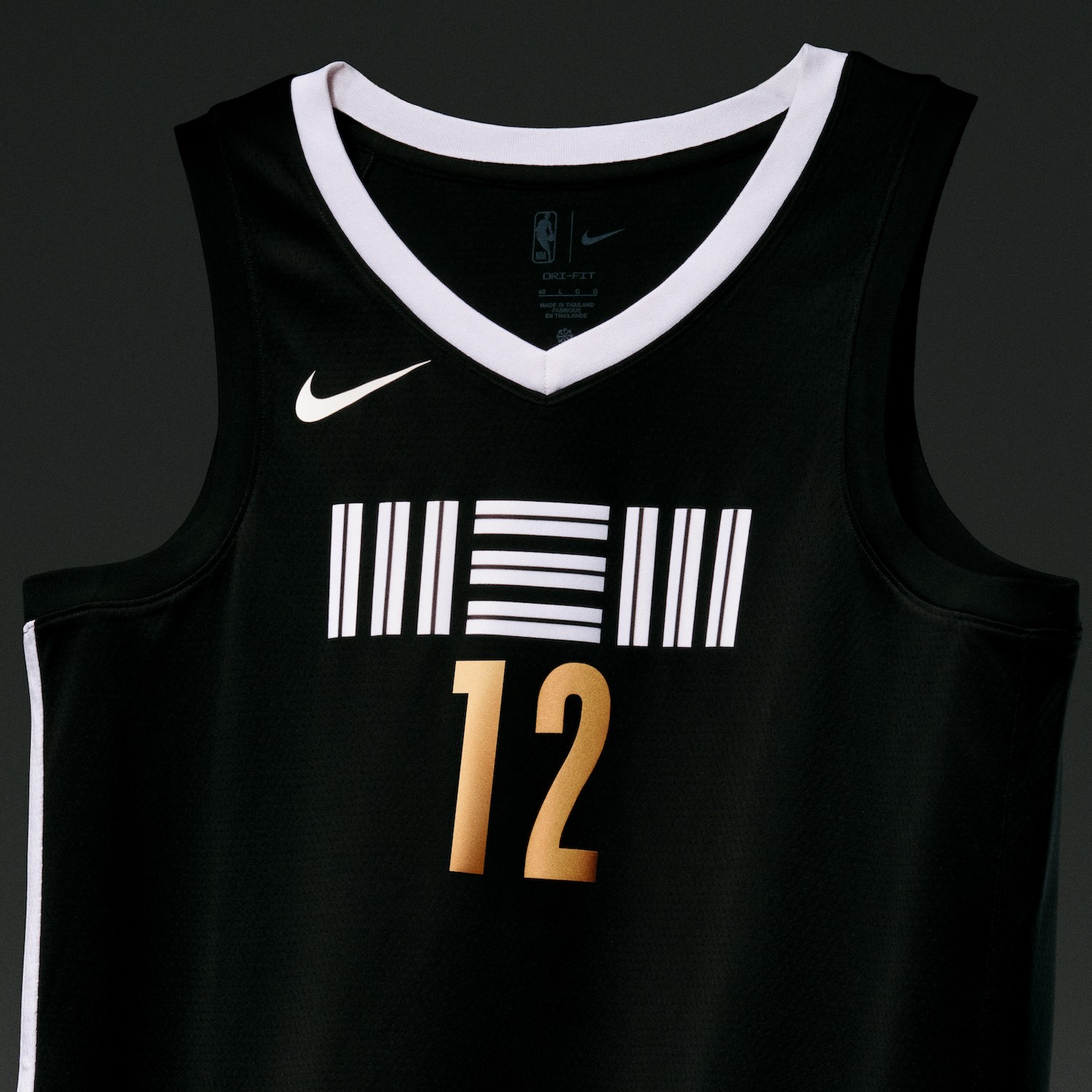
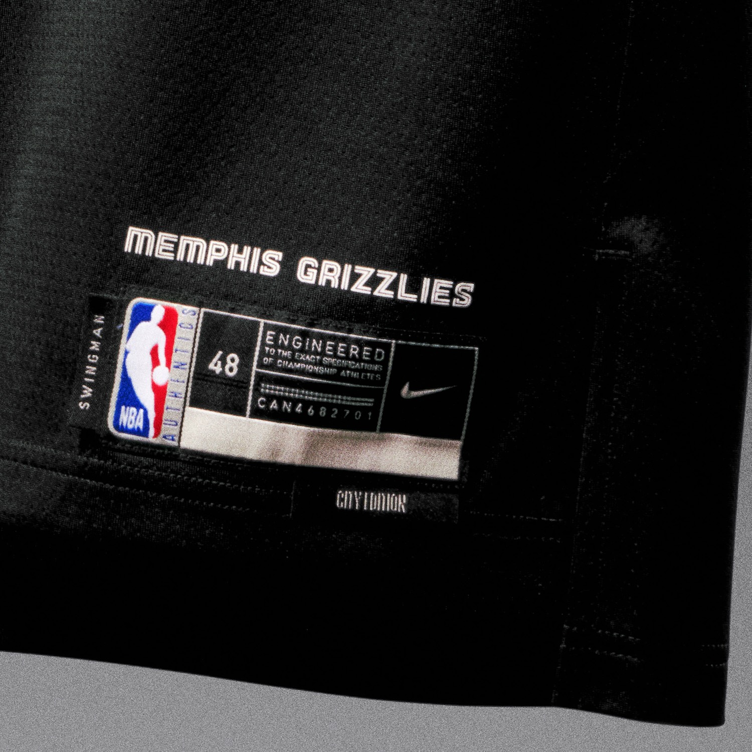
Memphis Grizzlies
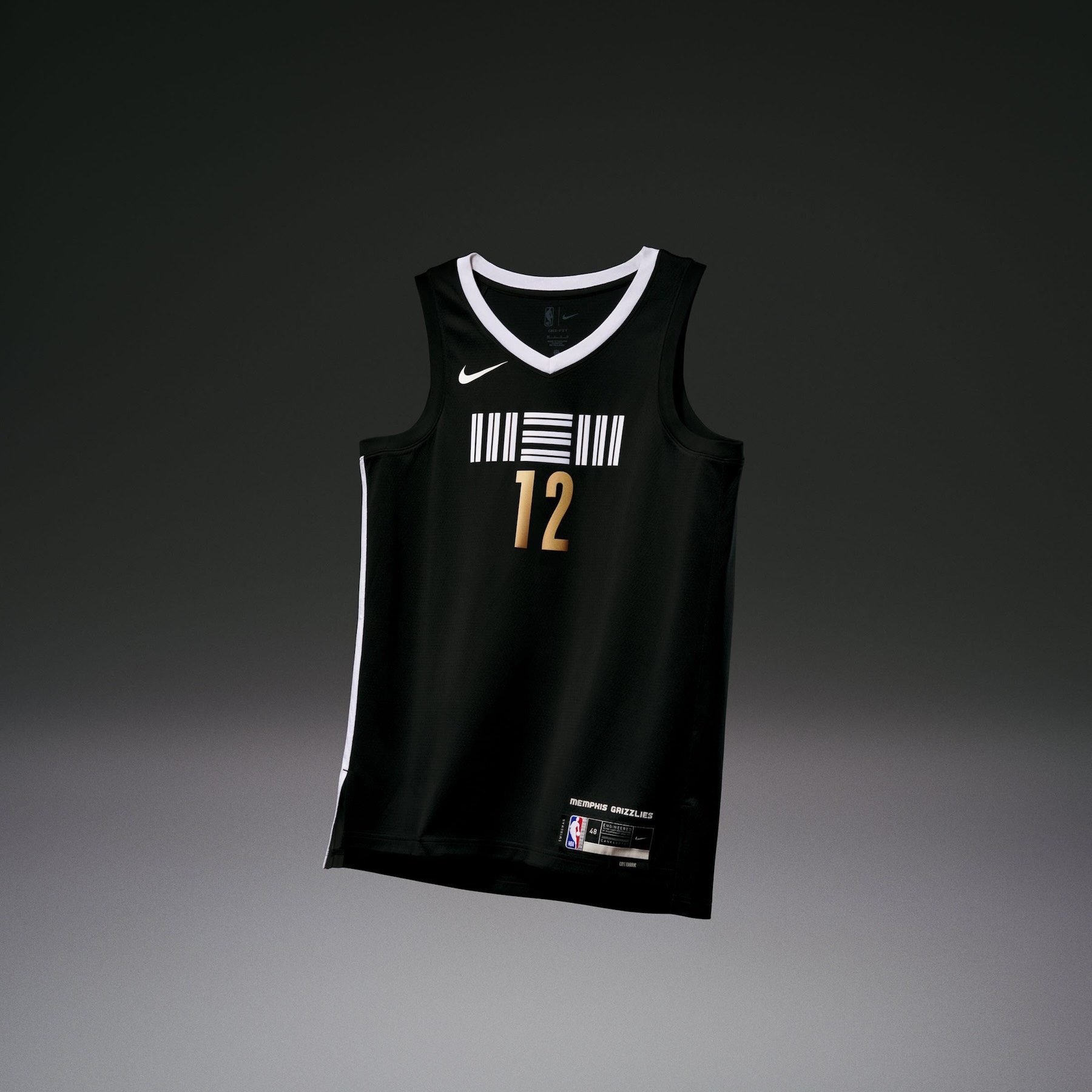
• The Memphis Grizzlies uniform displays the team’s secondary “MEM” logo proudly on the chest. The logo debuted during the 2018-19 season.
• It maintains the team’s asymmetry in the white striping down the side of the uniform, making a connection to not only Memphis’s geography with the Mississippi River anchoring the city on one side, but also the cultural history of the team and its city.
• The bear icon on the left side of the short is a nod back to the franchise’s first seasons in Vancouver.
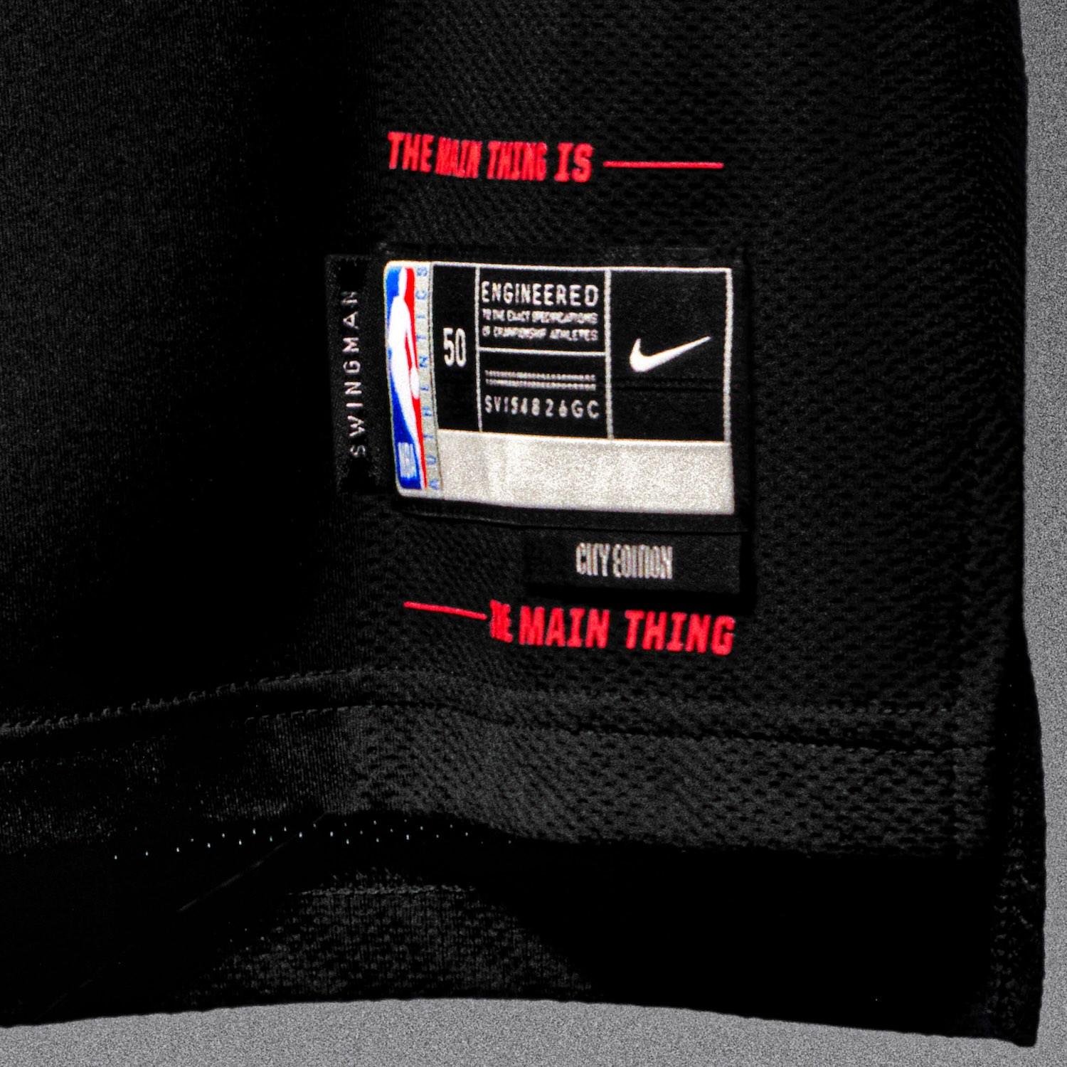
Miami Heat
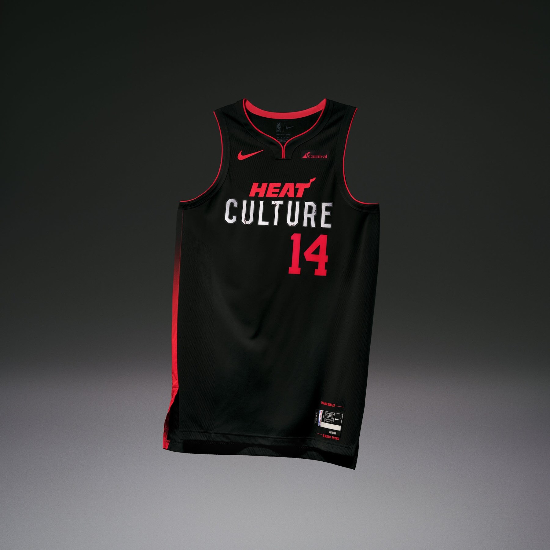
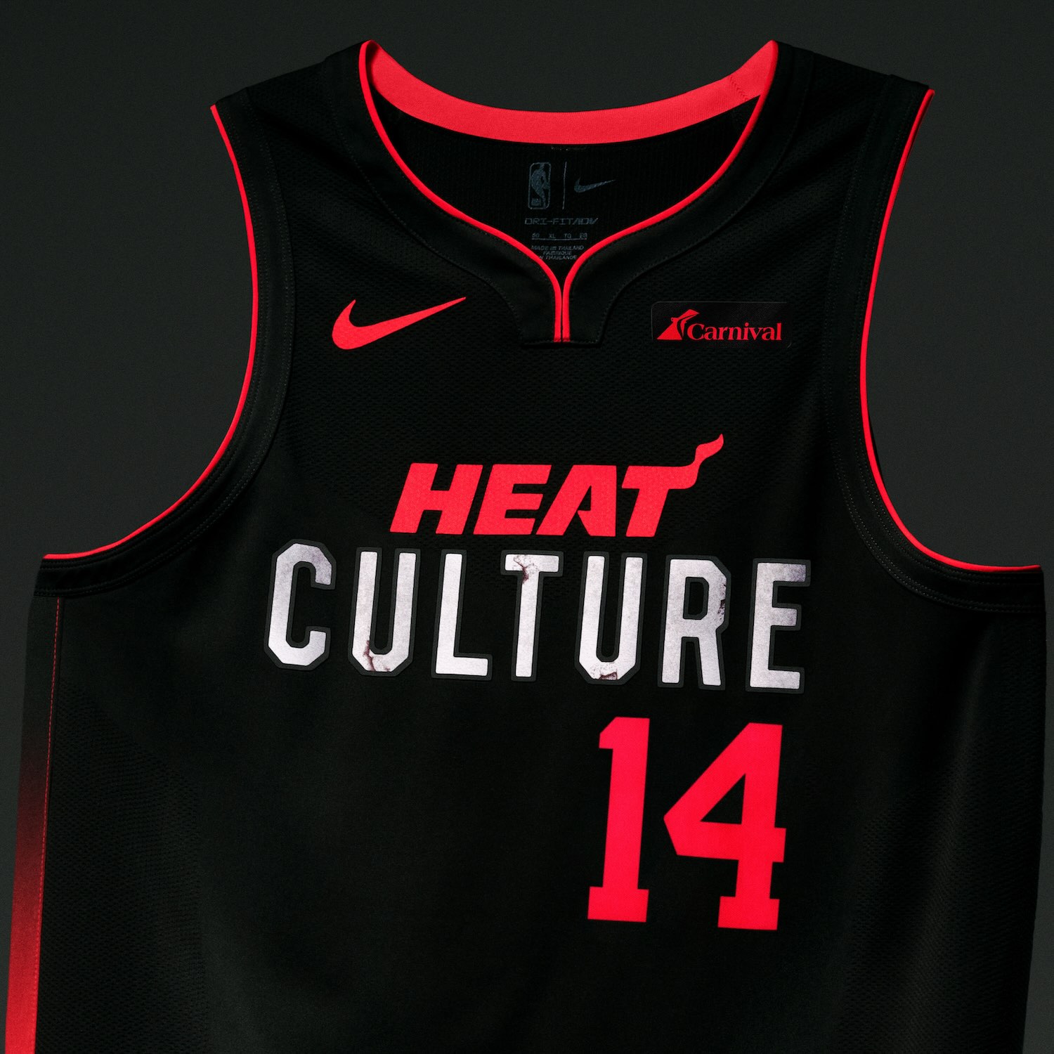
• The Miami Heat uniform proudly states the team’s mantra, “Heat Culture,” on the chest. The phrase is the team’s famed code of excellence that’s made its way into mainstream basketball coverage.
• Another of the Heat’s mantras — to be “the hardest working, best conditioned, most professional, unselfish, toughest, meanest, nastiest team in the NBA” — runs along the side panel.
• The jocktag features Heat President and former Head Coach Pat Riley’s famous quote, that when competing for a championship, you should always ensure that “The Main Thing is the Main Thing.”
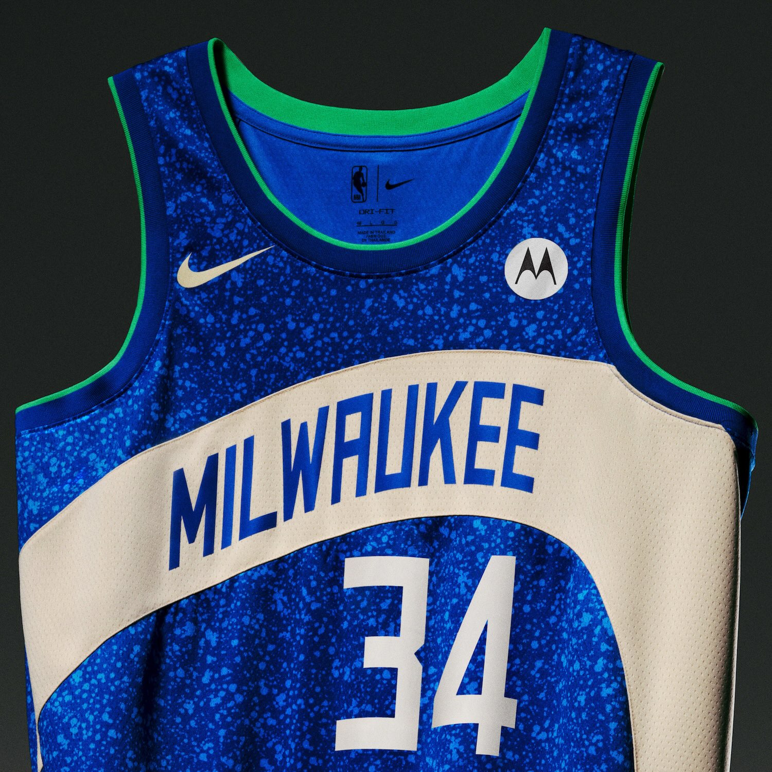
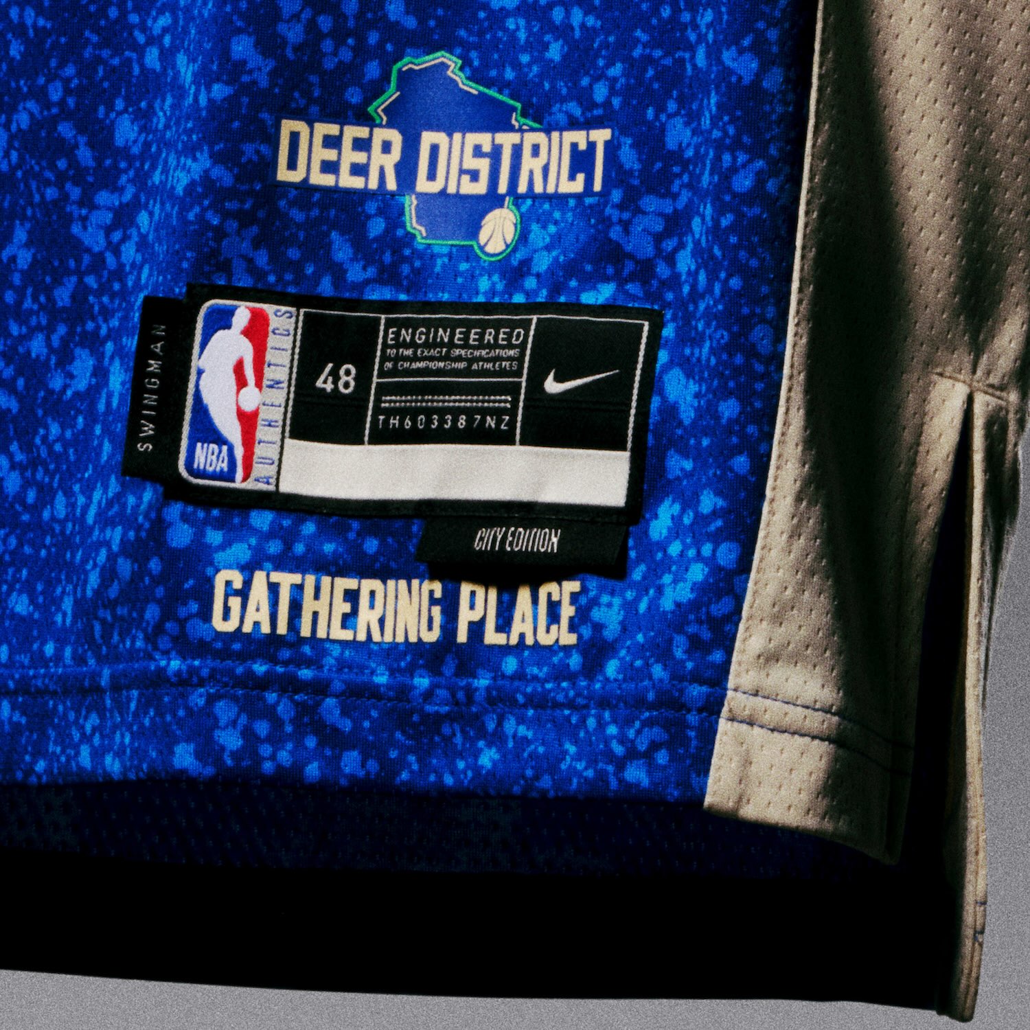
Milwaukee Bucks
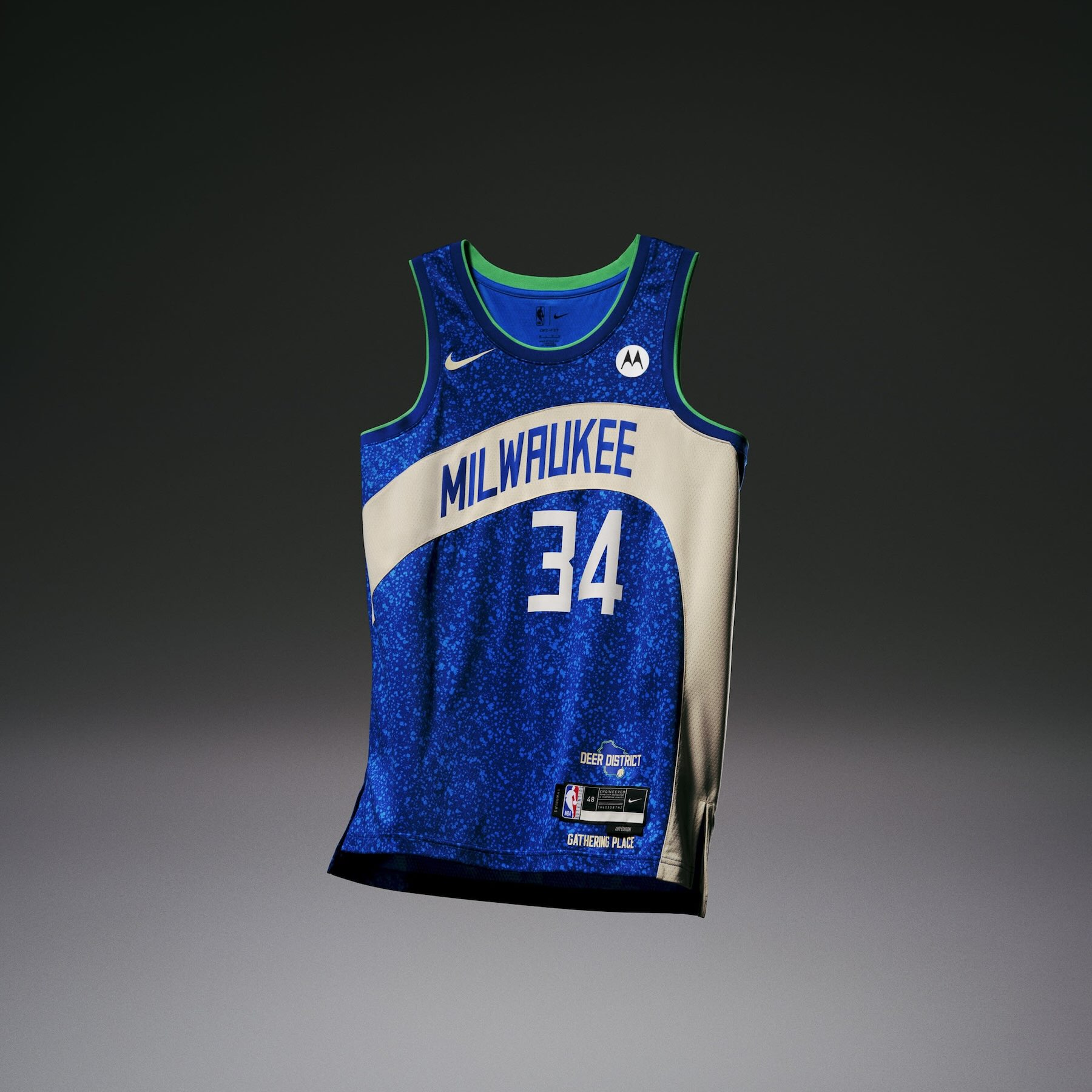
• The Milwaukee Bucks uniform is designed around the concept of bringing people together, where that’s around Lake Michigan or in the Deer District, home to the team’s home arena, Fiserv Forum.
• The uniform’s colorway is reminiscent of the city’s relationship to water. Within the blue, a speckled pattern is inspired by the fans that packed the Deer District during the NBA Finals in 2021, cheering the team on to bring home its first title in 50 years. A swooping, cream-colored wave runs across the chest and down the left side panel, reflecting the architectural shape of Fiserv Forum.
• Touches of green on the shorts and trim represent the LED lighting on the stadium’s façade, which turns neon green whenever the Bucks win. The “M” logo on the belt buckle is also lit up.
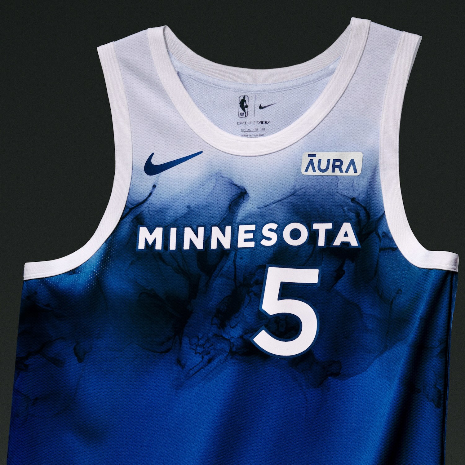
Minnesota Timberwolves
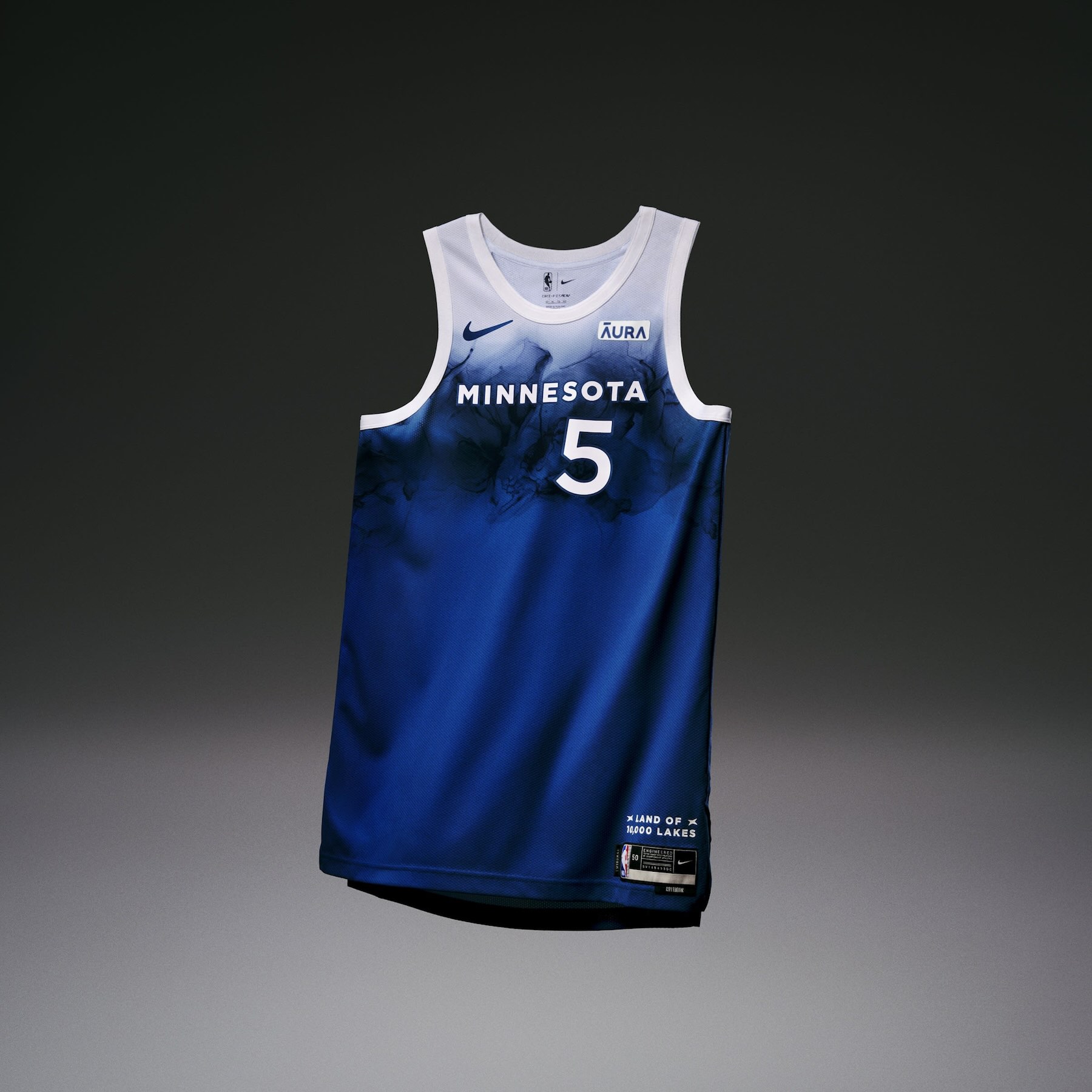
• The Minnesota Timberwolves uniform draws from the colors, texture and beauty of the state’s surrounding waters. The fabric features a custom pattern — handmade in Bloomington, MN — designed to look like an abstract interpretation of water.
• A “Minnesota” wordmark is printed boldly across the chest, while the state logo is displayed on the waistband.
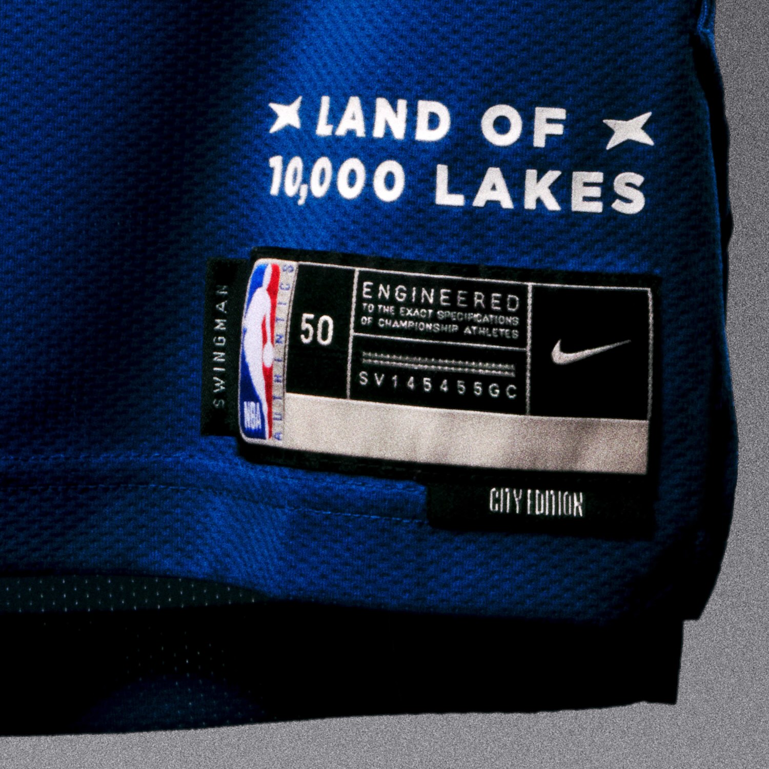
• Text reading “Land of 10,000 Lakes” is printed on both the side taping/along the length of the jersey, the shorts and the jocktag.
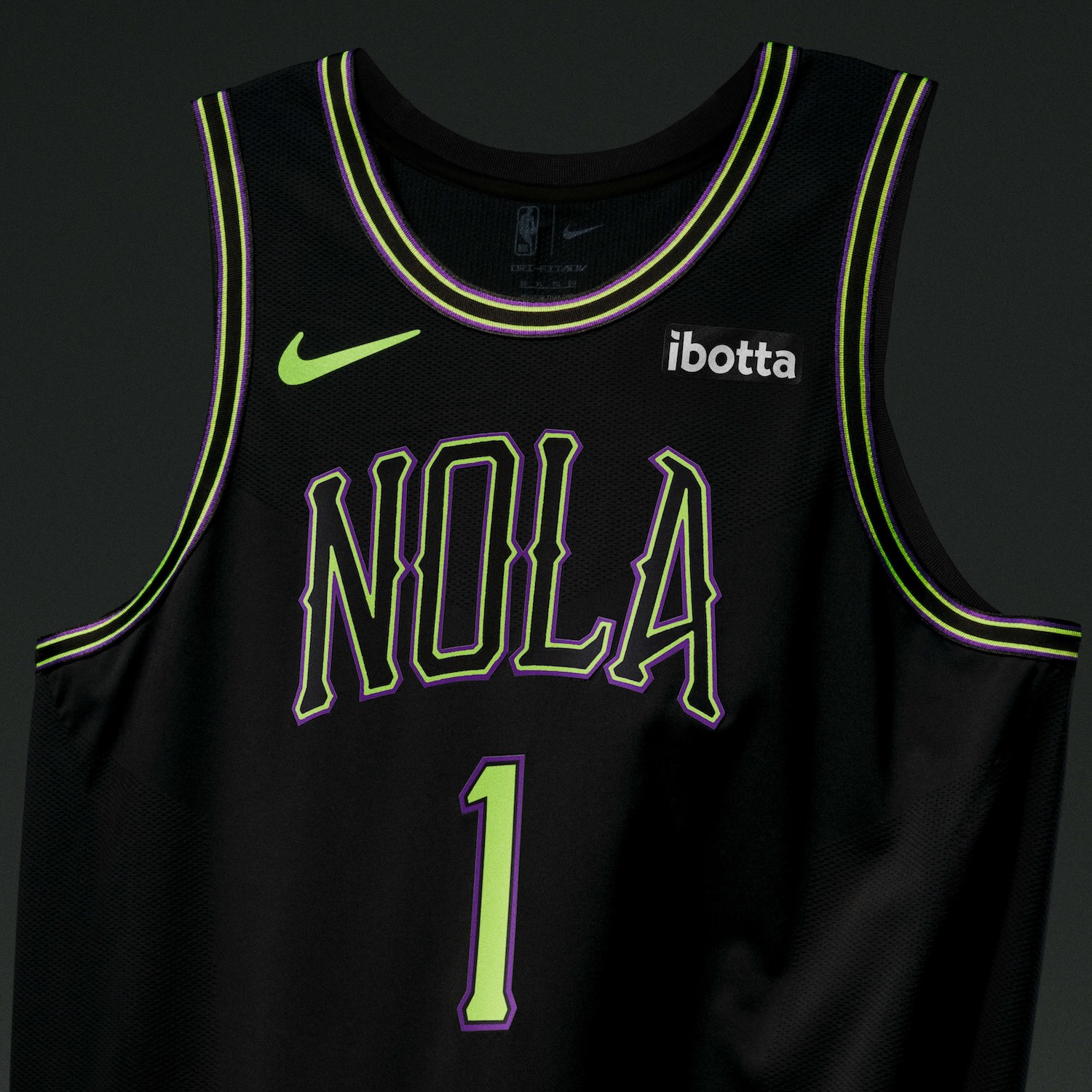
New Orleans Pelicans
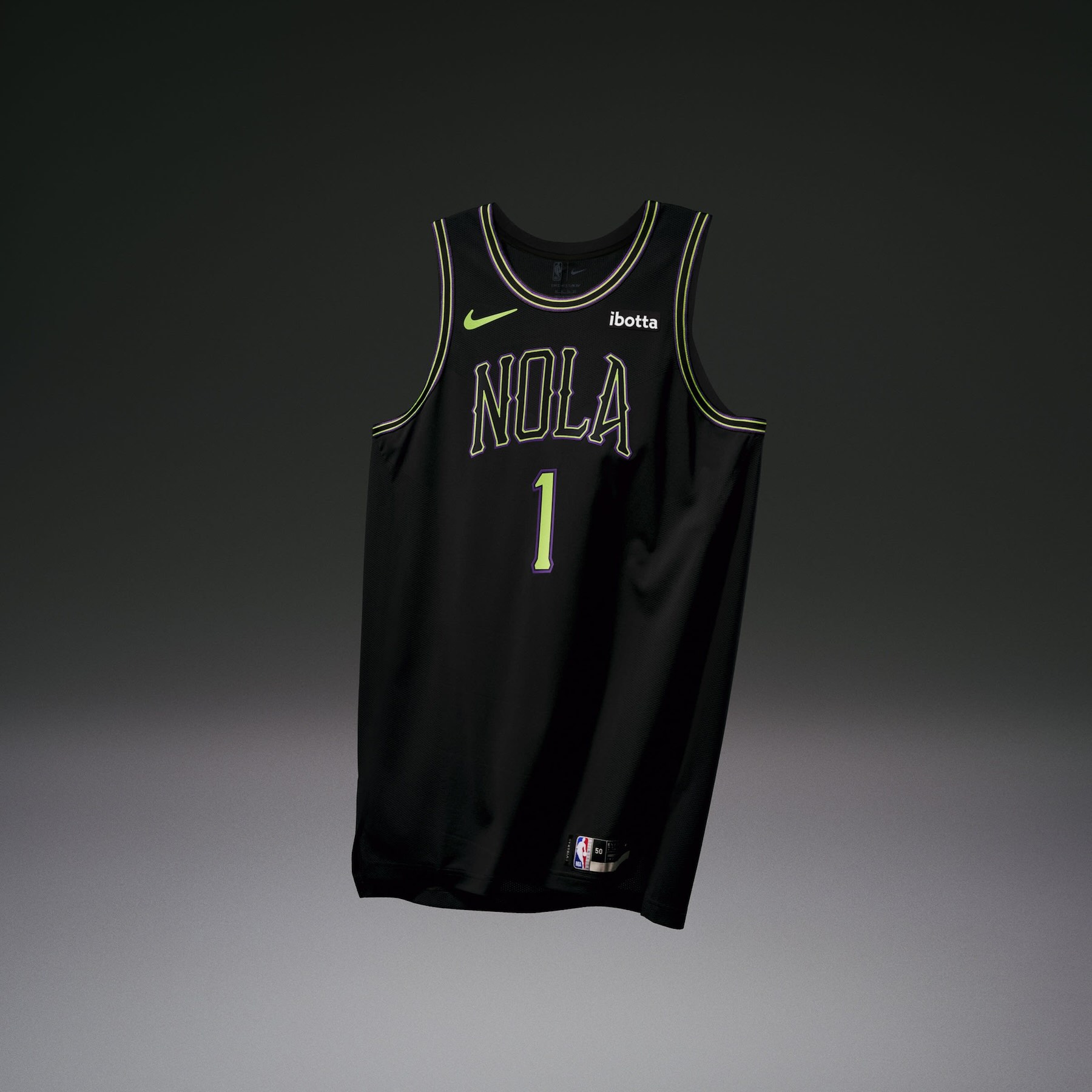
• The New Orleans Pelicans uniform captures the one-of-one spirit of the city through the design’s deep purple and green accent colors, conjuring up images of NOLA’s nightlife.
• The fonts used on the uniform’s wordmarks and number sets represent the stylistic typography found throughout the city, combined with the Pels’ more traditional block letter treatment.
• Both the Pelican logo on the shorts and the partial Crescent City Basketball logo on the waistband have been recreated to look like skeletons.
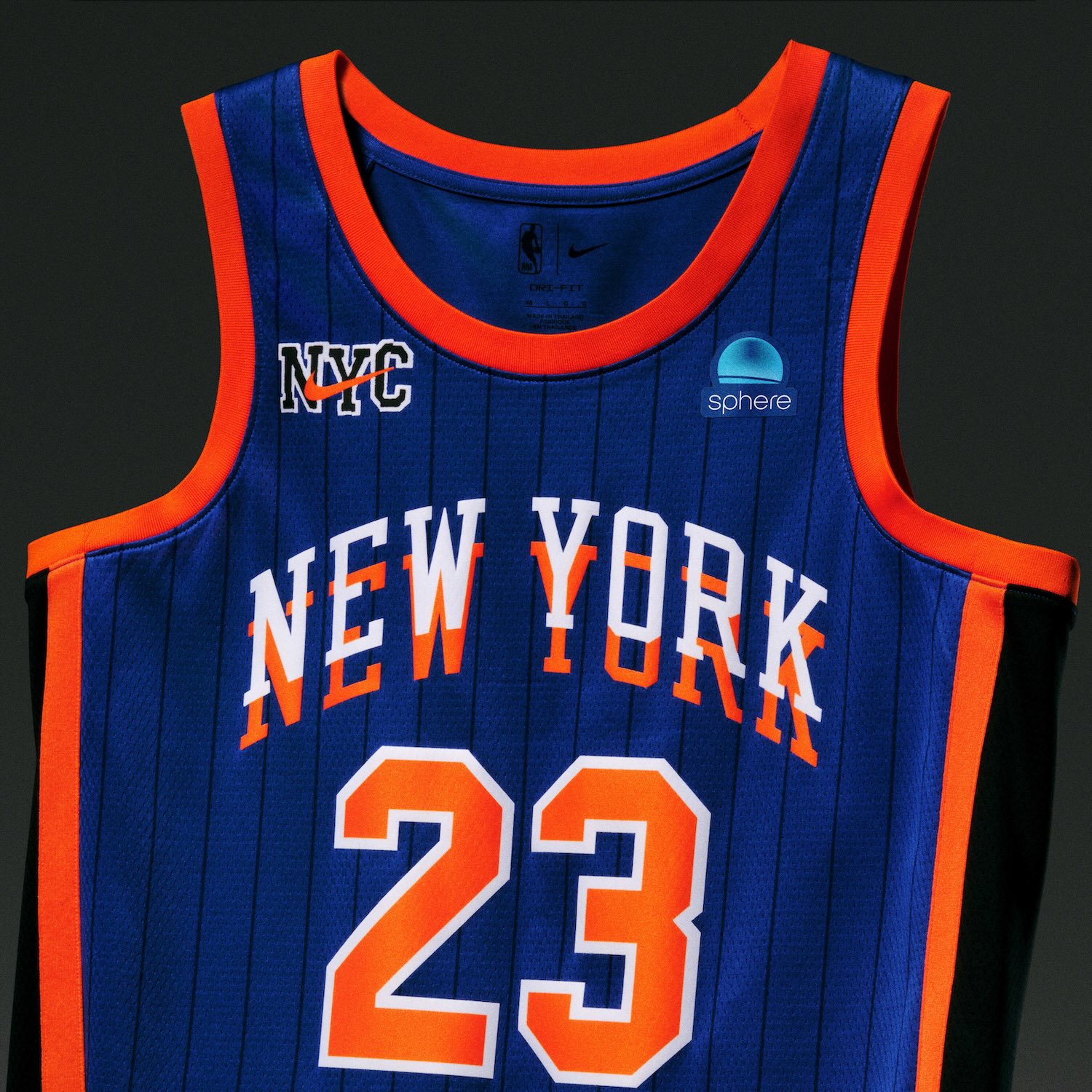
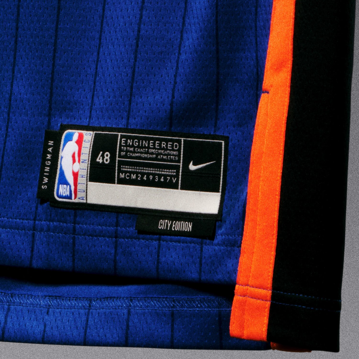
New York Knicks
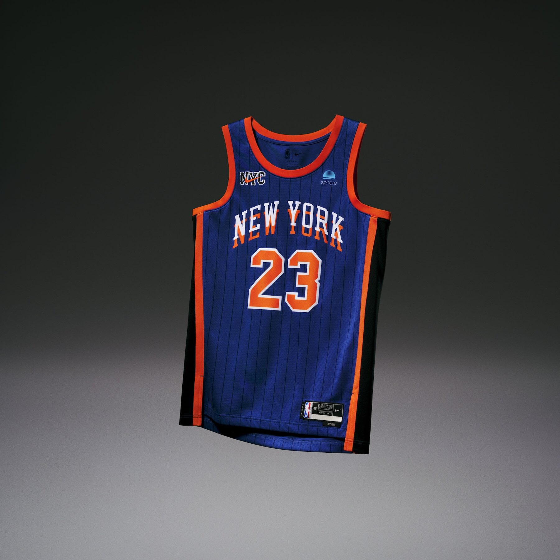
• The New York Knicks uniform is a collaboration between Nike and lifestyle brand Kith to celebrate the late ‘90s and early 2000s eras of the team.
• The design highlights the change from color blocking to the first time the Knicks sported pinstripes on the court.
• The New York City phrase, “The city so nice, they named it twice” is reflected by the team name’s doubled layering on the uniform top. The NYC Nike logo sits on the chest and waistband.
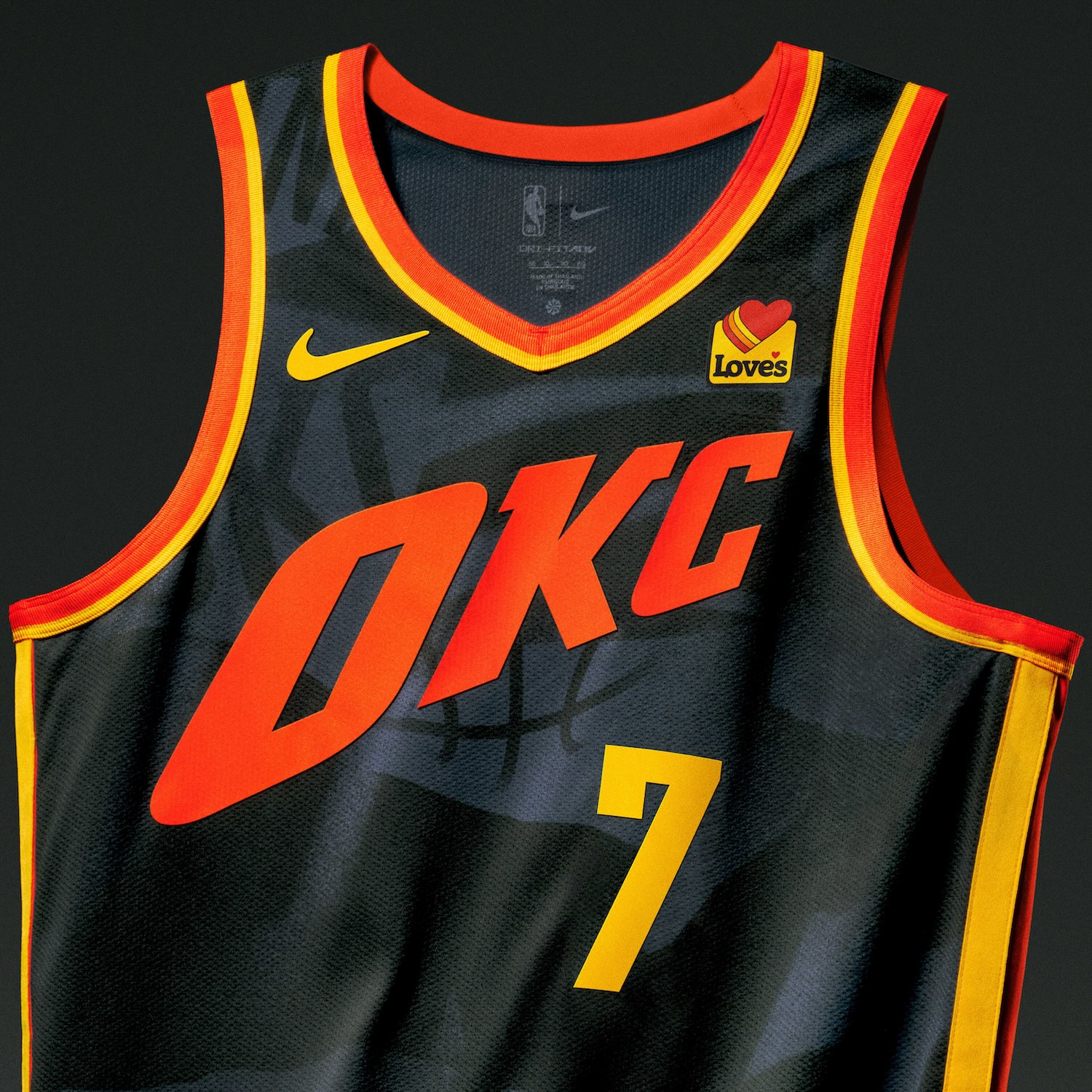
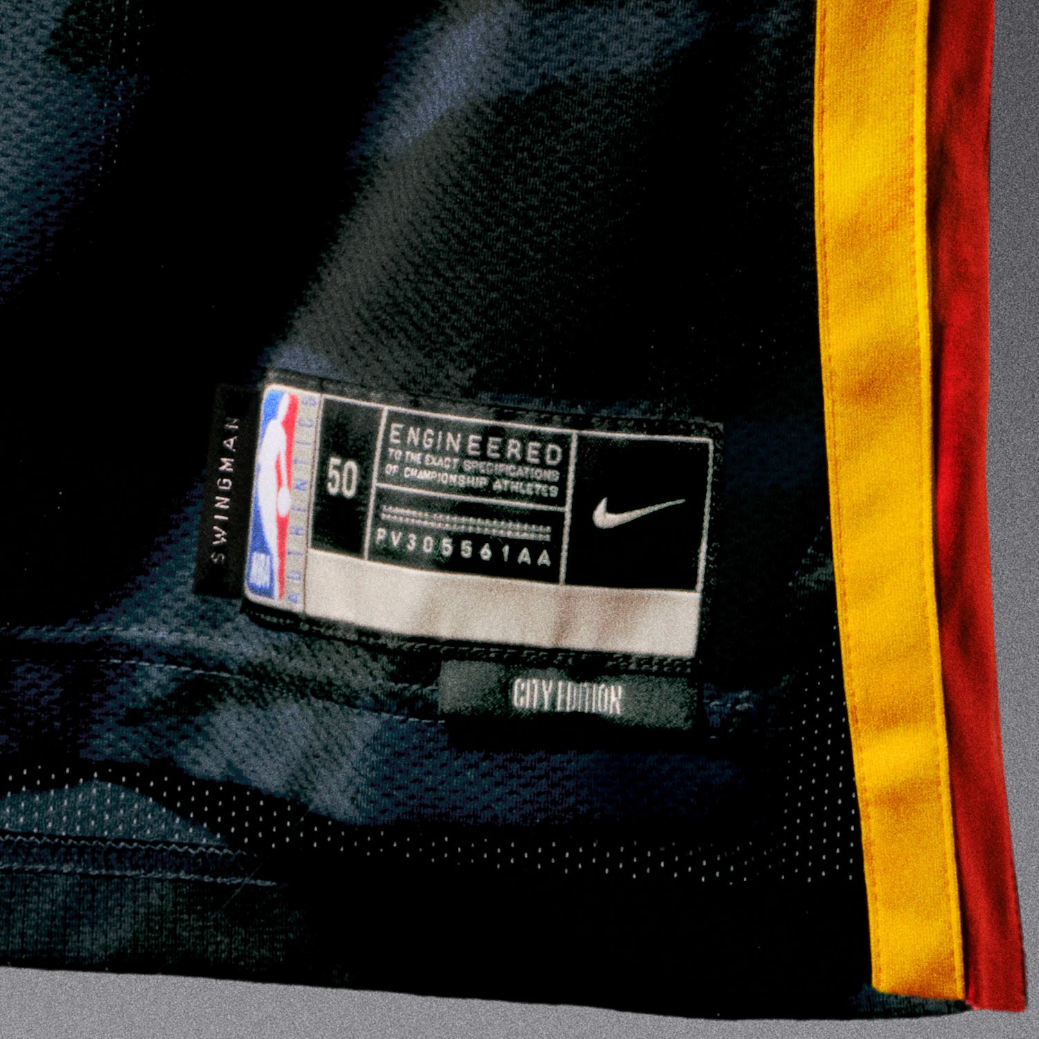
Oklahoma City Thunder
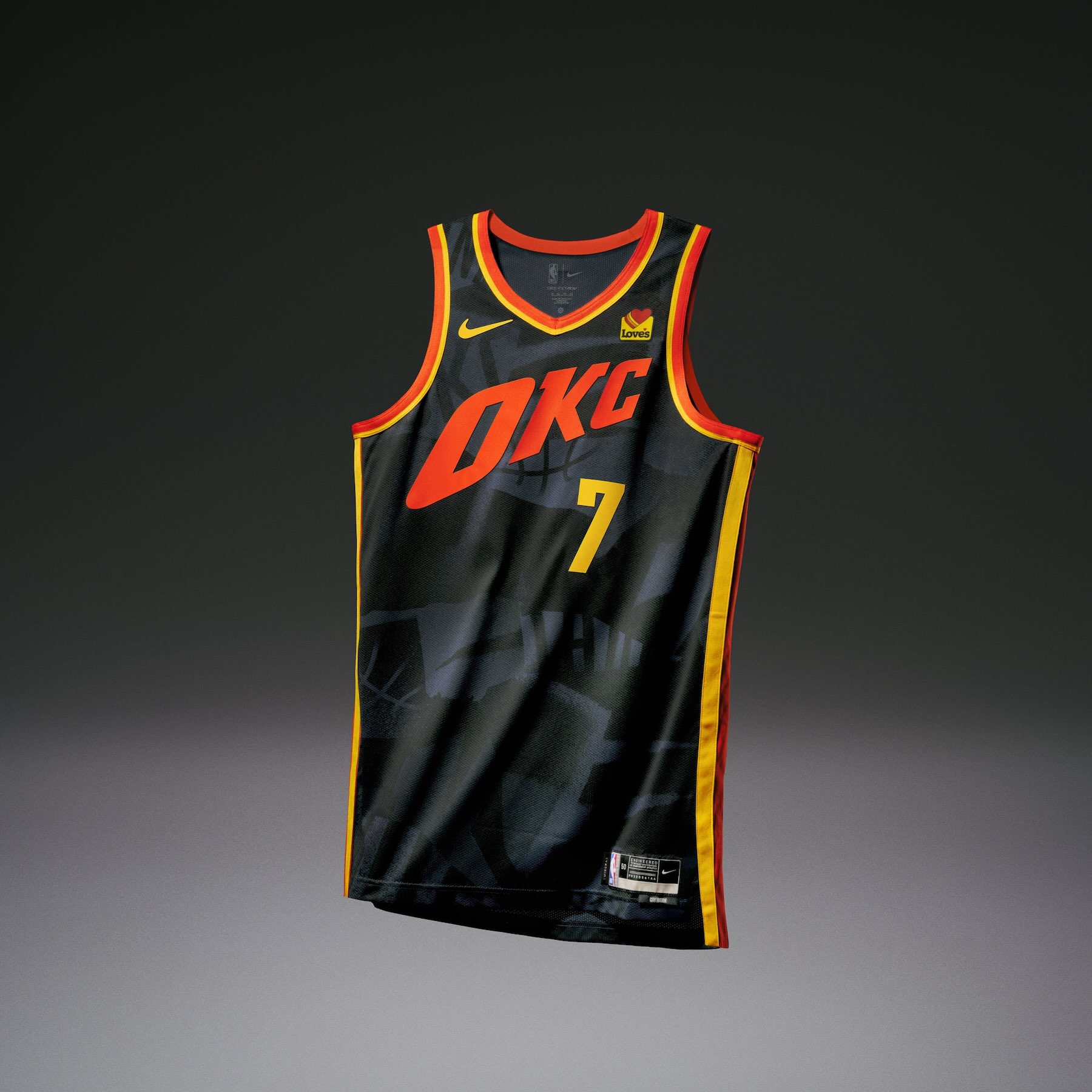
• The Oklahoma City Thunder uniform celebrates OKC’s community art, which serves as a local centerpiece of creative expression. The base of the jersey and the shorts feature a custom, abstract pattern, consisting of various elements of past Thunder logos and wordmarks.
• Pops of sunset orange and yellow throughout the OKC wordmark, number set, logos and trims reflect the beauty of the state’s landscape.
• The state of Oklahoma is centered on the belt buckle, while a “Thunder Up” anthem appears on the jocktag.
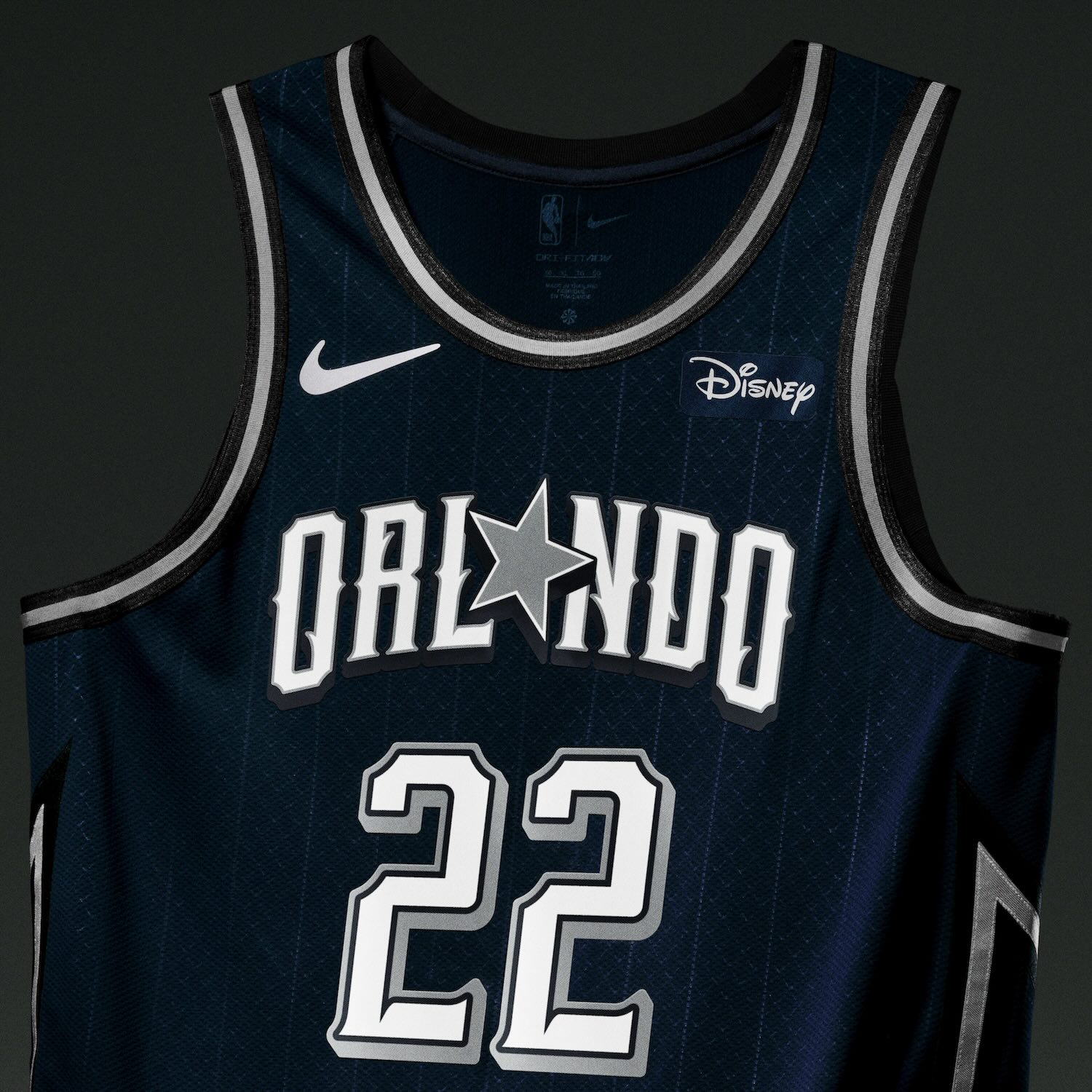
Orlando Magic
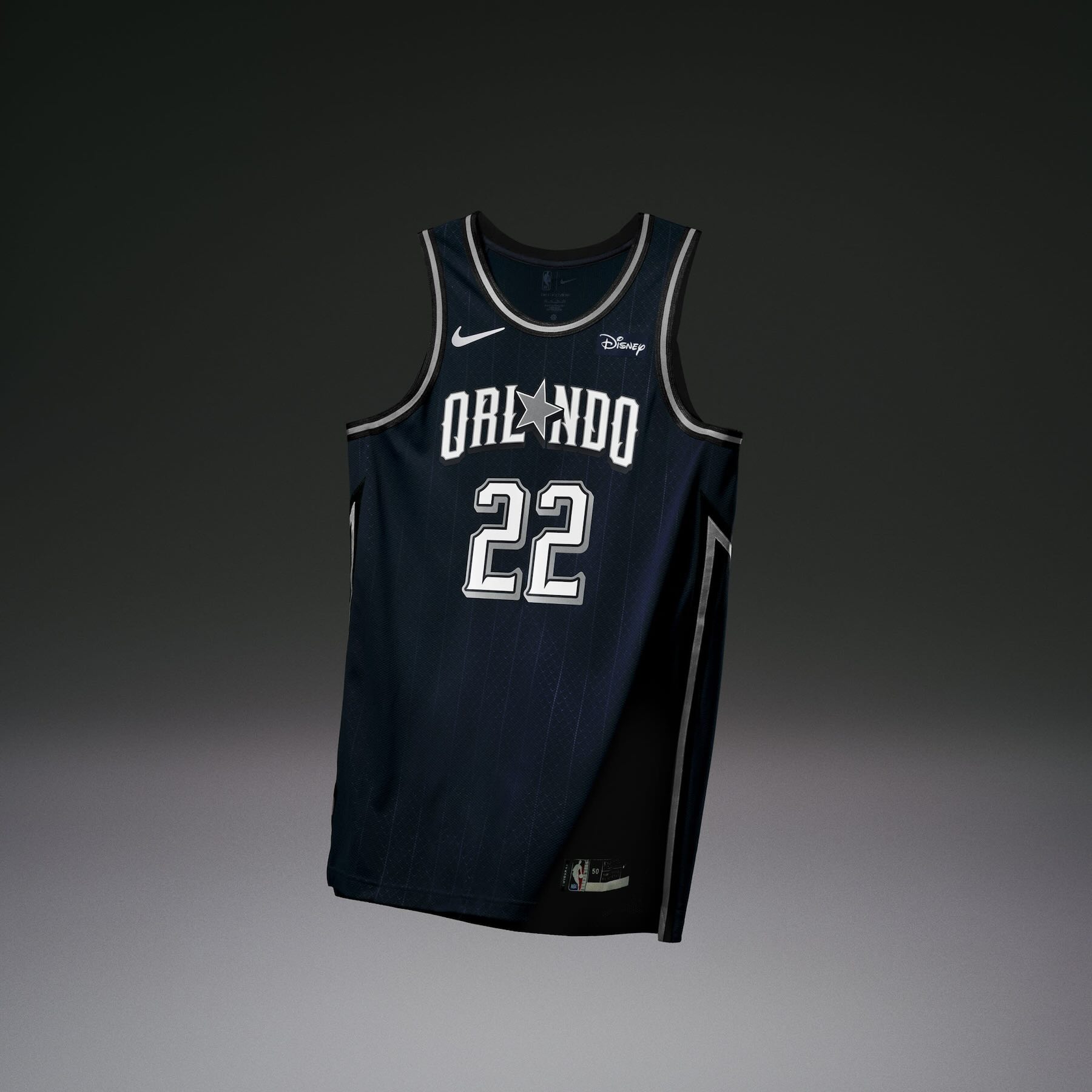
• The Orlando Magic uniform is designed to look like a suit of armor as the team hits the hardwood to battle the world’s best basketball players for the coveted “W”. The navy uniform has a subtle chain link pattern throughout and incorporates silver and metallic hints.
• The team incorporated the franchise’s iconic retro star in place of the “A” to celebrate the Magic’s 35th anniversary season.
• Designers also deconstructed the Magic’s classic comet logo, displaying its energy bolt down the side panel with its stars resting at the bottom.
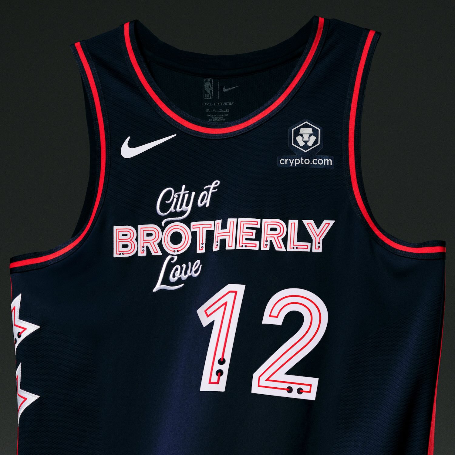
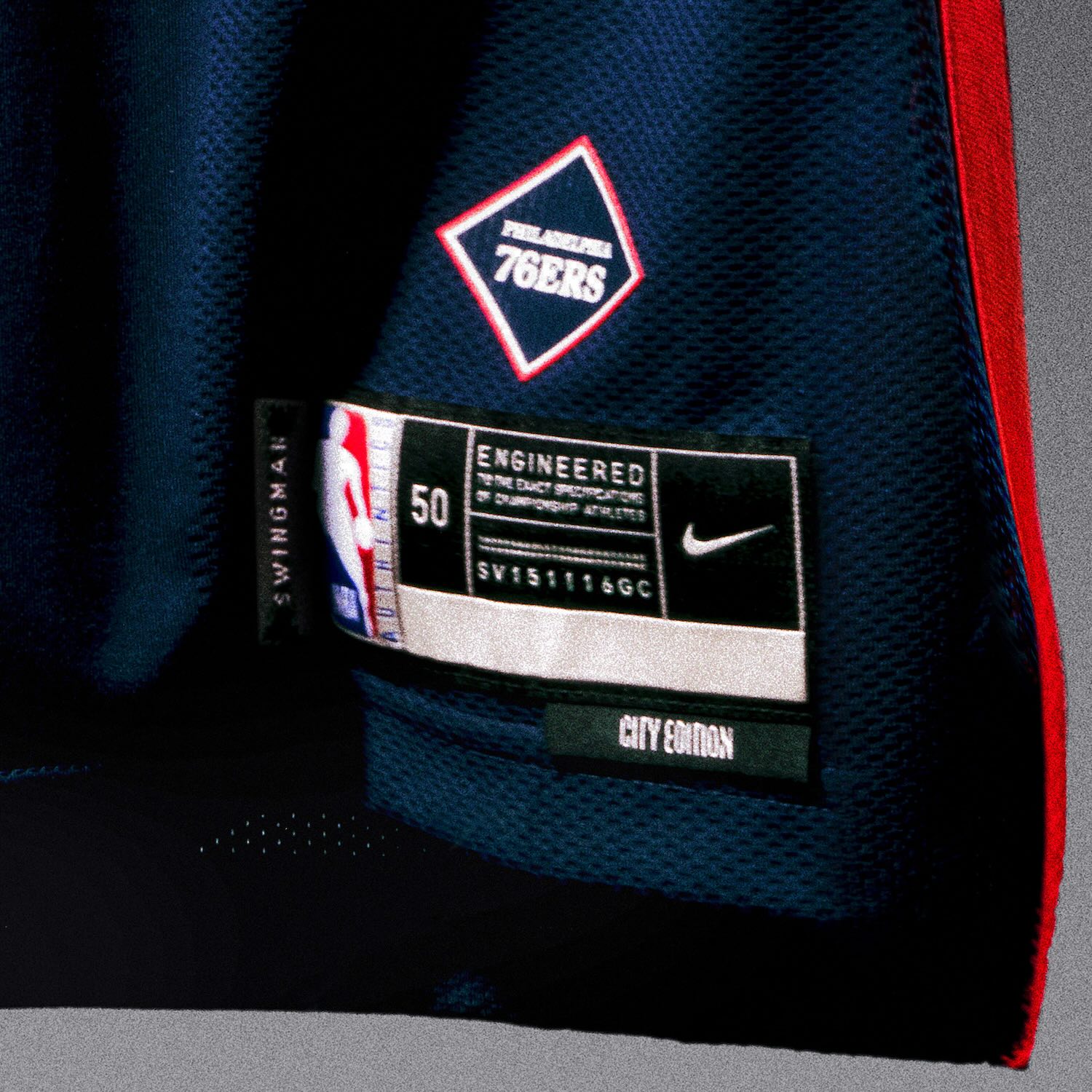
Philadelphia 76ers
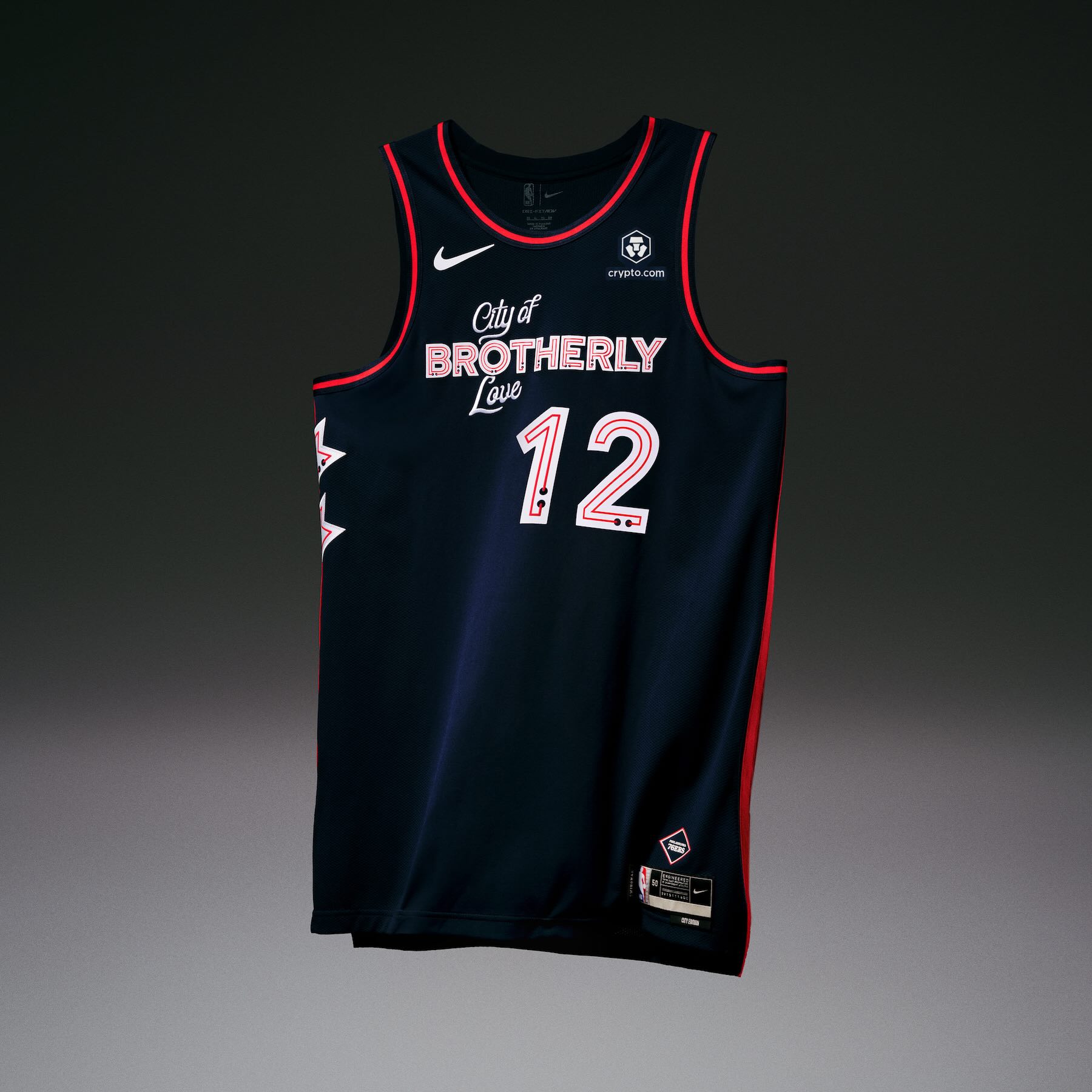
• The Philadelphia 76ers uniform is inspired by the historic Reading Terminal Market in the heart of Center City. The “City of Brotherly Love” wordmark carries over as a wordmark from last season’s uniform but is reinterpreted as the Market iconic neon sign. Two downward facing arrows run down the jersey’s right side, like the arrows that directed people from the train station to the bustling market below.
• The uniform features a deep navy base color for only the second time in the team’s history (it first appeared in last season’s City Edition uniform). The red and white accent colors, along with an in-line stroke within the letters and numbers, reflect the vibrant neon signs throughout the market.
• The Philadelphia 76ers wordmark is placed within a diamond enclosure in the same style of the market’s logo on the jersey jocktag.
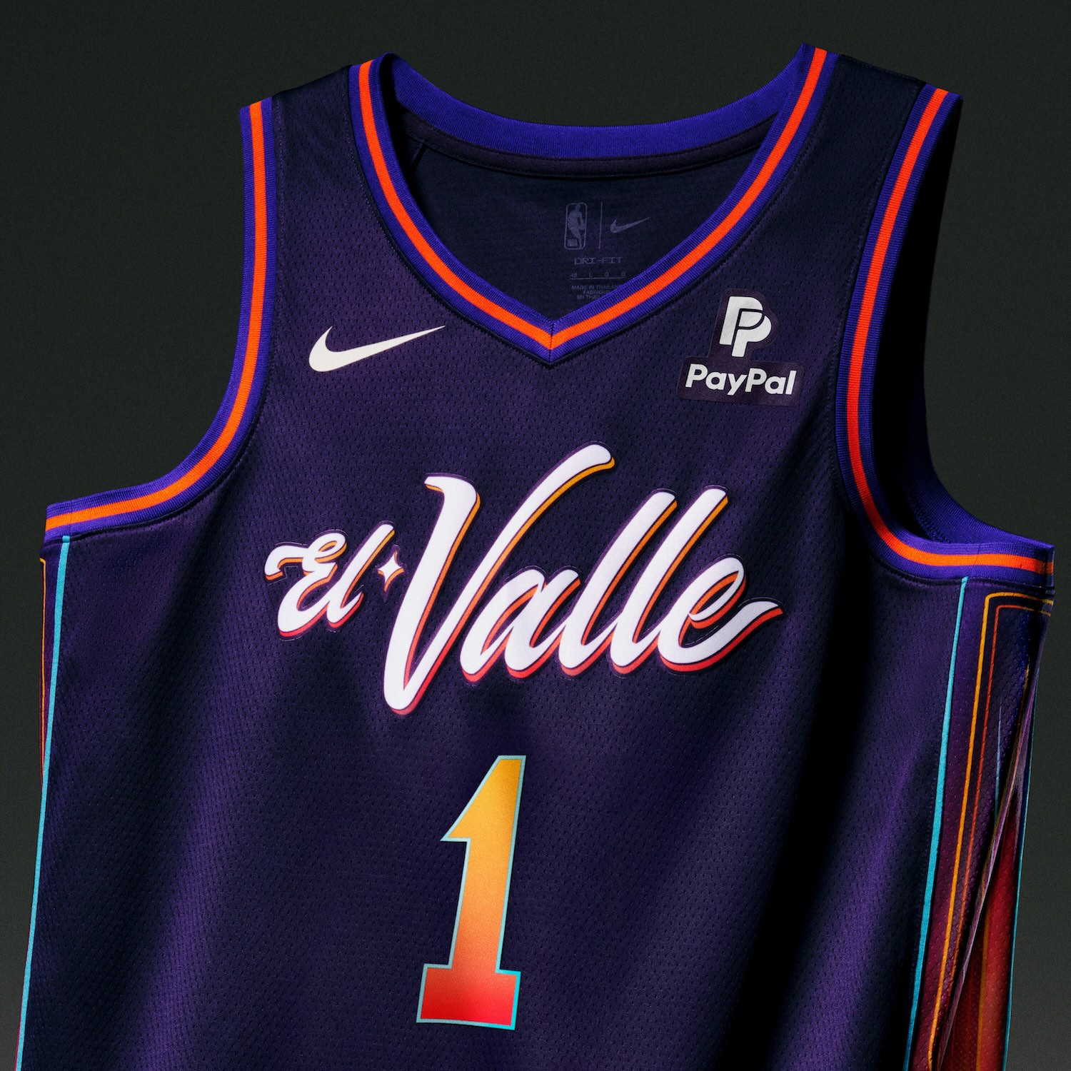
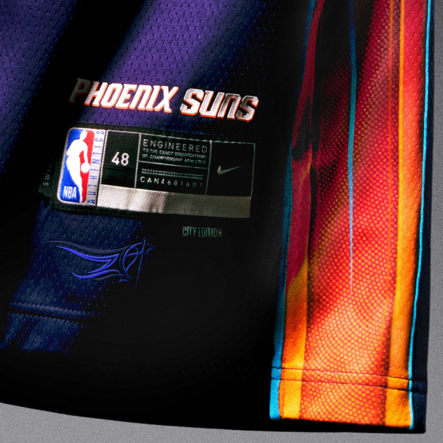
Phoenix Suns
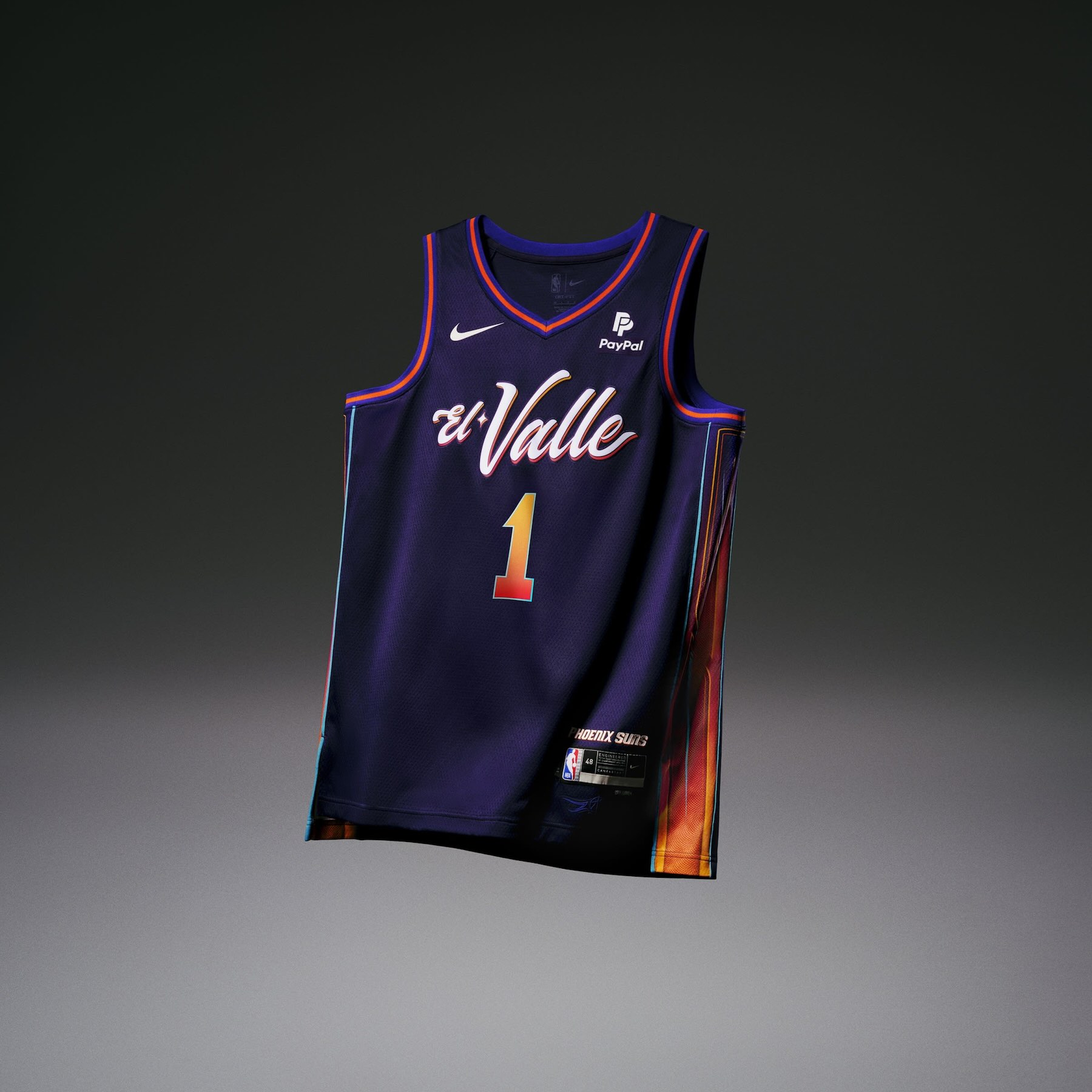
• The Phoenix Suns uniform pays tribute to the city’s Mexican culture and the team’s Chicano fanbase. The “El Valle” uniform celebrates lowrider culture and the art of rolling “bajito y suavecito” (low and slow) through its color patterns and custom pinstripe design.
• In addition to the midnight purple base, orchid purple trim, orange accents and turquoise piping, a valley-inspired gradient is featured on the number sets and side panels.
• The pinstripe design found on the side panel of the jersey and the shorts is inspired by the paintjobs of lowriders throughout the Valley. The Suns’ classic sunburst icon is displayed on the shorts.
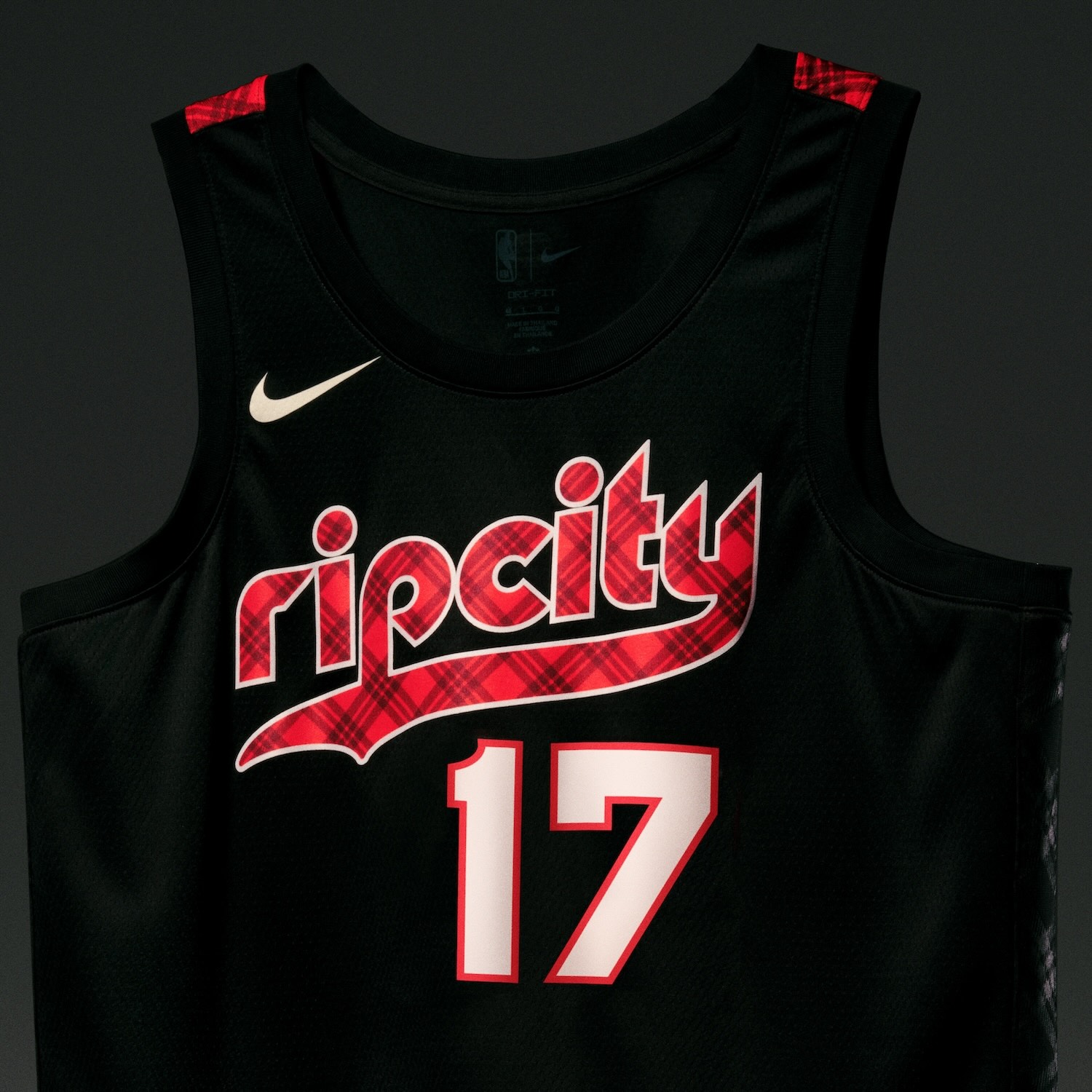
Portland Trail Blazers
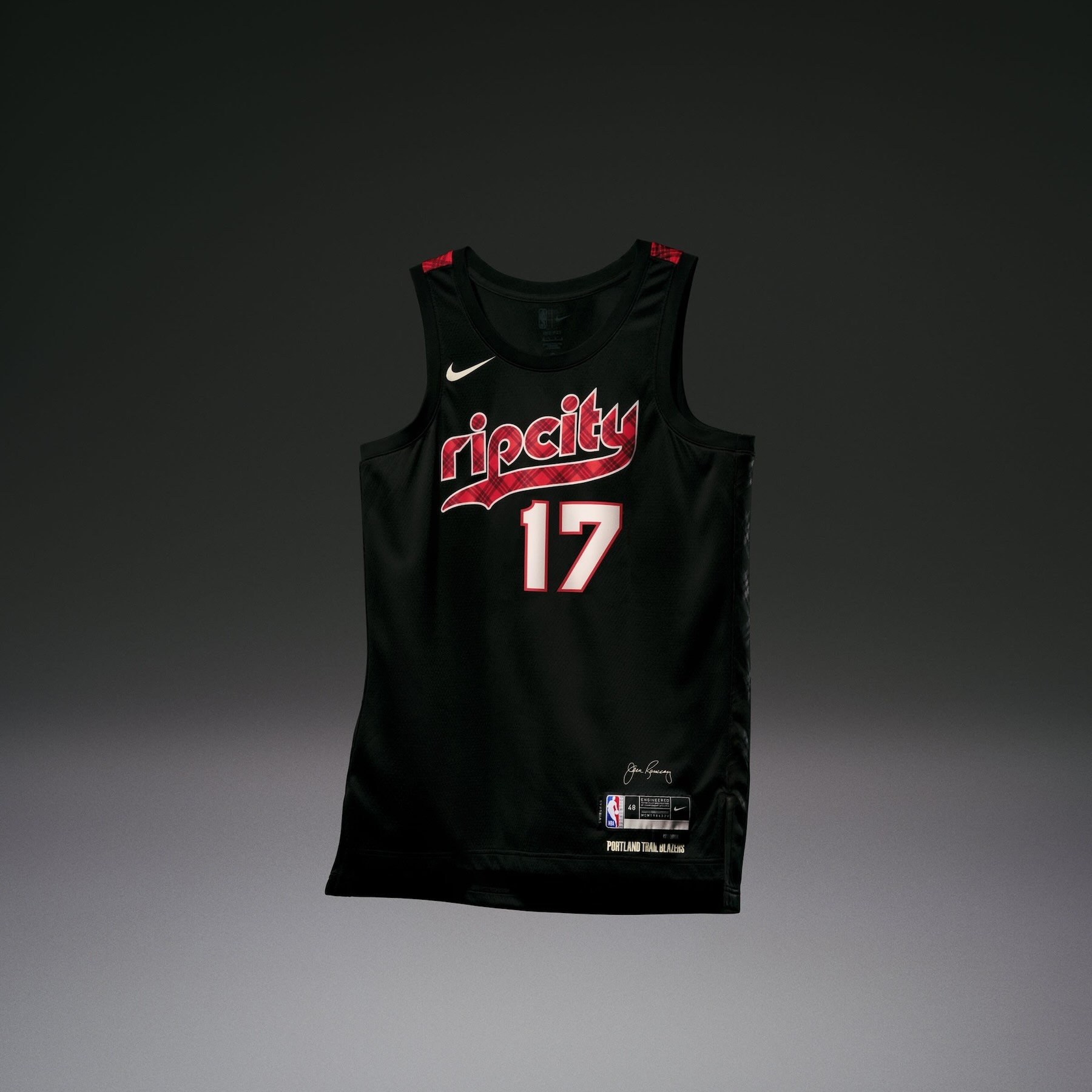
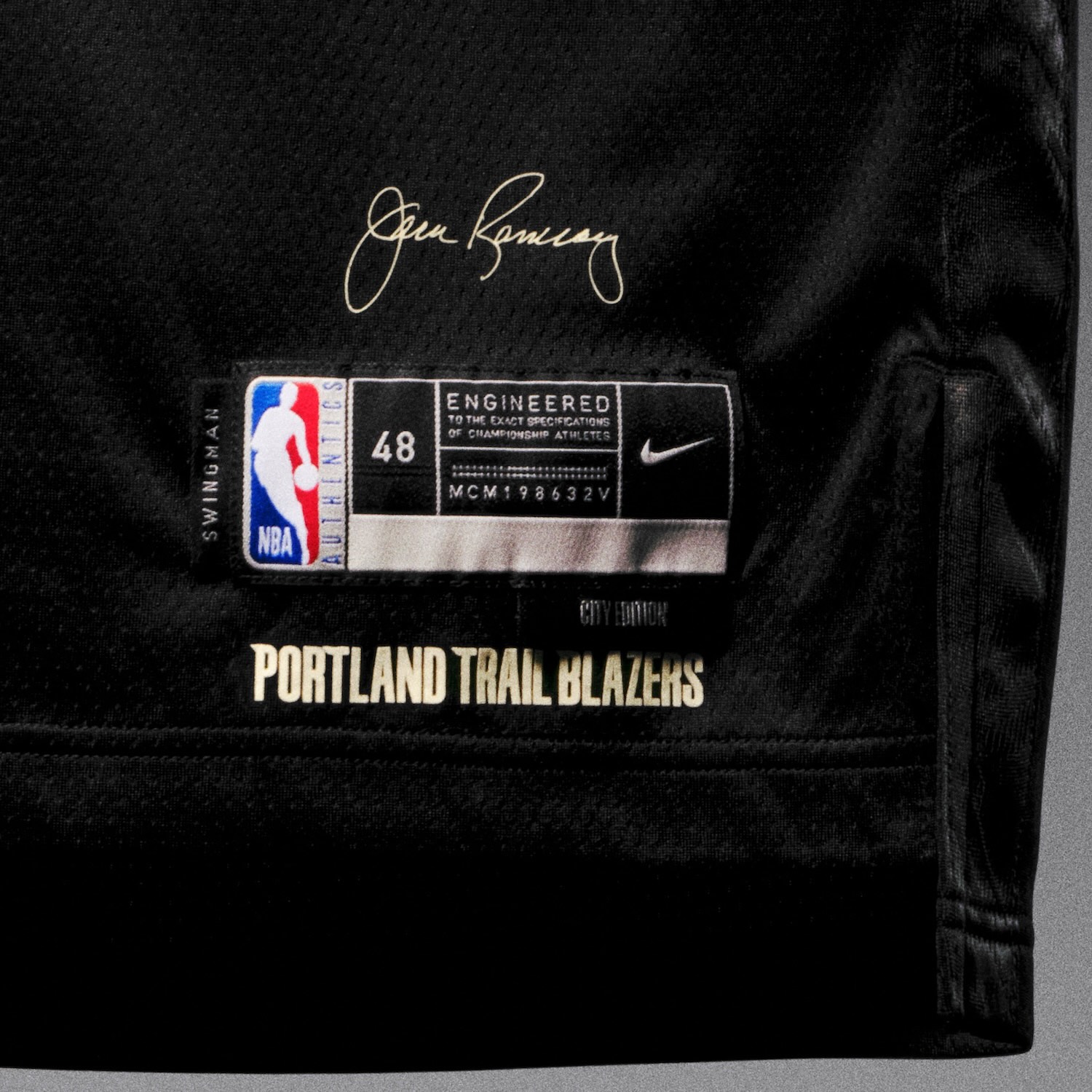
• The Portland Trail Blazers uniform honors the late head coach Jack Ramsay, who led the Blazers to their sole NBA Championship in 1977 while wearing a wild assortment of plaid suits. The uniform base is black, but the accent wings, waistband and Rip City wordmark are adorned with a bold red and black plaid pattern inspired by Dr. Jack’s trademark styles.
• On the belt buckle is a replica of the tribute “Dr. Jack” patch the team wore on their jerseys the year he passed away in 2014.
• Representing the team’s modern identity, the team’s primary pinwheel logo appears on the shorts.
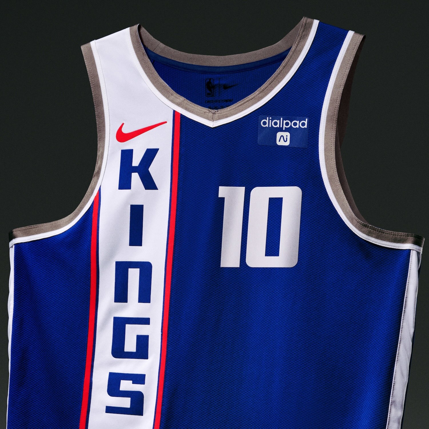
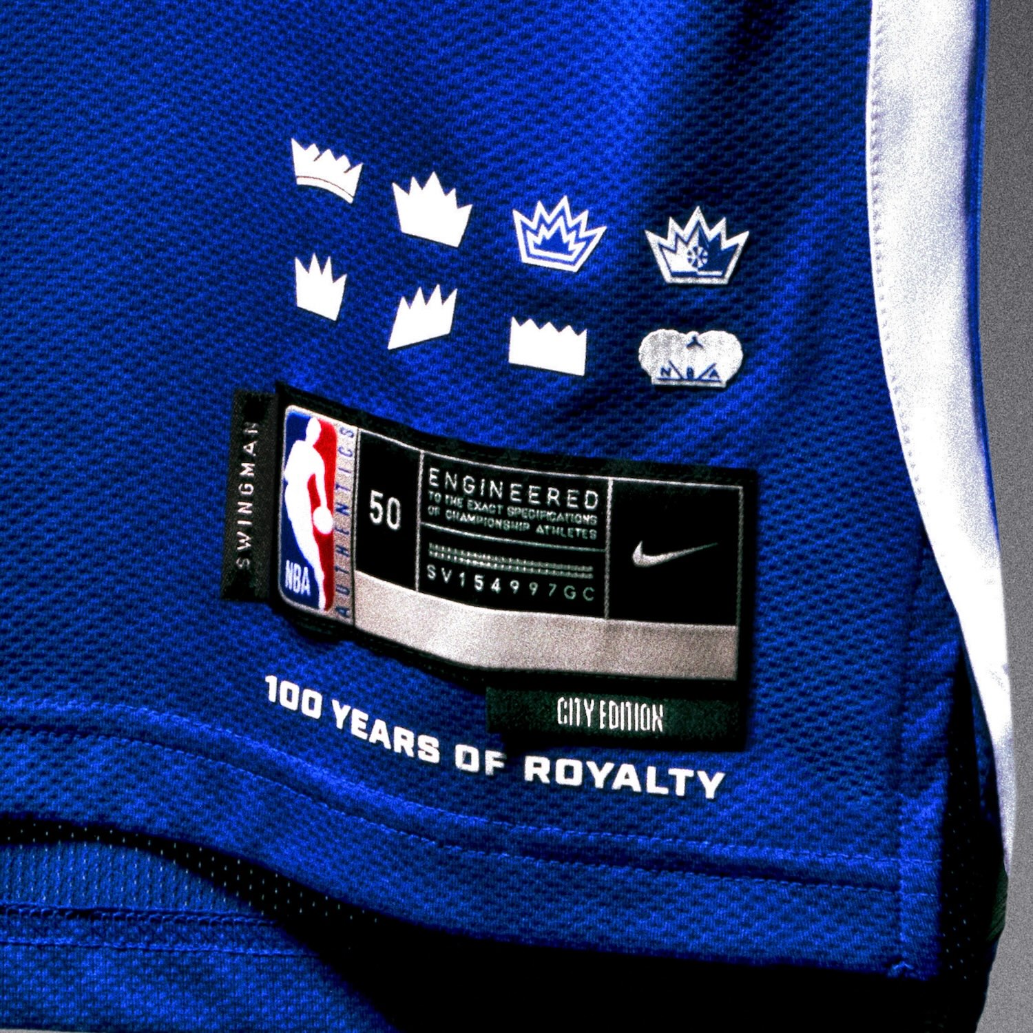
Sacramento Kings
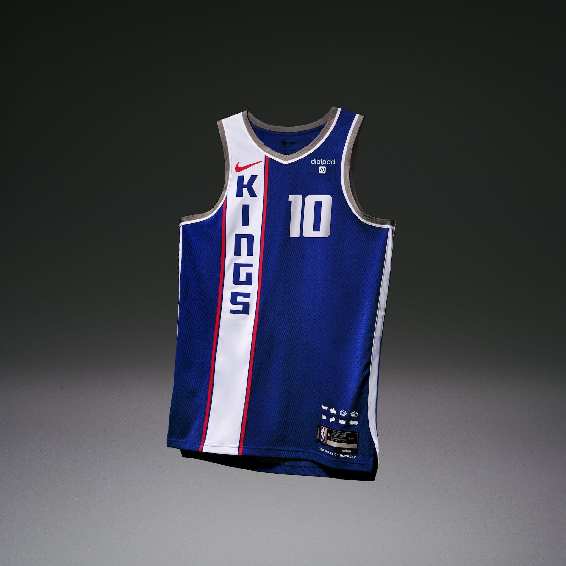
• The Sacramento Kings uniform honors the franchise’s 100th anniversary by reimagining one of their most legendary uniforms: the 1968 Cincinnati Royals Road uniform (the team became the Sacramento Kings in 1985). The design features a vertical Kings wordmark on top of a royal blue hue, while blending the historical Royals/Kings colors with a touch of contemporary gray.
• The jock tag features various crown emblems, a secondary symbol that’s been an integral part of the team’s identity since the team’s beginning. A single crown logo sits on the waistband.
• The shorts display the present-day ball lion logo.
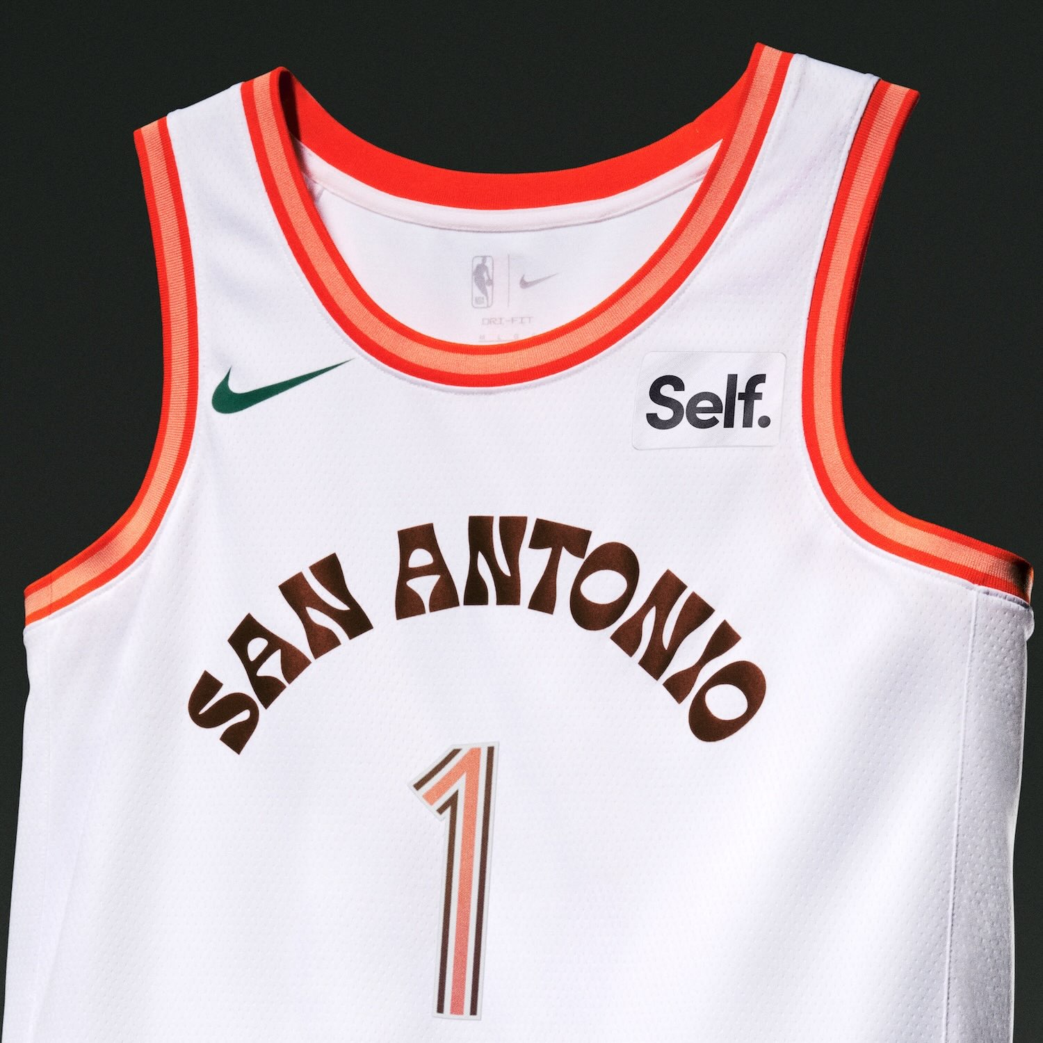
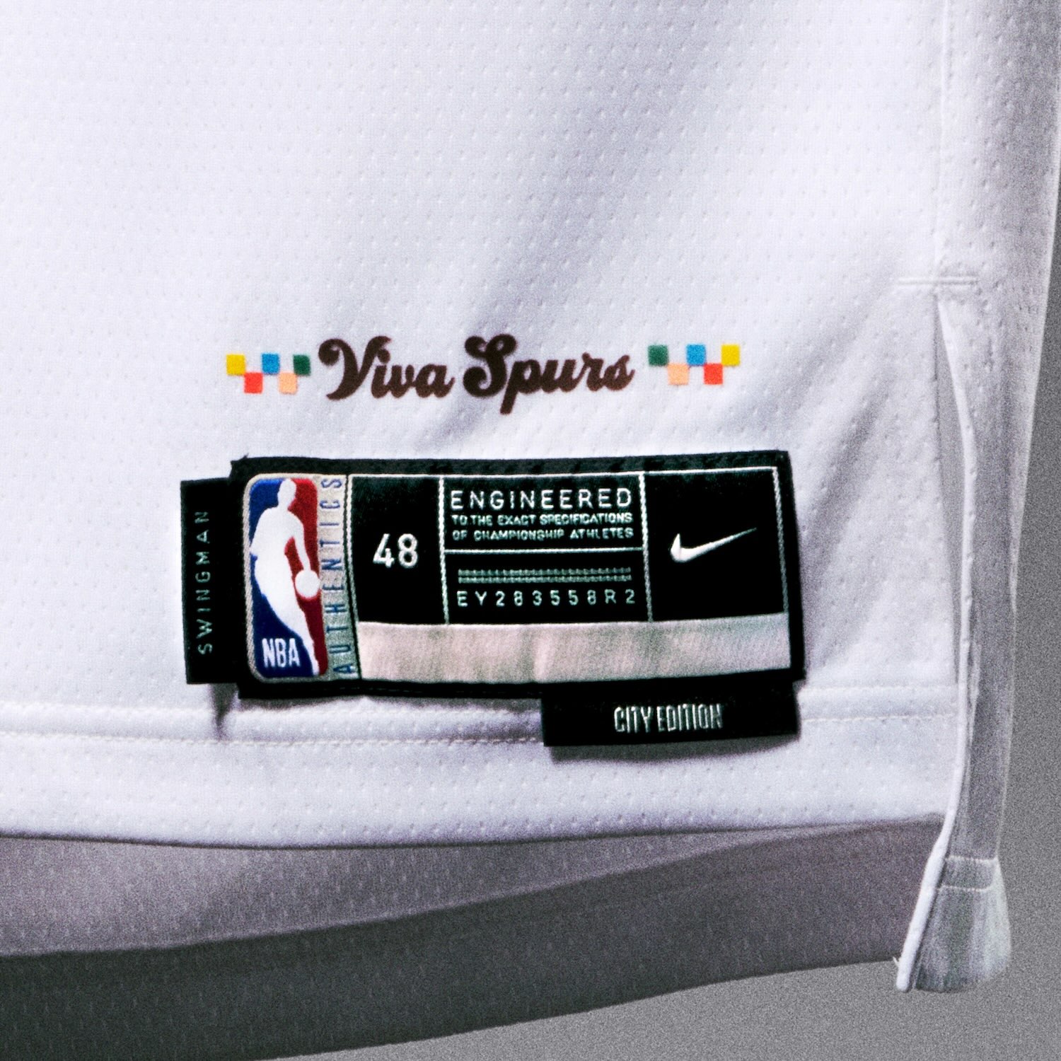
San Antonio Spurs
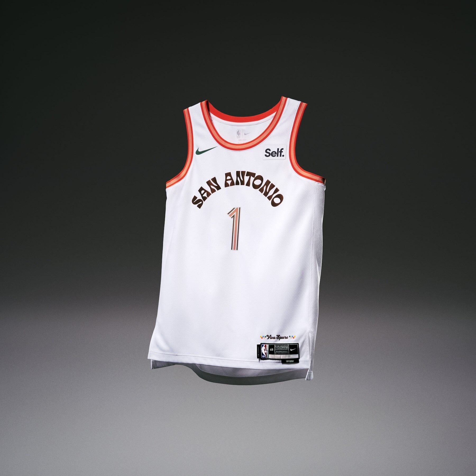
• The San Antonio Spurs uniform throws it back to 1968 during the World’s Fair — Hemisfair — for a celebration of global connection as seen through the lens of San Antonio culture. The event helped provide the infrastructure that supported the Spurs’ move to San Antonio in 1973. The design features a retro tower logo, representing the heart of downtown where the fair took place.
• A custom “San Antonio” wordmark across the chest draws inspiration from newspaper headlines that called out the sights and sounds from the Hemisfair.
• On the jocktag, the phrase “Viva Spurs” turns back the clock to one of the team’s longtime mantras.
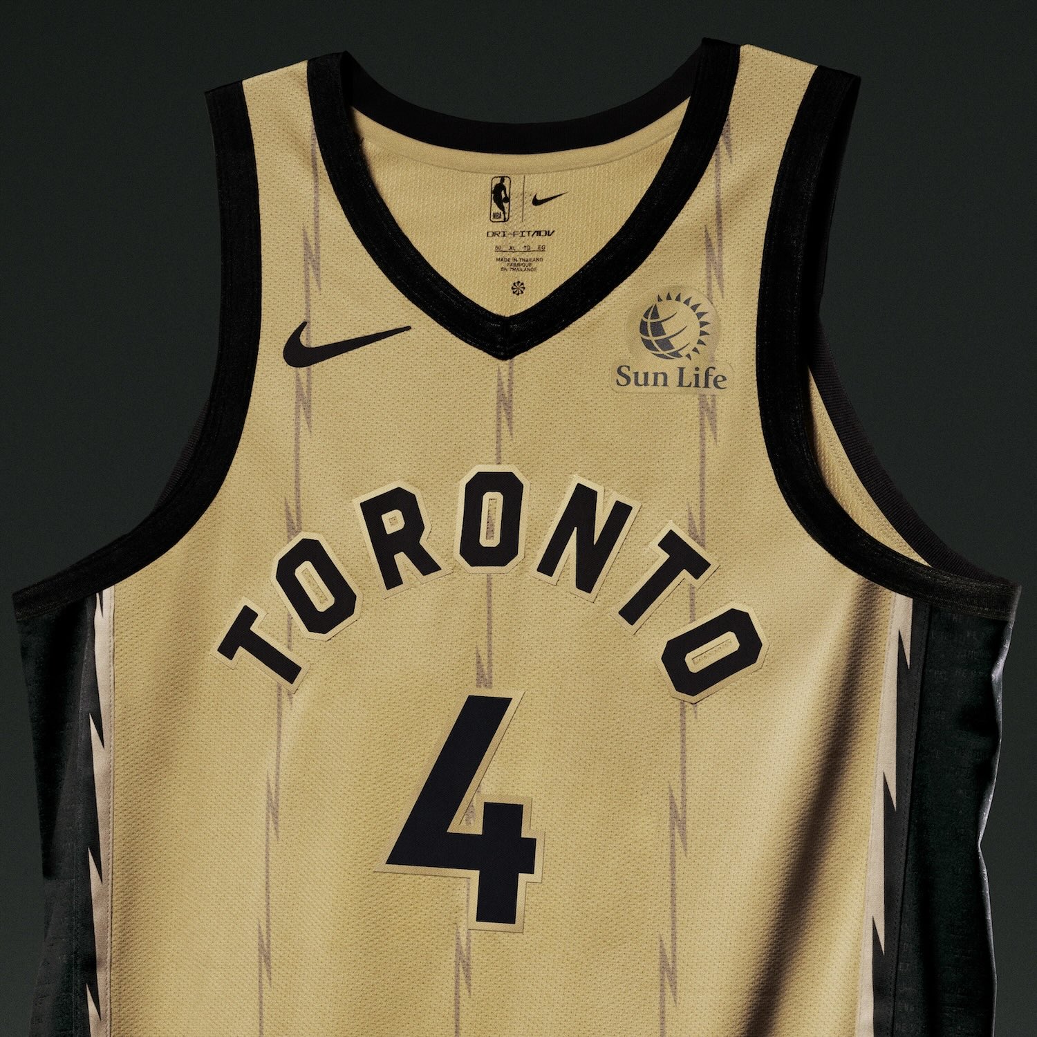
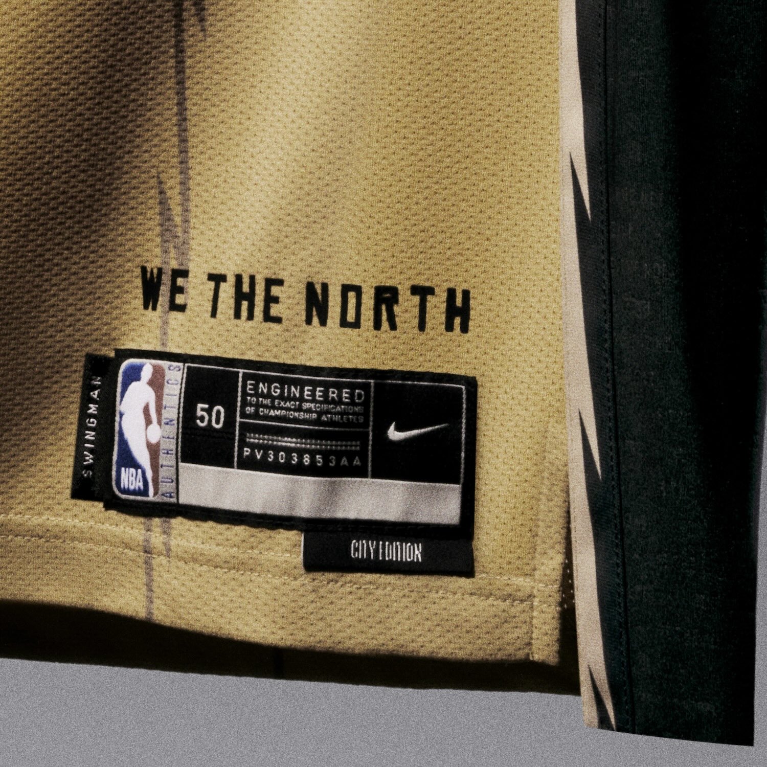
Toronto Raptors
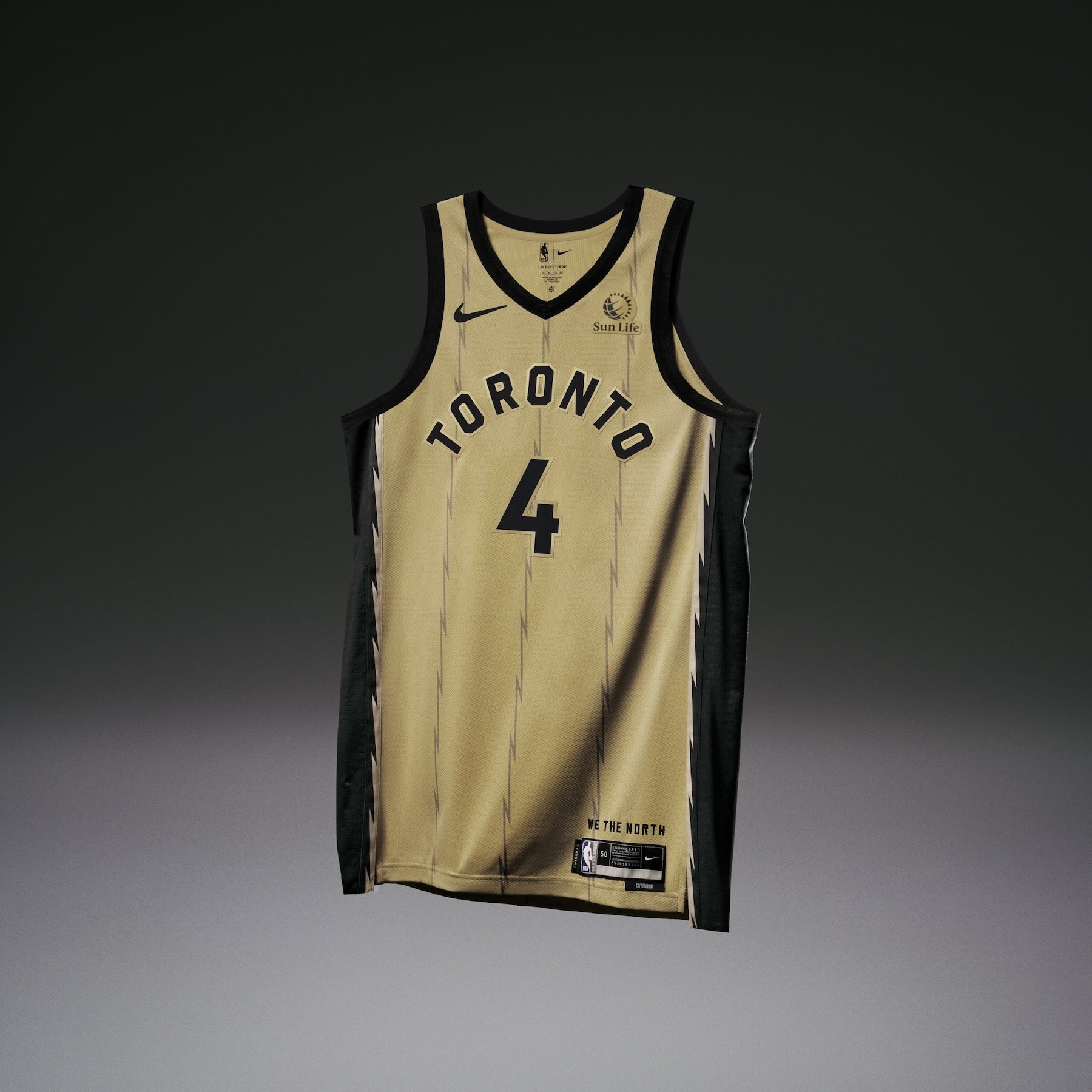
• The Toronto Raptors uniform takes the gold usually found on the details of City Edition uniforms and applies it throughout the whole uniform as the body color.
• A lightning-patterned pinstripe lines the matte gold uniform and a bold of electricity shoots down the side panel. The Raptors’ battle cry, “We The North,” in inscribed in multiple languages within the bolt.
• A Canadian maple leaf is centered on the belt buckle.
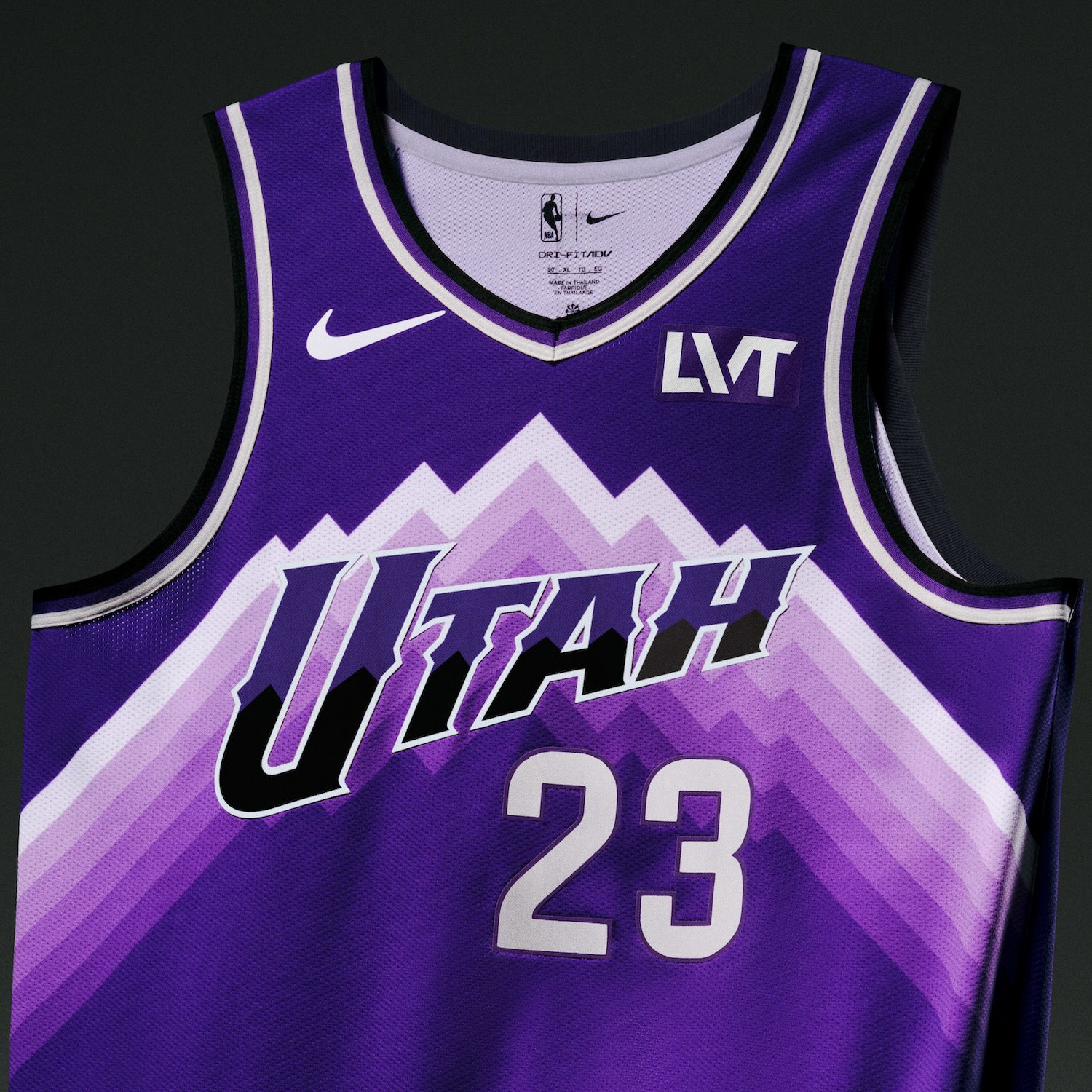
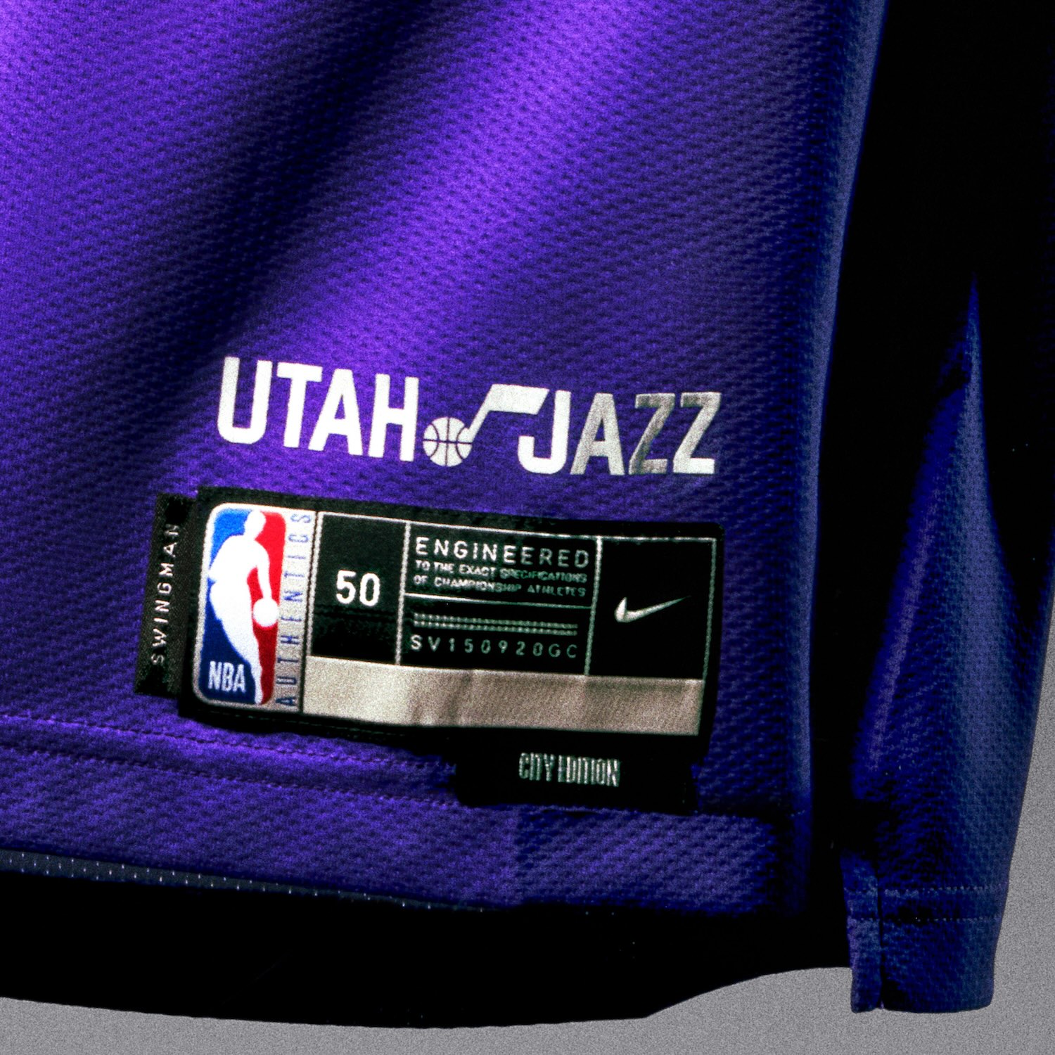
Utah Jazz
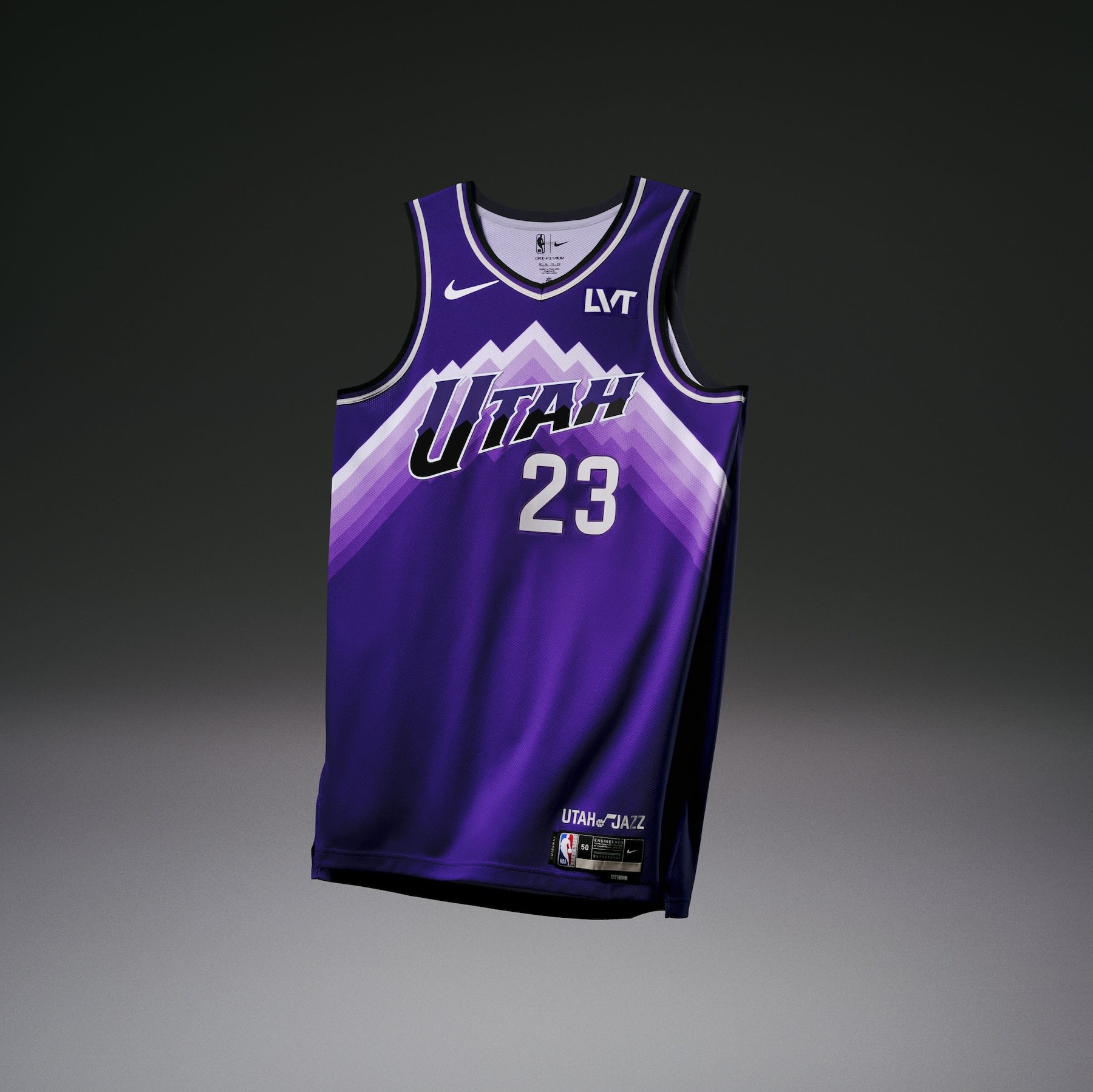
• The Utah Jazz uniform introduces a new mountain design, representing the mountain range along the Wasatch front, incorporating a purple to white gradient.
• The design takes several cues from the team’s road uniforms in the late ‘90s and early 2000s, including a mountain range across the chest, a simplified asymmetrical short design with a mountain pattern and the “UTAH” wordmark in classic lettering.
• The shorts feature a note logo for the first time on a City Edition uniform.
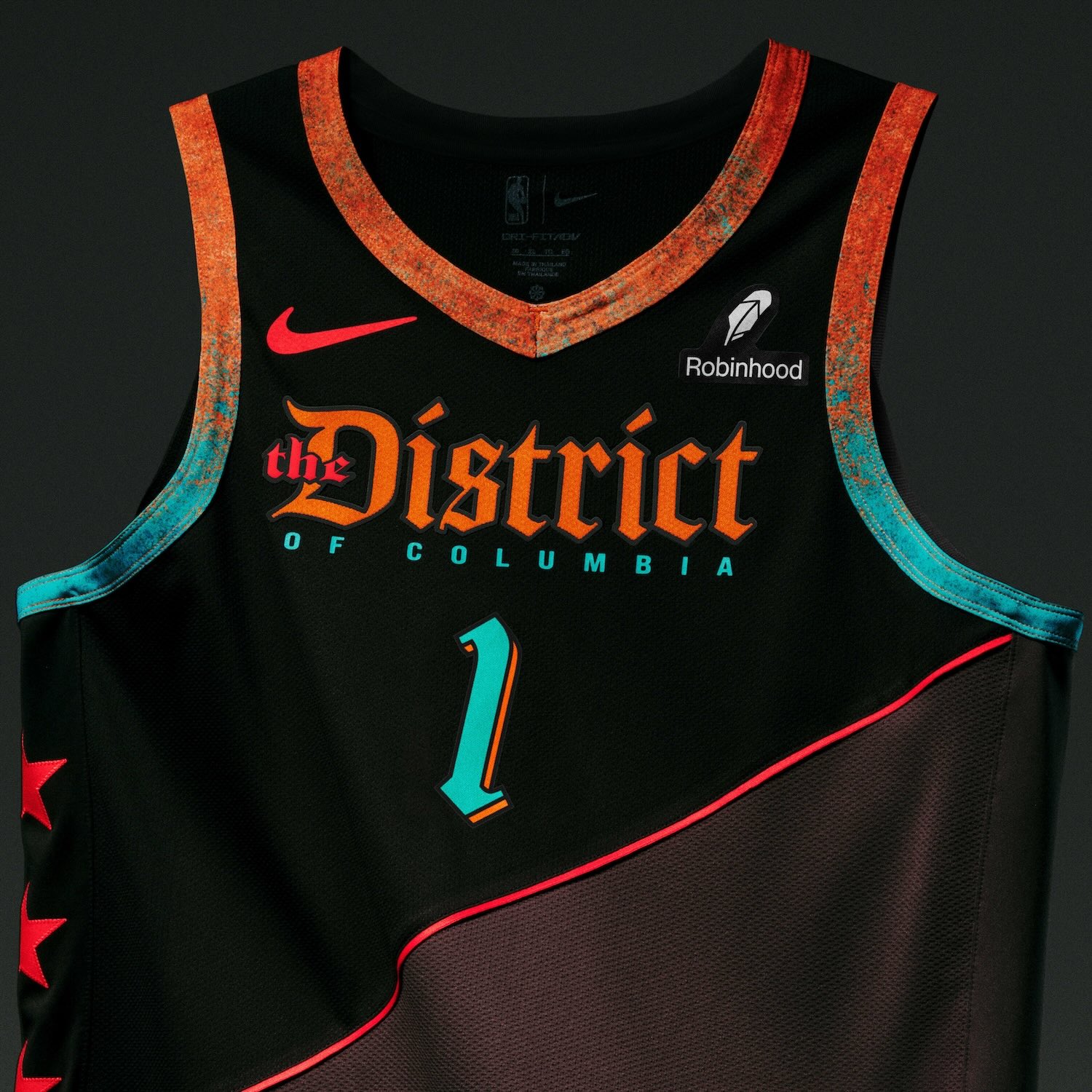
Washington Wizards
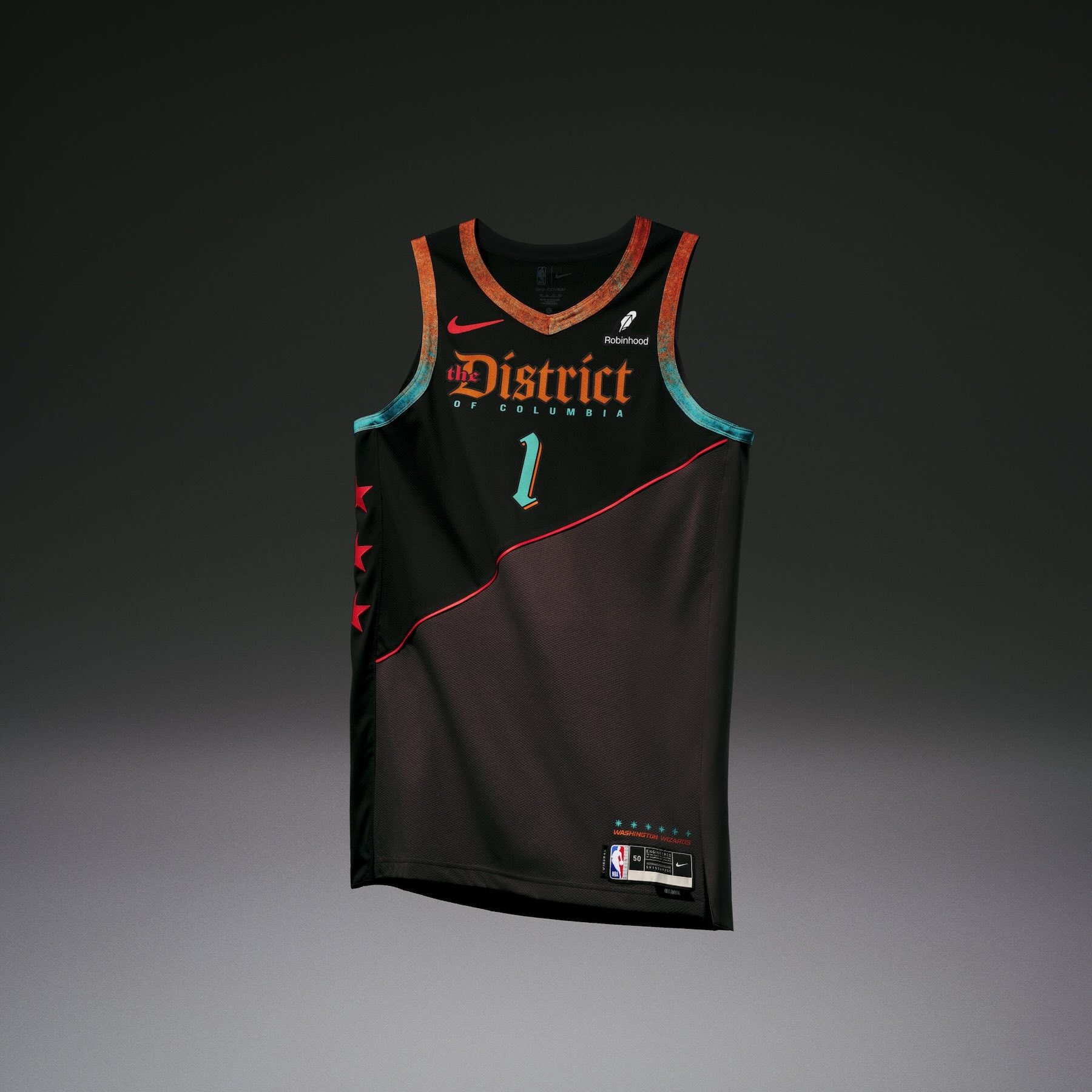
• The Washington Wizards uniform is inspired by the building blocks of the nation’s past. In the 1700s, 40 boundary stones were laid out in a 10-mile radius to create the original outline of Washington, D.C., becoming some of the oldest federal monuments on record. The area created by the stones is incorporated into the uniform’s blocked graphic on the design.
• A patina-like effect was created using various color to give the uniform a vintage, aged look. The taping around the neck and shoulders are a gradient of bronze and patina, signaling the color of the fencing that surrounds many of the boundary stones today.
• Three red stars down the right side of the uniform are fashioned after the D.C. flag, while the logo on the bottom-right side of the shorts brings a twist to the traditional team logo, featuring a boundary stone where the Washington Monument normally resides.